22 Apr Create Popup
Green Popups philosophy: each popup is a set of elements. There are no primary or secondary elements. All of them are equal. Even main widow box is a regular rectangle or image. Keeping this idea in the mind, allows to design unique popups with various shapes and sizes. Creating popup is a process of creating of elements and positioning them properly. (It’s like working with Photoshop.)
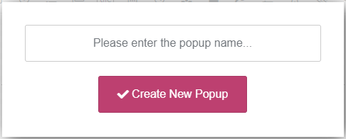
Plugin goes with easy-to-use drag-n-drop popup builder. To start creating a new popup just click “Create Popup” in Left Side Menu. It prompts you to enter a name for the new popup, once you’ve done so click “Create New Popup” button to continue.
You can then start adding elements and configuring the form.
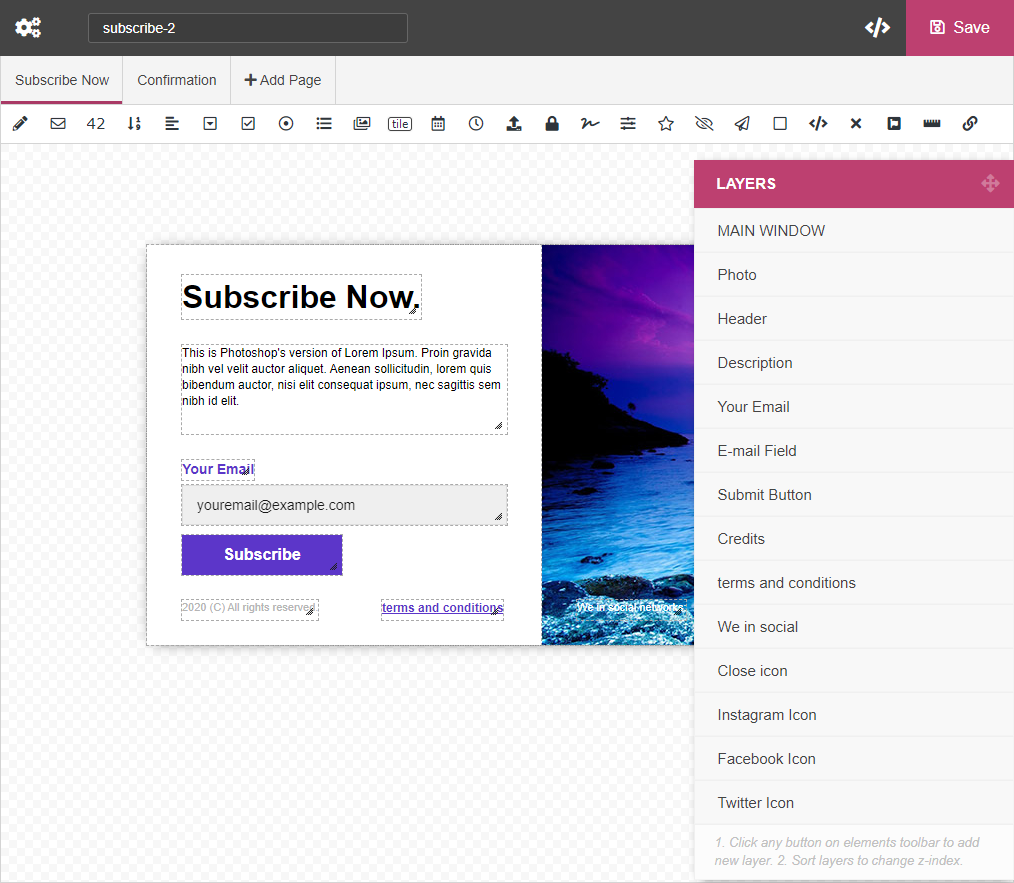
Popup Builder consists of several toolbars, (top toolbar, pages/steps toolbar, elements toolbar), “construction area”, “Layers” floating panel and “Element Properties” panel.
Top toolbar
Top toolbar contains the following elements (from left to right):
- Popup Settings (). This button opens “Popup Settings” window. It has hundreds adjustable parameters related to general popup functionality, design, notifications, integrations, etc. All of them are described in this documentation. Just scroll down to appropriate section.
- Slug. Unique ID of the popup. It is used to call popups.
- How To Use (). This button opens “How To Use” window. There you can find all possible ways of using the popup.
- Save (). Click this button to save the changes.
Pages/steps Toolbar
This bar is used to build multi-pages (multi-steps) popups. By clicking button you can add as many pages/steps as you want.
There is one special page/step which always exists from the beginning – . The content of this page/step is displayed when users successfully submit the popup. Importnat! This is not the only way to inform users about successful submission. For more options please visit the chapter below.
Popup Elements Toolbar
This toolbar contains popup element icons. If you want to add some element to the popup (for example, input field or button or something else), just click relevant icon and new element will be added. Then you can move new element into desired position, resize and configure it. Following elements can be added to the form:
- – Text Input Field
- – Email Input Field
- – Numeric Input Field
- – Numeric Spinner
- – Textarea
- – Select Box (Drop-down List)
- – Checkbox
- – Radio Button
- – Multiselect List
- – Image Select
- – Tile
- – Date Picker
- – Time Picker
- – File Upload
- – Password
- – Star Rating
- – Signature Field
- – Range Slider
- – Hidden Field
- – Submit Button
- – Rectangle / Image
- – HTML Content
- – Close Icon
- – Font Awesome Icon
- – Progress Bar
- – Link Button
The properties of each element are described in details in chapter “Popup Elements”.
Construction Area
This is an area of Popup Builder where you create the popup. If you want to add some element to the popup (for example, input field or button or something else), just click relevant icon on Popup Elements Toolbar and new element will be added. Use mouse to move element into desired position and resize it. Each element has context menu, just do right click over it.
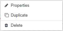
Context Menu contains the following items:
- Properties. Click it to open “Element Properties” panel. Each form element has dozens properties that you can change. For more details regarding properties, please read Popup Elements chapter.
- Duplicate. Create exact copy (including all properties) of the element.
- Duplicate to. Create exact copy (including all properties) of the element and move it to different page/step. Available for multi-page popups.
- Move to. Move element to different page/step. Available for multi-page popups.
- Delete. Delete the element.
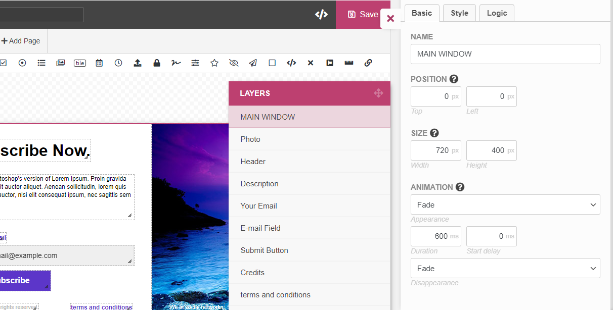
Layers Panel
This is a floating panel that contains full list of elements. You can move this panel and sort list of elements. The lower element in a list has the higher z-index. An element with higher z-index is always in front of an element with a lower z-index.
Element Properties panel
When you click any element in Layers Panel (or “Properties” in element’s context menu), the right side panel is opened (image below). It contains parameters of selected element.
Sorry, the comment form is closed at this time.