Documentation

All you need to know about Green Popups

Intro

Disclaimer

We are constantly improving our plugin by adding new features and fixing bugs. Please keep the plugin updated and always use latest version. This documentation is related to actual version of the plugin, so don’t forget to check it from time to time.
  • Initial release: October 30th, 2013
  • Latest update: March 22nd, 2024
  • Version: 7.49

Back To Top

Requirements

Your server must match the following requirements. All modern servers already do it.

  • PHP version 5.5 or higher.
  • MySQL version 5.0 or higher.
Your WordPress-driven website and server must match the following requirements.

  • WordPress version 4.2 or higher.
  • PHP version 5.5 or higher.
  • MySQL version 5.0 or higher.

Back To Top

Installation

We created Wizard which helps to install script properly.

  1. Unpack downloaded archive and upload files to your server.
  2. Open it in your browser – Wizard will be launched automatically.
  3. Wizard ask for couple questions. Nothing special – MySQL parameters and admin credentials to access Admin Panel.
  4. Once finished, go to Dashboard and click “Green Popups” box under “Installed Plugins” section. It activates the plugin.
  5. Once activated, plugin adds relevant item to Left Side Menu.
  6. Find “How To Use” submenu. It explains how to embed plugin into your wesbite – nothing difficult, just paste couple JS/HTML-snippets.
Green Forms is a WordPress plugin and it is installed as regular WordPress plugin:

  1. Go to WordPress dashboard and click left side menu “Plugins >> Add New”.
  2. Click “Upload” link and upload zip-archive downloaded from CodeCanyon.
  3. Activate uploaded plugin.

If you have any difficulties with uploading zip-archive, please do it manually using FTP:

  1. Use any FTP-client to connect your server.
  2. Unzip archive downloaded from CodeCanyon.
  3. Upload unzipped folder to plugins directory: /wp-content/plugins/
  4. Go to WordPress dashboard, click left side menu “Plugins” and activate uploaded plugin.

Once installed and activated, plugin creates “Green Popups” menu section in left side menu. All further actions, related to plugin functionality, are done through this menu section.

Back To Top

Updates

Updating the script is a manual procedure. It’s pretty simple. Don’t worry.

  1. Download latest version of the script from CodeCanyon.
  2. Overwrite existing files on your server, except file /inc/config.php and folder /content/data/.

You won’t lose forms and settings. They are stored in MySQL database.

There are 2 ways to update the plugin.

  • Automatic update. To enable this feature you need put Item Purchase Code on Settings page (at the bottom). After that, updates will be pulled from our servers automatically. If for some reasons your server can not connect to update server, please do manual update.
  • Manual update. Download latest version of the plugin from CodeCanyon and overwrite exiting files in folder /wp-content/plugins/halfdata-green-popups/ by new ones.

You won’t lose forms and settings. They are stored in MySQL database.

Back To Top

Migrate from Layered Popups

Although Green Popups is a next step of development of Layered Popups, it goes as a separate plugin. It means that Layered Popups and Green Popups can be installed simultaneously on the same site and they work independently. We created special tool to copy all data from Layered Popups to Green Popups. After migration procedure you can disable Layered Popups and continue using Green Popups.
So, what to do.

  1. Make sure that Layered Popups and all add-ons (that you use) are active.
  2. Install and activate Green Popups and all add-ons (if you use them). You can download them from CodeCanyon.
  3. Go to migration tool through Left Side Menu “Green Popups >> Migrating” (this menu available only if you performed steps 1 and 2 described above).
  4. Make sure that Layered Popups and all add-ons (that you use) are active.
  5. Click “Migrate from Layered Popups” button and wait while all counters become “100%”.
  6. Disable Layered Popups and all its add-ons.
  7. Enjoy using Green Popups.

In case of any problems please contact us through Support Center.

Back To Top

Settings

General Settings

General Settings can be reached through menu “Green Popups >> Settings”.

Mailing Settings

All email messages sent by script use the following parameters for “FROM:” header. You also can override these parameters for certain form, if required.

  • Sender Name. All messages from the script are sent using this name as “FROM:” header value.
  • Sender Email. All messages from the script are sent using this email address as “FROM:” header value.

Miscellaneous

  • Pre-load popups. Enable this option to pre-load popups (not recommended). If disabled, popups are pulled on demand using AJAX.
  • Pre-load event popups. If enabled, only event popups (OnLoad, OnExit, etc.) are loaded together with website. All other popups are pulled on demand using AJAX.
  • GA Tracking. Enable this option to send form submission event to Google Analytics. Google Analytics must be installed on your website. If you use Google Tags Manager, please configure it properly to accept events.
  • Font Awesome. Enable this option if you want to use full set of Font Awesome icons. Otherwise, limited set of icons is used (for better performance). If your site already loads Font Awesome, you can enable relevant option to avoid double loading of the same library.
  • Air Datepicker plugin. Enable this option if you want to use nice datepicker (Air Datepicker) with date and time fields. If your site already loads Air Datepicker, you can enable relevant option to avoid double loading of the same plugin.
  • jQuery Mask plugin. For some type of form elements you can use input masks. This feature is driven by jQuery Mask plugin. Enabling it, allows you to set certain input mask for input fields. If your site already loads jQuery Mask plugin, you can enable relevant option to avoid double loading of the same library.
  • JavaScript Expression Parser. Enable this feature if you want to show result of math expressions in real-time. If your site already loads JavaScript Expression Parser, you can enable relevant option to avoid double loading of the same plugin.
  • Signature Pad plugin. Enable this feature if you want to use signature pad with forms. If your site already loads Signature Pad plugin, you can enable relevant option to avoid double loading of the same plugin.
  • Ion.RangeSlider plugin. Enable this feature if you want to use range slider with forms. If your site already loads Ion.RangeSlider plugin, you can enable relevant option to avoid double loading of the same plugin.
  • CSV separator. Select CSV separator.
  • Email validation. Please select the type of email validation. For more details please read chapter Email Validation Settings.
  • User uploads. Select how long to keep user uploads on server.
  • Reset cookie. Click the button to reset cookie. Popup will appear for all users. Do this operation if you changed content in popup and want to display it for returning visitors.

AWeber Connection

This section appears if you activated AWeber Integration module (read Plugin Modules paragraph regarding enabling/disabling modules). In this section you can connect website with your AWeber account. After successful connection, you can configure integration on Form Settings window, Integrations tab.

Zoho CRM Connection

This section appears if you activated Zoho CRM Integration module (read Plugin Modules paragraph regarding enabling/disabling modules). In this section you can connect website with your Zoho CRM account. After successful connection, you can configure integration on Form Settings window, Integrations tab.

Item Purchase Code

To activate your license please enter Item Purchase Code. Where can I find my Purchase Code?

Back To Top

Advanced Settings

Advanced plugin settings can be reached through menu “Green Popups >> Settings”, tab Advanced.

Plugin Modules

Plugin has modular architecture. It easily allows you to enable/disable certain functionality. For example, if you need MailChimp integration or accept payments via PayPal, just activate appropriate module and configure it on popup editor.
Actual version of the plugin has the following basic modules:

  • Custom JavaScript Handler. Turn this module on if you want to use custom JavaScript event handlers for forms. After activation you can configure them on popup editor.
  • 3rd party HTML form. Turn this module on if you want to re-submit popup data as a part of 3rd party HTML form. After activation you can configure integration on popup editor.
  • Custom GET/POST. Turn this module on if you want to re-submit popup data to 3rd party URL using GET or POST request. After activation you can configure integration on popup editor.
  • 3rd party MySQL. Turn this module on if you want to insert popup data into 3rd party MySQL table. After activation you can configure integration on popup editor.
  • WP User. Turn this module on if you want to create new WordPress user when form submitted or login users using Green Popups. After activation you can configure integration on popup editor.

Actual version of the plugin has the following default marketing, newsletter and CRM modules:

  • Acelle Mail. Turn this module on if you want to submit popup data to Acelle Mail. This module uses Acelle Mail API. After activation you can configure integration on popup editor.
  • ActiveCampaign. Turn this module on if you want to submit popup data to ActiveCampaign. This module uses ActiveCampaign API. After activation you can configure integration on popup editor.
  • ActiveTrail. Turn this module on if you want to submit popup data to ActiveTrail. This module uses ActiveTrail API. After activation you can configure integration on popup editor.
  • AgileCRM. Turn this module on if you want to submit popup data to AgileCRM. This module uses AgileCRM API. After activation you can configure integration on popup editor.
  • Automizy. Turn this module on if you want to submit popup data to Automizy. This module uses Automizy API. After activation you can configure integration on popup editor.
  • AvangEmail. Turn this module on if you want to submit popup data to AvangEmail. This module uses AvangEmail API. After activation you can configure integration on popup editor.
  • AWeber. Turn this module on if you want to submit popup data to AWeber. This module uses AWeber API. After activation connect to AWeber on General Settings page and configure integration on popup editor.
  • BirdSend. Turn this module on if you want to submit popup data to BirdSend. This module uses BirdSend API. After activation you can configure integration on popup editor.
  • Bitrix24. Turn this module on if you want to submit popup data to Bitrix24. This module uses Bitrix24 API. After activation you can configure integration on popup editor.
  • Campaign Monitor. Turn this module on if you want to submit popup data to Campaign Monitor. This module uses Campaign Monitor API. After activation you can configure integration on popup editor.
  • CleverReach. Turn this module on if you want to submit popup data to CleverReach. This module uses CleverReach REST API. After activation you can configure integration on popup editor.
  • Constant Contact. Turn this module on if you want to submit popup data to Constant Contact. This module uses Constant Contact API. After activation you can configure integration on popup editor.
  • Conversio. Turn this module on if you want to submit popup data to Conversio. This module uses Conversio API. After activation you can configure integration on popup editor.
  • ConvertKit. Turn this module on if you want to submit popup data to ConvertKit. This module uses ConvertKit API. After activation you can configure integration on popup editor.
  • Drip. Turn this module on if you want to submit popup data to Drip. This module uses Drip API. After activation you can configure integration on popup editor.
  • E-goi. Turn this module on if you want to submit popup data to E-goi. This module uses E-goi API. After activation you can configure integration on popup editor.
  • EmailOctopus. Turn this module on if you want to submit popup data to EmailOctopus. This module uses EmailOctopus API. After activation you can configure integration on popup editor.
  • Encharge. Turn this module on if you want to submit popup data to Encharge. This module uses Encharge API. After activation you can configure integration on popup editor.
  • FluentCRM. Turn this module on if you want to submit popup data to FluentCRM. (This module is available for WordPress version only). After activation you can configure integration on popup editor.
  • FreshMail. Turn this module on if you want to submit popup data to FreshMail. This module uses FreshMail API. After activation you can configure integration on popup editor.
  • GetResponse. Turn this module on if you want to submit popup data to GetResponse. This module uses GetResponse API. After activation you can configure integration on popup editor.
  • Gist. Turn this module on if you want to submit popup data to Gist. This module uses Gist API. After activation you can configure integration on popup editor.
  • Groundhogg. Turn this module on if you want to submit popup data to Groundhogg. (This module is available for WordPress version only). After activation you can configure integration on popup editor.
  • HubSpot. Turn this module on if you want to submit popup data to HubSpot. This module uses HubSpot API. After activation you can configure integration on popup editor.
  • INBOX. Turn this module on if you want to submit popup data to INBOX. This module uses INBOX API. After activation you can configure integration on popup editor.
  • Infomaniak Newsletter. Turn this module on if you want to submit popup data to Infomaniak Newsletter. This module uses Infomaniak Newsletter API. After activation you can configure integration on popup editor.
  • Intercom. Turn this module on if you want to submit popup data to Intercom. This module uses Intercom API. After activation you can configure integration on popup editor.
  • Jetpack Subscriptions. Turn this module on if you want to submit popup data to Jetpack Subscriptions. (This module is available for WordPress version only). After activation you can configure integration on popup editor.
  • Klaviyo. Turn this module on if you want to submit popup data to Klaviyo. This module uses Klaviyo API. After activation you can configure integration on popup editor.
  • Mad Mimi. Turn this module on if you want to submit popup data to Mad Mimi. This module uses Mad Mimi API. After activation you can configure integration on popup editor.
  • Mailautic. Turn this module on if you want to submit popup data to Mailautic. This module uses Mailautic API. After activation you can configure integration on popup editor.
  • MailChimp. Turn this module on if you want to submit popup data to MailChimp. This module uses MailChimp API. After activation you can configure integration on popup editor.
  • MailerLite. Turn this module on if you want to submit popup data to MailerLite. This module uses MailerLite API. After activation you can configure integration on popup editor.
  • MailFit. Turn this module on if you want to submit popup data to MailFit. This module uses MailFit API. After activation you can configure integration on popup editor.
  • Mailgun. Turn this module on if you want to submit popup data to Mailgun. This module uses Mailgun API. After activation you can configure integration on popup editor.
  • Mailjet. Turn this module on if you want to submit popup data to Mailjet. This module uses Mailjet API. After activation you can configure integration on popup editor.
  • MailPoet. Turn this module on if you want to submit popup data to MailPoet. (This module is available for WordPress version only). After activation you can configure integration on popup editor.
  • Mailrelay. Turn this module on if you want to submit popup data to Mailrelay. This module uses Mailrelay API. After activation you can configure integration on popup editor.
  • Mailster. Turn this module on if you want to submit popup data to Mailster. (This module is available for WordPress version only). After activation you can configure integration on popup editor.
  • MailWizz. Turn this module on if you want to submit popup data to MailWizz. This module uses MailWizz API. After activation you can configure integration on popup editor.
  • Mautic. Turn this module on if you want to submit popup data to Mautic. This module uses Mautic API. After activation you can configure integration on popup editor.
  • Moosend. Turn this module on if you want to submit popup data to Moosend. This module uses Moosend API. After activation you can configure integration on popup editor.
  • Mumara. Turn this module on if you want to submit popup data to Mumara. This module uses Mumara API. After activation you can configure integration on popup editor.
  • Newsman. Turn this module on if you want to submit popup data to Newsman. This module uses Newsman API. After activation you can configure integration on popup editor.
  • Omnisend. Turn this module on if you want to submit popup data to Omnisend. This module uses Omnisend API. After activation you can configure integration on popup editor.
  • Ontraport. Turn this module on if you want to submit popup data to Ontraport. This module uses Ontraport API. After activation you can configure integration on popup editor.
  • Pabbly. Turn this module on if you want to submit popup data to Pabbly. This module uses Pabbly API. After activation you can configure integration on popup editor.
  • Pipedrive. Turn this module on if you want to submit popup data to Pipedrive. This module uses Pipedrive API. After activation you can configure integration on popup editor.
  • Rapidmail. Turn this module on if you want to submit popup data to Rapidmail. This module uses Rapidmail API. After activation you can configure integration on popup editor.
  • Salesflare. Turn this module on if you want to submit popup data to Salesflare. This module uses Salesflare API. After activation you can configure integration on popup editor.
  • SalesAutoPilot. Turn this module on if you want to submit popup data to SalesAutoPilot. This module uses SalesAutoPilot API. After activation you can configure integration on popup editor.
  • SendFox. Turn this module on if you want to submit popup data to SendFox. This module uses SendFox API. After activation you can configure integration on popup editor.
  • SendGrid. Turn this module on if you want to submit popup data to SendGrid. This module uses SendGrid API. After activation you can configure integration on popup editor.
  • SendinBlue. Turn this module on if you want to submit popup data to SendinBlue. This module uses SendinBlue API. After activation you can configure integration on popup editor.
  • SendPulse. Turn this module on if you want to submit popup data to SendPulse. This module uses SendPulse API. After activation you can configure integration on popup editor.
  • Sendy. Turn this module on if you want to submit popup data to Sendy. This module uses Sendy API. After activation you can configure integration on popup editor.
  • SG Autorepondeur. Turn this module on if you want to submit popup data to SG Autorepondeur. This module uses SG Autorepondeur API. After activation you can configure integration on popup editor.
  • SocketLabs (Email Marketing Center). Turn this module on if you want to submit popup data to SocketLabs (Email Marketing Center). This module uses SocketLabs (Email Marketing Center) API. After activation you can configure integration on popup editor.
  • The Newsletter Plugin. Turn this module on if you want to submit popup data to The Newsletter Plugin. (This module is available for WordPress version only). After activation you can configure integration on popup editor.
  • Tribulant Newsletters. Turn this module on if you want to submit popup data to Tribulant Newsletters. (This module is available for WordPress version only). After activation you can configure integration on popup editor.
  • VerticalResponse. Turn this module on if you want to submit popup data to VerticalResponse. This module uses VerticalResponse API. After activation connect to VerticalResponse on General Settings page and configure integration on popup editor.
  • Your Mailing List Provider. Turn this module on if you want to submit popup data to Your Mailing List Provider. This module uses Your Mailing List Provider API. After activation you can configure integration on popup editor.
  • Zapier. Turn this module on if you want to submit popup data to Zapier. This module uses Zapier Webkooks App. After activation you can configure integration on popup editor.
  • Zoho CRM. Turn this module on if you want to submit popup data to Zoho CRM. This module uses Zoho CRM API. After activation connect to Zoho CRM on General Settings page and configure integration on popup editor.

Actual version of the plugin has the following payment provider modules:

  • Authorize.Net. Turn this module on if you want to accept payments via Authorize.Net (accept USD only). After activation you can configure payment gateway on popup editor.
  • Blockchain. Turn this module on if you want to accept bitcoin payments via Blockchain. After activation you can configure payment gateway on popup editor.
  • Instamojo. Turn this module on if you want to accept payments via Instamojo. After activation you can configure payment gateway on popup editor.
  • InterKassa. Turn this module on if you want to accept payments via InterKassa. After activation you can configure payment gateway on popup editor.
  • Mollie. Turn this module on if you want to accept payments via Mollie. After activation you can configure payment gateway on popup editor.
  • PayFast. Turn this module on if you want to accept payments via PayFast. After activation you can configure payment gateway on popup editor.
  • PayPal. Turn this module on if you want to accept payments via PayPal. After activation you can configure payment gateway on popup editor.
  • Paystack. Turn this module on if you want to accept payments via Paystack (accept NGN only). After activation you can configure payment gateway on popup editor.
  • PayUmoney. Turn this module on if you want to accept payments via PayUmoney (accept INR only). After activation you can configure payment gateway on popup editor.
  • Perfect Money. Turn this module on if you want to accept payments via Perfect Money. After activation you can configure payment gateway on popup editor.
  • Razorpay. Turn this module on if you want to accept payments via Razorpay. After activation you can configure payment gateway on popup editor.
  • Skrill. Turn this module on if you want to accept payments via Skrill. After activation you can configure payment gateway on popup editor.
  • Stripe. Turn this module on if you want to accept credit/debit cards via Stripe. After activation you can configure payment gateway on popup editor.
  • WePay. Turn this module on if you want to accept credit/debit cards via WePay. After activation you can configure payment gateway on popup editor.
  • Yandex.Money. Turn this module on if you want to accept payments via Yandex.Money. After activation you can configure payment gateway on popup editor.

Actual version of the plugin has the following SMS gateway modules:

  • BulkGate. Turn this module on if you want to submit popup data to BulkGate. This module uses BulkGate API. After activation you can configure integration on popup editor.
  • GatewayAPI. Turn this module on if you want to submit popup data to GatewayAPI. This module uses GatewayAPI API. After activation you can configure integration on popup editor.
  • Nexmo. Turn this module on if you want to submit popup data to Nexmo. This module uses Nexmo API. After activation you can configure integration on popup editor.
  • Twilio. Turn this module on if you want to submit popup data to Twilio. This module uses Twilio API. After activation you can configure integration on popup editor.

Actual version of the plugin has the following 3rd party Email Validation modules:

  • Clearout. Turn this module on if you want to validate email addresses through Clearout. This module uses Clearout API. After activation you can configure integration on General Settings.
  • Kickbox. Turn this module on if you want to validate email addresses through Kickbox. This module uses Kickbox API. After activation you can configure integration on General Settings.
  • TheChecker. Turn this module on if you want to validate email addresses through TheChecker. This module uses TheChecker API. After activation you can configure integration on General Settings.
  • TrueMail. Turn this module on if you want to validate email addresses through TrueMail. This module uses TheChecker API. After activation you can configure integration on General Settings.

Translations

Translate some labels.

Miscellaneous

  • Admin menu items. Show or hide some admin menu items.
  • Async Initialization. Turn this feature on to enable initiliization of event popups asynchronously (recommended for best front-end performance).
  • !Important CSS. Turn this feature on of you have some CSS-conflicts with existing stylesheet.
  • Minification. Turn this feature on if you want to load minified version of CSS and JS files.

Back To Top

Email Validation Settings

Green Popups has various ways to validate email addresses submitted by users. You can configure this feature on General Settings page under Miscellaneous section. Below you can find list of supported methods.

  • Basic. Check the validity of email address syntax.
  • Advanced. Check the validity of email address syntax and MX record of domain.
  • Clearout. Email address is checked using Clearout service. To enable this feature, make sure that you activated appropriate module. Go to Advanced Settings page and turn on Activate Clearout Integration module. Return to General Settings and select Clearout as email validation method. Don’t forget to set Clearout API Token. You can find it in the Profile.
  • Email List Validation. Email address is checked using Email List Validation service. To enable this feature, make sure that you activated appropriate module. Go to Advanced Settings page and turn on Activate Email List Validation Integration module. Return to General Settings and select Email List Validation as email validation method. Don’t forget to set Email List Validation API Key. You can find it in the API Keys.
  • Email List Verify. Email address is checked using Email List Verify service. To enable this feature, make sure that you activated appropriate module. Go to Advanced Settings page and turn on Activate Email List Verify Integration module. Return to General Settings and select Email List Verify as email validation method. Don’t forget to set Email List Verify API Key. You can find it in the API Keys.
  • Kickbox. Email address is checked using Kickbox service. To enable this feature, make sure that you activated appropriate module. Go to Advanced Settings page and turn on Activate Kickbox Integration module. Return to General Settings and select Kickbox as email validation method. Don’t forget to set Kickbox API Key. You can find it in the API Keys.
  • TheChecker. Email address is checked using TheChecker service. To enable this feature, make sure that you activated appropriate module. Go to Advanced Settings page and turn on Activate TheChecker Integration module. Return to General Settings and select TheChecker as email validation method. Don’t forget to set TheChecker API Key. You can find it in the API Details.
  • TrueMail. Email address is checked using TrueMail service. To enable this feature, make sure that you activated appropriate module. Go to Advanced Settings page and turn on Activate TrueMail Integration module. Return to General Settings and select TrueMail as email validation method. Don’t forget to set TrueMail API Key. You can find it in the API Keys.

Selected validation method will be used for all Email Validators used with specified input fields.

Back To Top

GeoIP Settings

Important! This feature available for WordPress plugin only.

Green Popups allows to show OnLoad, OnScroll, etc. popups to visitors based on their geolocation. It uses 3rd party databases and services to detect geolocation using visitor IP-address. You can configure integration with these services on General Settings page under Miscellaneous section. Below you can find list of supported services.

  • None. Disable geolocation filter.
  • Geolocation IP Detection plugin. Geolocation is detected using Geolocation IP Detection plugin (it must be installed on your WordPress). To enable this service, make sure that you activated appropriate module. Go to Advanced Settings page and turn on Activate Geolocation IP Detection Plugin Integration module. Return to General Settings and select “Geolocation IP Detection plugin” as your GeoIP service.
  • ipstack. Geolocation is detected using ipstack. To enable this service, make sure that you activated appropriate module. Go to Advanced Settings page and turn on Activate ipstack Integration module. Return to General Settings and select “ipstack” as your GeoIP service. Don’t forget to set ipstack API Key. You can find it in the ipstack dashboard.

Selected validation method will be used for all targets. Please read Targeting regarding creating targets.

IMPORTANT! Geolocation filters are only available if you use async initialization mode. To enable this mode, go to Advanced Settings page and activate Enable async initialization of event popups.

Back To Top

Popups

Popups

All popups can be reached through Left Side Menu “Green Popups >> Popups”. Plugin goes with 12 different demos. You can create your own popups or use our Popups Library with over 200 already created items.

List of popups is organized as a table with several columns:

  • Name. The name is used for your own reference. It helps to identify the popup.
  • Preview icon. Click the icon to see how popup looks on website.
  • Slug. Unique slug (ID) of the popup. It is used to call the popup when required.
  • Using icon. Click the icon to see how to use popup on website.
  • Entries. This column shows how many times the popup’s form was submitted.
  • Operations/actions. You can perform several actions for each popup by clicking appropriate item.
    • Edit. Edit the popup.
    • Activate / deactivate. Activate popup to use it. Once deactivated the popup can’t be displayed on website.
    • Duplicate. Create exact copy of the popup.
    • Export popup definition. Create zipped version of popup. Archive includes popup details and images used with popup.
    • Export all records as CSV. You know what it does. 😉
    • Statistics. View popup statistics (impressions, submits, etc.).
    • Reset statistics. Reset popup statistics.
    • Field Analytics. view field analytics.
    • Delete. Remove popup from the list.

At the bottom of the list you can find button “Import popup”. You can use it to import previously exported popups.

Back To Top

Create Popup

Green Popups philosophy: each popup is a set of elements. There are no primary or secondary elements. All of them are equal. Even main widow box is a regular rectangle or image. Keeping this idea in the mind, allows to design unique popups with various shapes and sizes. Creating popup is a process of creating of elements and positioning them properly. (It’s like working with Photoshop.)

Plugin goes with easy-to-use drag-n-drop popup builder. To start creating a new popup just click “Create Popup” in Left Side Menu. It prompts you to enter a name for the new popup, once you’ve done so click “Create New Popup” button to continue.
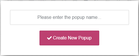
You can then start adding elements and configuring the form.

Popup Builder consists of several toolbars, (top toolbar, pages/steps toolbar, elements toolbar), “construction area”, “Layers” floating panel and “Element Properties” panel.
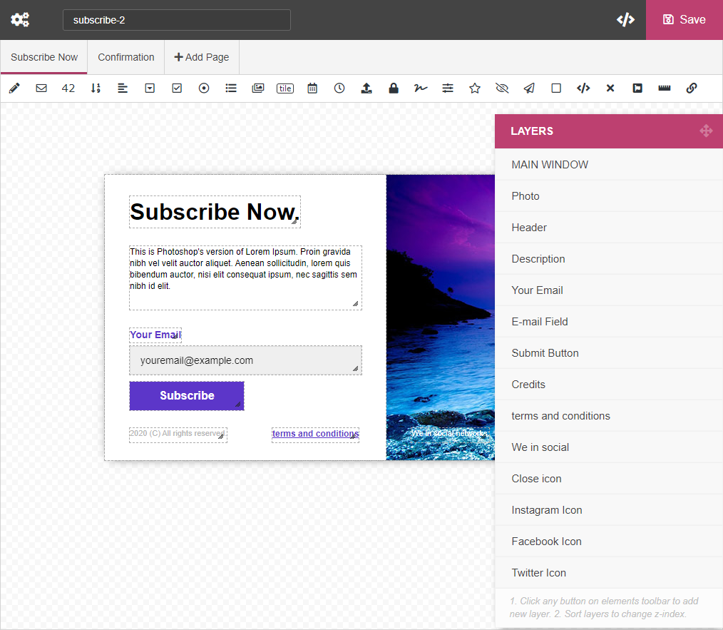
Top toolbar

Top toolbar contains the following elements (from left to right):

  • Popup Settings (). This button opens “Popup Settings” window. It has hundreds adjustable parameters related to general popup functionality, design, notifications, integrations, etc. All of them are described in this documentation. Just scroll down to appropriate section.
  • Slug. Unique ID of the popup. It is used to call popups.
  • How To Use (). This button opens “How To Use” window. There you can find all possible ways of using the popup.
  • Save ( Save). Click this button to save the changes.

Pages/steps Toolbar

This bar is used to build multi-pages (multi-steps) popups. By clicking button Add Page you can add as many pages/steps as you want.

There is one special page/step which always exists from the beginning – Confirmation. The content of this page/step is displayed when users successfully submit the popup. Importnat! This is not the only way to inform users about successful submission. For more options please visit the chapter below.

Popup Elements Toolbar

This toolbar contains popup element icons. If you want to add some element to the popup (for example, input field or button or something else), just click relevant icon and new element will be added. Then you can move new element into desired position, resize and configure it. Following elements can be added to the form:

  • – Text Input Field
  • – Email Input Field
  • – Numeric Input Field
  • – Numeric Spinner
  • – Textarea
  • – Select Box (Drop-down List)
  • – Checkbox
  • – Radio Button
  • – Multiselect List
  • – Image Select
  • – Tile
  • – Date Picker
  • – Time Picker
  • – File Upload
  • – Password
  • – Star Rating
  • – Signature Field
  • – Range Slider
  • – Hidden Field
  • – Submit Button
  • – Rectangle / Image
  • – HTML Content
  • – Close Icon
  • – Font Awesome Icon
  • – Progress Bar
  • – Link Button

The properties of each element are described in details in chapter “Popup Elements”.

Construction Area

This is an area of Popup Builder where you create the popup. If you want to add some element to the popup (for example, input field or button or something else), just click relevant icon on Popup Elements Toolbar and new element will be added. Use mouse to move element into desired position and resize it. Each element has context menu, just do right click over it.
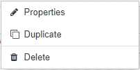
Context Menu contains the following items:

  • Properties. Click it to open “Element Properties” panel. Each form element has dozens properties that you can change. For more details regarding properties, please read Popup Elements chapter.
  • Duplicate. Create exact copy (including all properties) of the element.
  • Duplicate to. Create exact copy (including all properties) of the element and move it to different page/step. Available for multi-page popups.
  • Move to. Move element to different page/step. Available for multi-page popups.
  • Delete. Delete the element.

Layers Panel

This is a floating panel that contains full list of elements. You can move this panel and sort list of elements. The lower element in a list has the higher z-index. An element with higher z-index is always in front of an element with a lower z-index.

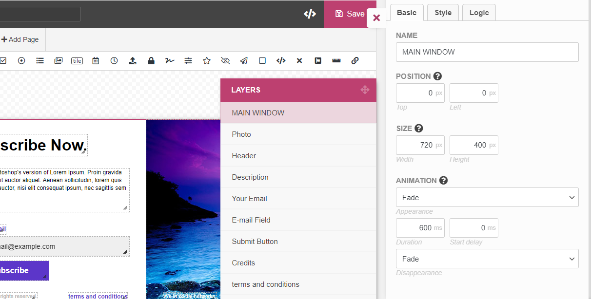
Element Properties panel

When you click any element in Layers Panel (or “Properties” in element’s context menu), the right side panel is opened (image below). It contains parameters of selected element.
Back To Top

Popups Library

All license owners have access to online Popups Library directly from admin dashboard (menu “Green Popups >> Popups Library”). They can import any popup into Popups list and use it. To have access to Popups Library you need set Item Purchase Code into relevant field on General Settings page (at the bottom). If you don’t know what is Item Purchase Code, please check this URL: https://help.market.envato.com/hc/en-us/articles/202822600.

Back To Top

Using Popups

Use the popup on any web pages. How to do it?

  1. Make sure that webpage has DOCTYPE. If not, add the following line as a first line of HTML-document.
  2. Make sure that website loads jQuery version 1.9 or higher. If not, add the following line into head section of HTML-document.
  3. Copy JS-snippet taken on Advanced Settings page in your admin panel and paste it into HTML-document. You need paste it at the end of body section (above closing </body> tag).
  4. Use any method described below.
OnClick (standard) Use the following URL with a link/button (href attribute):

OBJECT_SLUG is a popup slug taken from relevant column on Popups page or A/B campaign slug taken form relevant column on A/B Campaigns page.
OR

OBJECT1_SLUG is an object slug (popup or campaign) for desktops/laptops.
OBJECT2_SLUG is an object slug (popup or campaign) for mobiles.
OnClick (JavaScript) Add the following attribute to your HTML-element:

OBJECT_SLUG is a popup slug taken from relevant column on Popups page or A/B campaign slug taken form relevant column on A/B Campaigns page.
OR

OBJECT1_SLUG is an object slug (popup or campaign) for desktops/laptops.
OBJECT2_SLUG is an object slug (popup or campaign) for mobiles.
JavaScript Use the following javascript function to open the popup:

OBJECT_SLUG is a popup slug taken from relevant column on Popups page or A/B campaign slug taken form relevant column on A/B Campaigns page.
OR

OBJECT1_SLUG is an object slug (popup or campaign) for desktops/laptops.
OBJECT2_SLUG is an object slug (popup or campaign) for mobiles.
OnLoad (JavaScript) The alternate way to display the popup, when website loaded (OnLoad popup). Insert the following JavaScript-snippet into body section of the page (between tags and ).

<script>
lepopup_add_event("onload", {
	item:        "OBJECT1_SLUG",
	item_mobile: "OBJECT2_SLUG",
	mode:        "every-time",
	period:      24,
	delay:       0,
	close_delay: 0
});
</script>

As you can see function lepopup_add_event("onload", ..) accept an object with several parameters:
item, item_mobile – popup slug taken from relevant column on Popups page or A/B campaign slug taken form relevant column on A/B Campaigns page. At least one of these parameters must be defined. Object defined as popup_mobile will is displayed on mobiles only.
mode – how often OnLoad popup must be displayed. You can use one of the following values:

  • every-time – the popup is displayed every time until user submit the popup’s form.
  • once-period – the popup is displayed once per period hours until submit user the popup’s form.
  • once-only – the popup is displayed only once.
  • none – the popup is never displayed.

period – period (in hours) is used when mode is set as once-period. This parameter is ignored in all other cases.
delay – the popup can be displayed with certain delay when page loaded. This parameter defines the delay (in seconds).
close_delay – the popup can be automatically closed after certain delay. This parameter defines the delay (in seconds). Set 0 (zero) or omit parameter to disable this feature.

OnScroll (JavaScript) The alternate way to display the popup, when user scroll down the page (OnScroll popup). Insert the following JavaScript-snippet into body section of the page (between tags and ).

<script>
lepopup_add_event("onscroll", {
	item:        "OBJECT1_SLUG",
	item_mobile: "OBJECT2_SLUG",
	mode:        "every-time",
	period:      24,
	offset:      "600"
});
</script>

As you can see function lepopup_add_event("onscroll", ..) accept an object with several parameters:
item, item_mobile – popup slug taken from relevant column on Popups page or A/B campaign slug taken form relevant column on A/B Campaigns page. At least one of these parameters must be defined. Object defined as popup_mobile will is displayed on mobiles only.
mode – how often OnLoad popup must be displayed. You can use one of the following values:

  • every-time – the popup is displayed every time until user submit the popup’s form.
  • once-period – the popup is displayed once per period hours until submit user the popup’s form.
  • once-only – the popup is displayed only once.
  • none – the popup is never displayed.

period – period (in hours) is used when mode is set as once-period. This parameter is ignored in all other cases.
offset – the popup is displayed when user scroll down to this number of pixels. If you want this value to be in %, just add % symbol, like this: offset: "80%".

OnExit (JavaScript) The alternate way to display the popup, when user moves mouse cursor to top edge of browser window, assuming that he/she is going to leave the page (OnExit popup). Insert the following JavaScript-snippet into body section of the page (between tags and ).

<script>
lepopup_add_event("onexit", {
	item:        "OBJECT_SLUG",
	mode:        "every-time",
	period:      24
});
</script>

As you can see function lepopup_add_event("onexit", ..) accept an object with several parameters:
item – popup slug taken from relevant column on Popups page or A/B campaign slug taken form relevant column on A/B Campaigns page. At least one of these parameters must be defined. Object defined as popup_mobile will is displayed on mobiles only.
mode – how often OnLoad popup must be displayed. You can use one of the following values:

  • every-time – the popup is displayed every time until user submit the popup’s form.
  • once-period – the popup is displayed once per period hours until submit user the popup’s form.
  • once-only – the popup is displayed only once.
  • none – the popup is never displayed.

period – period (in hours) is used when mode is set as once-period. This parameter is ignored in all other cases.

OnInactivity (JavaScript) The alternate way to display the popup, when user does nothing on website for certain period of time (OnInactivity popup). Insert the following JavaScript-snippet into body section of the page (between tags and ).

<script>
lepopup_add_event("onidle", {
	item:        "OBJECT1_SLUG",
	item_mobile: "OBJECT2_SLUG",
	mode:        "every-time",
	period:      24,
	delay:       30
});
</script>

As you can see function lepopup_add_event("onidle", ..) accept an object with several parameters:
item, item_mobile – popup slug taken from relevant column on Popups page or A/B campaign slug taken form relevant column on A/B Campaigns page. At least one of these parameters must be defined. Object defined as popup_mobile will is displayed on mobiles only.
mode – how often OnLoad popup must be displayed. You can use one of the following values:

  • every-time – the popup is displayed every time until user submit the popup’s form.
  • once-period – the popup is displayed once per period hours until submit user the popup’s form.
  • once-only – the popup is displayed only once.
  • none – the popup is never displayed.

period – period (in hours) is used when mode is set as once-period. This parameter is ignored in all other cases.
delay – the popup is displayed after this period of user’s inactivity (in seconds).

OnAdBlockDetected (JavaScript) The alternate way to display the popup, when AdBlock or similar software detected (OnAdBlockDetected popup). Insert the following JavaScript-snippet into body section of the page (between tags and ).

<script>
lepopup_add_event("onadb", {
	item:        "OBJECT1_SLUG",
	item_mobile: "OBJECT2_SLUG",
	mode:        "every-time",
	period:      24
});
</script>

As you can see function lepopup_add_event("onadb", ..) accept an object with several parameters:
item, item_mobile – popup slug taken from relevant column on Popups page or A/B campaign slug taken form relevant column on A/B Campaigns page. At least one of these parameters must be defined. Object defined as popup_mobile will is displayed on mobiles only.
mode – how often OnLoad popup must be displayed. You can use one of the following values:

  • every-time – the popup is displayed every time until user submit the popup’s form.
  • once-period – the popup is displayed once per period hours until submit user the popup’s form.
  • once-only – the popup is displayed only once.
  • none – the popup is never displayed.

period – period (in hours) is used when mode is set as once-period. This parameter is ignored in all other cases.

Inline (HTML) Use the following HTML-snippet to embed the popup as inline object.

POPUP_SLUG is a popup slug taken from relevant column on Popups page.
OR

POPUP1_SLUG is a popup slug for desktops/laptops.
POPUP2_SLUG is a popup slug for mobiles.
Link locker (manual)

You can lock access to certain links on your website. It means that when user clicks locked link, the popup appears. User must submit the popup form. After that link becomes available. You may have many different links locked by the same popup. Once the popup submitted all these links become available. Paste your popup slug and original URL below to generate Locking URL.


Locking URL.

OnClick (standard)

Use the following URL with a link/button (href attribute):

OR

OBJECT1_SLUG is an object slug (popup or campaign) for desktops/laptops.
OBJECT2_SLUG is an object slug (popup or campaign) for mobiles.
OnClick (JavaScript)

Add the following attribute to your HTML-element:

OBJECT_SLUG is a popup slug taken from relevant column on Popups page or A/B campaign slug taken form relevant column on A/B Campaigns page.
OR

OBJECT1_SLUG is an object slug (popup or campaign) for desktops/laptops.
OBJECT2_SLUG is an object slug (popup or campaign) for mobiles.
JavaScript

Use the following javascript function to open the popup:

OBJECT_SLUG is a popup slug taken from relevant column on Popups page or A/B campaign slug taken form relevant column on A/B Campaigns page.
OR

OBJECT1_SLUG is an object slug (popup or campaign) for desktops/laptops.
OBJECT2_SLUG is an object slug (popup or campaign) for mobiles.
OnLoad (standard)

To display certain popup, when website loaded (OnLoad popup), create OnLoad target (Green Popups >> Targeting) and make it active (drag and drop from Passive area to Active area). While creating target, you can configure how and where the popup must be displayed.
OnLoad (JavaScript)

The alternate way to display the popup, when website loaded (OnLoad popup). Insert the following JavaScript-snippet into body section of the page (between tags and ).

<script>
lepopup_add_event("onload", {
	item:        "OBJECT1_SLUG",
	item_mobile: "OBJECT2_SLUG",
	mode:        "every-time",
	period:      24,
	delay:       0,
	close_delay: 0
});
</script>

As you can see function lepopup_add_event("onload", ..) accept an object with several parameters:
item, item_mobile – popup slug taken from relevant column on Popups page or A/B campaign slug taken form relevant column on A/B Campaigns page. At least one of these parameters must be defined. Object defined as popup_mobile will is displayed on mobiles only.
mode – how often OnLoad popup must be displayed. You can use one of the following values:

  • every-time – the popup is displayed every time until user submit the popup’s form.
  • once-period – the popup is displayed once per period hours until submit user the popup’s form.
  • once-only – the popup is displayed only once.
  • none – the popup is never displayed.

period – period (in hours) is used when mode is set as once-period. This parameter is ignored in all other cases.
delay – the popup can be displayed with certain delay when page loaded. This parameter defines the delay (in seconds).
close_delay – the popup can be automatically closed after certain delay. This parameter defines the delay (in seconds). Set 0 (zero) or omit parameter to disable this feature.

OnScroll (standard)

To display certain popup, when user scroll down the page (OnScroll popup), create OnScroll target and make it active (drag and drop from Passive area to Active area). While creating target, you can configure how and where the popup must be displayed.
OnScroll (JavaScript)

The alternate way to display the popup, when user scroll down the page (OnScroll popup). Insert the following JavaScript-snippet into body section of the page (between tags and ).

<script>
lepopup_add_event("onscroll", {
	item:        "OBJECT1_SLUG",
	item_mobile: "OBJECT2_SLUG",
	mode:        "every-time",
	period:      24,
	offset:      "600"
});
</script>

As you can see function lepopup_add_event("onscroll", ..) accept an object with several parameters:
item, item_mobile – popup slug taken from relevant column on Popups page or A/B campaign slug taken form relevant column on A/B Campaigns page. At least one of these parameters must be defined. Object defined as popup_mobile will is displayed on mobiles only.
mode – how often OnLoad popup must be displayed. You can use one of the following values:

  • every-time – the popup is displayed every time until user submit the popup’s form.
  • once-period – the popup is displayed once per period hours until submit user the popup’s form.
  • once-only – the popup is displayed only once.
  • none – the popup is never displayed.

period – period (in hours) is used when mode is set as once-period. This parameter is ignored in all other cases.
offset – the popup is displayed when user scroll down to this number of pixels. If you want this value to be in %, just add % symbol, like this: offset: "80%".

OnExit (standard)

To display certain popup, when user moves mouse cursor to top edge of browser window, assuming that he/she is going to leave the page (OnExit popup), create OnExit target and make it active (drag and drop from Passive area to Active area). While creating target, you can configure how and where the popup must be displayed.
OnExit (JavaScript)

The alternate way to display the popup, when user moves mouse cursor to top edge of browser window, assuming that he/she is going to leave the page (OnExit popup). Insert the following JavaScript-snippet into body section of the page (between tags and ).

<script>
lepopup_add_event("onexit", {
	item:        "OBJECT_SLUG",
	mode:        "every-time",
	period:      24
});
</script>

As you can see function lepopup_add_event("onexit", ..) accept an object with several parameters:
item – popup slug taken from relevant column on Popups page or A/B campaign slug taken form relevant column on A/B Campaigns page. At least one of these parameters must be defined. Object defined as popup_mobile will is displayed on mobiles only.
mode – how often OnLoad popup must be displayed. You can use one of the following values:

  • every-time – the popup is displayed every time until user submit the popup’s form.
  • once-period – the popup is displayed once per period hours until submit user the popup’s form.
  • once-only – the popup is displayed only once.
  • none – the popup is never displayed.

period – period (in hours) is used when mode is set as once-period. This parameter is ignored in all other cases.

OnInactivity (standard)

To display certain popup, when user does nothing on website for certain period of time (OnInactivity popup), create OnInactivity target and make it active (drag and drop from Passive area to Active area). While creating target, you can configure how and where the popup must be displayed.
OnInactivity (JavaScript)

The alternate way to display the popup, when user does nothing on website for certain period of time (OnInactivity popup). Insert the following JavaScript-snippet into body section of the page (between tags and ).

<script>
lepopup_add_event("onidle", {
	item:        "OBJECT1_SLUG",
	item_mobile: "OBJECT2_SLUG",
	mode:        "every-time",
	period:      24,
	delay:       30
});
</script>

As you can see function lepopup_add_event("onidle", ..) accept an object with several parameters:
item, item_mobile – popup slug taken from relevant column on Popups page or A/B campaign slug taken form relevant column on A/B Campaigns page. At least one of these parameters must be defined. Object defined as popup_mobile will is displayed on mobiles only.
mode – how often OnLoad popup must be displayed. You can use one of the following values:

  • every-time – the popup is displayed every time until user submit the popup’s form.
  • once-period – the popup is displayed once per period hours until submit user the popup’s form.
  • once-only – the popup is displayed only once.
  • none – the popup is never displayed.

period – period (in hours) is used when mode is set as once-period. This parameter is ignored in all other cases.
delay – the popup is displayed after this period of user’s inactivity (in seconds).

OnAdBlockDetected (standard)

To display certain popup, when AdBlock or similar software detected (OnAdBlockDetected popup), create OnAdBlockDetected target and make it active (drag and drop from Passive area to Active area). While creating target, you can configure how and where the popup must be displayed.
OnAdBlockDetected (JavaScript)

The alternate way to display the popup, when AdBlock or similar software detected (OnAdBlockDetected popup). Insert the following JavaScript-snippet into body section of the page (between tags and ).

<script>
lepopup_add_event("onadb", {
	item:        "OBJECT1_SLUG",
	item_mobile: "OBJECT2_SLUG",
	mode:        "every-time",
	period:      24
});
</script>

As you can see function lepopup_add_event("onadb", ..) accept an object with several parameters:
item, item_mobile – popup slug taken from relevant column on Popups page or A/B campaign slug taken form relevant column on A/B Campaigns page. At least one of these parameters must be defined. Object defined as popup_mobile will is displayed on mobiles only.
mode – how often OnLoad popup must be displayed. You can use one of the following values:

  • every-time – the popup is displayed every time until user submit the popup’s form.
  • once-period – the popup is displayed once per period hours until submit user the popup’s form.
  • once-only – the popup is displayed only once.
  • none – the popup is never displayed.

period – period (in hours) is used when mode is set as once-period. This parameter is ignored in all other cases.

Inline (Gutenberg block)

In case of using Gutenberg content editor you can add the popup as a standard Gutenberg Block. Find “Green Popups” under Widgets category.
Inline (shortcode)

Use the following shortcode to embed the popup as inline object.

POPUP_SLUG is a popup slug taken from relevant column on Popups page.
OR

POPUP1_SLUG is a popup slug for desktops/laptops.
POPUP2_SLUG is a popup slug for mobiles.
Inline (PHP)

Use the following PHP-code to embed the popup into theme files:

POPUP_SLUG is a popup slug taken from relevant column on Popups page.
OR

POPUP1_SLUG is a popup slug for desktops/laptops.
POPUP2_SLUG is a popup slug for mobiles.
Inline (HTML)

Use the following HTML-snippet to embed the popup as inline object. For local use this method works when “Async Init” mode activated on Advanced Settings page.

POPUP_SLUG is a popup slug taken from relevant column on Popups page.
OR

POPUP1_SLUG is a popup slug for desktops/laptops.
POPUP2_SLUG is a popup slug for mobiles.
ContentStart (inline)

Automatically insert the popup as an inline object at the beginning of posts/pages/products/etc. (ContentStart object), create ContentStart (inline) target and make it active (drag and drop from Passive area to Active area). While creating target, you can configure how and where the popup must be displayed.
ContentEnd (inline)

Automatically insert the popup as an inline object at the end of posts/pages/products/etc. (ContentEnd object), %screate ContentEnd (inline) target%s and make it active (drag and drop from Passive area to Active area). While creating target, you can configure how and where the popup must be displayed.
Widget

Go to Appearance >> Widgets and drag the Green Popups widget into the desired sidebar. You will be able to select this form from the dropdown options while configuring widget.
Link locker (shortcode)

You can lock access to certain links on your website. It means that when user clicks locked link, the popup appears. User must submit the popup form. After that link becomes available. You may have many different links locked by the same popup. Once the popup submitted all these links become available. Wrap your links (link is an <a>-tag, not URL) with shortcodes.

[lepopuplinklocker slug='POPUP_SLUG']
...
[/lepopuplinklocker]

POPUP_SLUG is a popup slug taken from relevant column on Popups page.
OR

[lepopuplinklocker slug='POPUP1_SLUG*POPUP2_SLUG']
...
[/lepopuplinklocker]

POPUP1_SLUG is a popup slug for desktops/laptops.
POPUP2_SLUG is a popup slug for mobiles.

Link locker (manual)

The alternate way to lock links is to construct locking URL manually. Use this method if your link is located in area which does not support shortcodes.


Locking URL.

Remote use Use the popup with any non-WordPress pages of the site or with 3rd party sites. How to do it?

  1. Make sure that non-WordPress page has DOCTYPE. If not, add the following line as a first line of HTML-document.
  2. Make sure that website loads jQuery version 1.9 or higher. If not, add the following line into head section of HTML-document.
  3. Copy JS-snippet taken on Advanced Settings page in your admin panel and paste it into HTML-document. You need paste it at the end of body section (above closing </body> tag).
  4. Use any method marked by blue dot (see above).

Back To Top

Popup Settings

Popup Settings

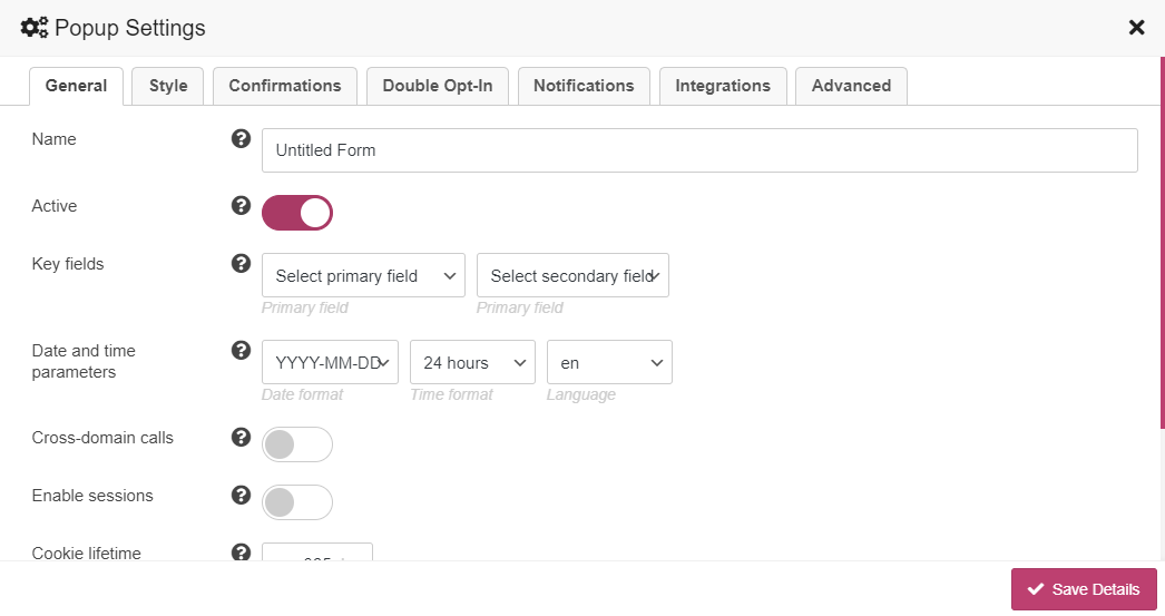
The Popup Settings window appears when you click button on Top Toolbar. It has hundreds adjustable parameters related to general form functionality, design, notifications, integrations, etc. All of them are described in this documentation. Popup Settings Window looks like below:
Back To Top

General Settings

Click button on Top Toolbar and select “General” tab. It contains the following general form settings:

  • Name. The name is used for your convenience. It helps to identify the popup on the site.
  • Active. Inactive popups will not appear on the site. It allows to disable the popup globally.
  • Key fields. This is 2 main fields of the popup. Values of these fields are displayed on Log page in relevant columns. It helps to identify submitted record without opening its full details.
  • Date and time parameters. Choose the date/ time formats and language for datetimepicker. It is used for “date” and “time” fields.
  • Cross-domain calls. Enable this option if you want to use cross-domain embedding, i.e. plugin installed on domain1, and popup is used on domain2. Due to security reasons this feature is automatically disabled if the popup has Signature field.
  • Sessions. Activate this option if you want to enable sessions for the popup. Session allows to keep non-completed popup data, so user can continue form filling when come back. You also can set session length. Important! (1) Session doesn’t keep value of “Signature” field and “File Upload” field. (2) Session data is saved as cookies.
  • Cookie lifetime. When popup submission is successful, the cookie is set to avoid further appearance. This is cookie lifetime in days.
  • Close when clicking ESC. Activate this option if you want to close the popup by pressing ESC-button.
  • Submit when clicking ENTER. Activate this option if you want to submit the form by pressing ENTER/RETURN-button.

Back To Top

Style Settings

Click button on Top Toolbar and select Style tab. It contains a lot of style settings grouped by categories.

Global Style Settings

This category contains global parameters of the popup:

  • Position. Select popup position on browser window.
  • Enable overlay. Activate this option if you want to enable overlay.
  • Overlay animation. Adjust the overlay animation effect.
  • Overlay color. Adjust the overlay color.
  • Active overlay. If enabled, the popup will be closed when user click overlay.
  • Spinner colors. Adjust colors of the spinner.
  • Text style. Adjust the style (font, color, size, etc.) of the text that appears in your popup.

Input Field Style Settings

This category contains parameters to adjust the style of input fields.

  • Icon style. Adjust the style (size, color, position) of input field icons.
  • Input text. Adjust the text style (font, color, size, etc.) of input fields. You can do it for different input states (normal, hover, focus). These parameters override “Text style” parameters from “Global Style Settings” category.
  • Input background. Adjust the background style of input fields. You can do it for different input states (normal, hover, focus).
  • Input border. Adjust the border style of input fields. You can do it for different input states (normal, hover, focus).
  • Input shadow. Adjust the shadow style of input fields. You can do it for different input states (normal, hover, focus).
  • Checkbox and radio style. Choose how to display checkbox and radio button fields and their captions.
  • Checkbox view. Choose the checkbox view.
  • Radio button view. Choose the radio button view.
  • Image Select style. Adjust image alignment and effect.
  • Image label. Adjust the text style (font, color, size, etc.) of image label. These parameters override “Text style” parameters from “Global Style Settings” category.
  • Image border. Adjust the border style of images. You can do it for different states (normal, hover, selected).
  • Image shadow. Adjust the shadow style of images. You can do it for different states (normal, hover, selected).
  • Multiselect style. Choose how to display multiselect options.
  • Tile style. Adjust the tile style.
  • Tile text. Adjust the text style (font, color, size, etc.) of tiles. You can do it for different input states (normal, hover, selected). These parameters override “Text style” parameters from “Global Style Settings” category.
  • Tile background. Adjust the background style of tiles. You can do it for different input states (normal, hover, selected).
  • Tile border. Adjust the border style of tiles. You can do it for different input states (normal, hover, selected).
  • Tile shadow. Adjust the shadow style of tiles. You can do it for different input states (normal, hover, selected).
  • Range slider skin. Select the skin of range slider. This parameter is available if your enabled Ion.RangeSlider plugin on General Settings page.
  • Range slider colors. Adjust colors of range slider. This parameter is available if your enabled Ion.RangeSlider plugin on General Settings page.

Button Style Settings

This category contains parameters to adjust the style of buttons.

  • Button style. Adjust the button size and position.
  • Button text. Adjust the text style (font, color, size, etc.) of buttons. You can do it for different button states (normal, hover, active). These parameters override “Text style” parameters from “Global Style Settings” category.
  • Button background. Adjust the background style of buttons. You can do it for different button states (normal, hover, active).
  • Button border. Adjust the border style of buttons. You can do it for different button states (normal, hover, active).
  • Button shadow. Adjust the shadow style of buttons. You can do it for different button states (normal, hover, active).

Error Bubble Style Settings

If user submit wrong data through certain input field, the error bubble is displayed for this field. In this category you can configure the view of the bubble.

  • Bubble background. Adjust the background of error bubbles.
  • Error text style. Adjust the text style (font, color, size, etc.) of errors. These parameters override “Text style” parameters from “Global Style Settings” category.

Progress Bar Settings

In case of using multi-page (multi-step) forms, you can enable progress bar. In this category you can configure the view of the progress bar.

  • Progress style. Select the general view of progress bar.
  • Colors. Adjust colors of progress bar.
  • Double-tone stripes. Add double-tone diagonal stripes to progress bar.
  • Show page name. Show page name.
  • Include confirmation page. Consider Confirmation page as part of total pages and include it into progress bar.

Back To Top

Confirmation Settings

Confirmation is an action that is executed on front-side when popup successfully submitted. By default it’s just closed.

If you need more specific action, click button on Top Toolbar and select “Confirmations” tab. There you can customize confirmation and use conditional logic. There are several action to select:

  • Close. Close popup.
  • Display Confirmation page. Each popup has Confirmation page where you can include some kind of “Thank you” message. If you choose this option, this special page will be displayed.
  • Display Confirmation page and redirect to certain URL. The same as above, but after specified number of seconds user will be redirected to specific URL.
  • Display Confirmation page and request payment. The same as above, but after specified number of seconds user will be requested to complete payment.
  • Redirect to certain URL. User is redirected to specific URL immediately.
  • Request payment. User is requested to complete payment immediately.
  • Display popup. Open other popup.

You can apply conditional logic to each action. This means that this action will be performed only if the data submitted by the user meets certain criteria.

Important! If several confirmations match form conditions, the first one (higher priority) will be applied. So, you can use mouse to re-order multiple confirmations.

Back To Top

Double Opt-In Settings

If you want users to confirm submitted data click button on Top Toolbar and select Double Opt-In tab and enable this feature. If enabled, the plugin sends email message with confirmation link to certain email address (submitted by user). When confirmation link clicked, relevant record is marked as “confirmed”.

Double Opt-In tab has the following parameters to configure:

  • Enable. Enable or disable double opt-in.
  • Recipient. The email address to which confirmation link will be sent to.
  • Subject. The subject of the email message.
  • Message. The content of the email message. It is mandatory to include {{confirmation-url}} into content.
  • From. The “From” address and name. The email address and name set here will be shown as the sender of the email.
  • Thanksgiving message. This message is displayed when users successfully confirmed their e-mail addresses.
  • Thanksgiving URL. This is alternate way of thanksgiving message. After confirmation users are redirected to this URL.

Important! This feature is disabled if the form requests users to complete the payment.

Back To Top

Notification Settings

The notification, welcome, thanksgiving or whatever email can be sent to user, administrator or any other email address. To enable this feature just click button on Top Toolbar, select Notifications tab and create as many notification as you need. You can customize these emails and use conditional logic.

Each notification has the following parameters to configure:

  • Name. The name of the notification. It is used for your convenience.
  • Enabled. You can stop this notification being sent by turning this off.
  • Send. Specify when notification must be sent: after successful form submission, when user confirmed submitted data using double opt-in feature, after successfully completed payment or after non-completed payment.
  • Recipient. Add email addresses (comma-separated) to which this email will be sent to.
  • Subject. The subject of the email message.
  • Message. The content of the email message.
  • Attachments. Select files that you want to attach to the email message.
  • Reply-To. Add a “Reply-To” email address. If not set, replying to the email will reply to the “From” address.
  • From. Sets the “From” address and name. The email address and name set here will be shown as the sender of the email.
  • Conditional logic. If enabled, you can create rules to enable this notification depending on the values of input fields.

You can apply conditional logic to each notification. This means that email message will be sent only if the data submitted by the user meets certain criteria.

Back To Top

Integration Settings

Popup data submitted by user can be sent to 3rd party services (such as MailChimp, AWeber, GetResponse, etc.). To enable this feature just click button on Top Toolbar, select Integrations tab and create as many integrations as you need. You can customize integrations and use conditional logic.

Important! If you do not see your marketing/CRM provider, make sure that you enabled appropriate integration module on Advanced Settings page.

Plugin has integration modules with following marketing/CRM providers:

  • Acelle Mail
  • ActiveCampaign
  • ActiveTrail
  • AgileCRM
  • Automizy
  • AvangEmail
  • AWeber
  • Beehiiv
  • BirdSend
  • Bitrix24
  • Campaign Monitor
  • CleverReach
  • Constant Contact
  • Conversio
  • ConvertKit
  • Drip
  • E-goi
  • EmailOctopus
  • Encharge
  • FluentCRM (available for WordPress plugin only)
  • FreshMail
  • GetResponse
  • Gist
  • Groundhogg (available for WordPress plugin only)
  • HubSpot
  • INBOX
  • Infomaniak Newsletter
  • Intercom
  • Interspire
  • Jetpack Subscriptions (available for WordPress plugin only)
  • Klaviyo
  • Mad Mimi
  • Mailautic
  • MailChimp
  • MailerLite
  • MailFit
  • Mailgun
  • Mailjet
  • MailPoet (available for WordPress plugin only)
  • Mailrelay
  • Mailster (available for WordPress plugin only)
  • MailWizz
  • Mautic
  • MojSMS (Contact)
  • Moosend
  • Mumara
  • Newsman
  • Omnisend
  • Ontraport
  • Pabbly Email Marketing
  • Pipedrive
  • Rapidmail
  • Salesflare
  • SalesAutoPilot
  • SendFox
  • SendGrid
  • SendinBlue
  • SendPulse
  • Sendy
  • SG Autorepondeur
  • SocketLabs (Email Marketing Center)
  • The Newsletter Plugin (available for WordPress plugin only)
  • Tribulant Newsletters (available for WordPress plugin only)
  • VerticalResponse
  • Your Mailing List Provider
  • Zapier
  • Zoho CRM

If you don’t see your provider in a list, just drop request and we will add it. 😉

Also plugin has integration modules that allows to:

  • Submit popup data as a part of 3rd party HTML form.
  • Send popup data as a custom GET/POST-requests.
  • Insert popup data into 3rd party MySQL database/table.
  • Create new WordPress User (available for WordPress plugin only).
  • Login existing WordPress User (available for WordPress plugin only).

Acelle Mail

To enable integration with Acelle Mail, make sure that you activated appropriate integration module. Go to Advanced Settings page and turn on Activate Acelle Mail Integration module. Then go to popup editor, click button on Top Toolbar, select Integrations tab and click Acelle Mail button. New Acelle Mail integration will be added. Click to configure integration.

It has the following parameters:

  • Name. The name of the integration. It is used for your convenience.
  • Enabled. You can disable this integration by turning this off.
  • Execute. You can specify when integration must be executed: after successful popup submission, when user confirmed submitted data using double opt-in feature, after successfully completed payment or after non-completed payment.
  • API Endpoint. Enter your Acelle Mail API Endpoint. You can get it on API page in your Acelle Mail account.
  • API Token. Enter your Acelle Mail API Token. You can get it on API page in your Acelle Mail account.
  • List ID. Select list ID where data submitted to.
  • Fields. Map popup fields to Acelle Mail fields.
  • Conditional logic. If enabled, you can create rules to enable this integration depending on the values of input fields.

ActiveCampaign

To enable integration with ActiveCampaign, make sure that you activated appropriate integration module. Go to Advanced Settings page and turn on Activate ActiveCampaign Integration module. Then go to popup editor, click button on Top Toolbar, select Integrations tab and click ActiveCampaign button. New ActiveCampaign integration will be added. Click to configure integration.

It has the following parameters:

  • Name. The name of the integration. It is used for your convenience.
  • Enabled. You can disable this integration by turning this off.
  • Execute. You can specify when integration must be executed: after successful popup submission, when user confirmed submitted data using double opt-in feature, after successfully completed payment or after non-completed payment.
  • API URL. Enter your ActiveCampaign API URL. To get API URL please go to your ActiveCampaign Account >> Settings >> Developer.
  • API Key. Enter your ActiveCampaign API Key. To get API Key please go to your ActiveCampaign Account >> Settings >> Developer.
  • List ID. Select list ID where data submitted to.
  • Fields. Map popup fields to ActiveCampaign fields.
  • Tags. Enter comma-separated list of tags.
  • Conditional logic. If enabled, you can create rules to enable this integration depending on the values of input fields.

ActiveTrail

To enable integration with ActiveTrail, make sure that you activated appropriate integration module. Go to Advanced Settings page and turn on Activate ActiveTrail Integration module. Then go to popup editor, click button on Top Toolbar, select Integrations tab and click ActiveTrail button. New ActiveTrail integration will be added. Click to configure integration.

It has the following parameters:

  • Name. The name of the integration. It is used for your convenience.
  • Enabled. You can disable this integration by turning this off.
  • Execute. You can specify when integration must be executed: after successful popup submission, when user confirmed submitted data using double opt-in feature, after successfully completed payment or after non-completed payment.
  • Access Token. Enter your ActiveTrail Access Token. Create it on Settings page in ActiveTrail account.
  • Fields. Map popup fields to ActiveTrail fields.
  • Groups. Select groups.
  • Conditional logic. If enabled, you can create rules to enable this integration depending on the values of input fields.

AgileCRM

To enable integration with AgileCRM, make sure that you activated appropriate integration module. Go to Advanced Settings page and turn on Activate AgileCRM Integration module. Then go to popup editor, click button on Top Toolbar, select Integrations tab and click AgileCRM button. New AgileCRM integration will be added. Click to configure integration.

It has the following parameters:

  • Name. The name of the integration. It is used for your convenience.
  • Enabled. You can disable this integration by turning this off.
  • Execute. You can specify when integration must be executed: after successful popup submission, when user confirmed submitted data using double opt-in feature, after successfully completed payment or after non-completed payment.
  • Site URL. Enter unique website address of your account. Usually it looks like https://SITE-NAME.agilecrm.com.
  • Email. Enter email address of your AgileCRM account (i.e. email address that you used to create AgileCRM account).
  • API Key. Enter your AgileCRM REST API Key. Find it in your AgileCRM account, click “Admin Settings” and “Developers & API”.
  • Campaign ID. Select Campaign ID where data submitted to.
  • System Properties. Map popup fields to AgileCRM system properties.
  • Custom Properties. Configure AgileCRM custom properties and map popup fields to them.
  • Tags. If you want to tag contact with tags, drop them here (comma-separated string).
  • Conditional logic. If enabled, you can create rules to enable this integration depending on the values of input fields.

Automizy

To enable integration with Automizy, make sure that you activated appropriate integration module. Go to Advanced Settings page and turn on Activate Automizy Integration module. Then go to popup editor, click button on Top Toolbar, select Integrations tab and click Automizy button. New Automizy integration will be added. Click to configure integration.

It has the following parameters:

  • Name. The name of the integration. It is used for your convenience.
  • Enabled. You can disable this integration by turning this off.
  • Execute. You can specify when integration must be executed: after successful popup submission, when user confirmed submitted data using double opt-in feature, after successfully completed payment or after non-completed payment.
  • API Token. Enter your Automizy API Token. Find it here.
  • List ID. Select list ID where data submitted to.
  • Fields. Map popup fields to Automizy fields.
  • Tags. Comma-separated list of tags.
  • Conditional logic. If enabled, you can create rules to enable this integration depending on the values of input fields.

AvangEmail

To enable integration with AvangEmail, make sure that you activated appropriate integration module. Go to Advanced Settings page and turn on Activate AvangEmail Integration module. Then go to popup editor, click button on Top Toolbar, select Integrations tab and click AvangEmail button. New AvangEmail integration will be added. Click to configure integration.

It has the following parameters:

  • Name. The name of the integration. It is used for your convenience.
  • Enabled. You can disable this integration by turning this off.
  • Execute. You can specify when integration must be executed: after successful popup submission, when user confirmed submitted data using double opt-in feature, after successfully completed payment or after non-completed payment.
  • Public Key. Enter your AvangEmail API Public Key. Find it here.
  • Private Key. Enter your AvangEmail API Private Key. Find it here.
  • List ID. Select list ID where data submitted to.
  • Fields. Map popup fields to AvangEmail fields.
  • Conditional logic. If enabled, you can create rules to enable this integration depending on the values of input fields.

AWeber

To enable integration with AWeber, make sure that you activated appropriate integration module. Go to Advanced Settings page and turn on Activate AWeber Integration module. Then go to General Settings page, find AWeber Connection section and connect plugin to your AWeber account. After successful connection go to popup editor, click button on Top Toolbar, select Integrations tab and click AWeber button. New AWeber integration will be added. Click to configure integration.

It has the following parameters:

  • Name. The name of the integration. It is used for your convenience.
  • Enabled. You can disable this integration by turning this off.
  • Execute. You can specify when integration must be executed: after successful popup submission, when user confirmed submitted data using double opt-in feature, after successfully completed payment or after non-completed payment.
  • List ID. Select list ID where data submitted to.
  • Fields. Map popup fields to AWeber fields.
  • Tags. Enter comma-separated list of tags applied to the contact.
  • Notes. Enter notes applied to the contact (max 60 sybmols).
  • Ad Tracking. Enter your Ad Tracking info applied to the contact.
  • Conditional logic. If enabled, you can create rules to enable this integration depending on the values of input fields.

Beehiiv

To enable integration with Beehiiv, make sure that you activated appropriate integration module. Go to Advanced Settings page and turn on Activate Beehiiv Integration module. Then go to popup editor, click button on Top Toolbar, select Integrations tab and click Beehiiv button. New Beehiiv integration will be added. Click to configure integration.

It has the following parameters:

  • Name. The name of the integration. It is used for your convenience.
  • Enabled. You can disable this integration by turning this off.
  • Execute. You can specify when integration must be executed: after successful popup submission, when user confirmed submitted data using double opt-in feature, after successfully completed payment or after non-completed payment.
  • API Key V2. Enter your Beehiiv API Key. Find it here.
  • Publication ID. Select Publication ID where data submitted to.
  • Fields. Map popup fields to AvangEmail fields.
  • Conditional logic. If enabled, you can create rules to enable this integration depending on the values of input fields.

BirdSend

To enable integration with BirdSend, make sure that you activated appropriate integration module. Go to Advanced Settings page and turn on Activate BirdSend Integration module. Then go to popup editor, click button on Top Toolbar, select Integrations tab and click BirdSend button. New BirdSend integration will be added. Click to configure integration.

Important! Please go to your BirdSend Account >> Settings >> Integrations >> BirdSend Apps and create new App. After that go to Permissions tab of App settings and set them as “Write”. Then go to Access Token tab of App settings and create Personal Access Token. Copy and Paste it into relevant field below.

It has the following parameters:

  • Name. The name of the integration. It is used for your convenience.
  • Enabled. You can disable this integration by turning this off.
  • Execute. You can specify when integration must be executed: after successful popup submission, when user confirmed submitted data using double opt-in feature, after successfully completed payment or after non-completed payment.
  • Personal Access Token. Paste your Personal Access Token with “write” permissions.
  • Sequence ID. Select sequence ID where data submitted to.
  • Fields. Map popup fields to BirdSend fields.
  • Tags. Comma-separated list of tags.
  • Conditional logic. If enabled, you can create rules to enable this integration depending on the values of input fields.

Bitrix24

To enable integration with Bitrix24, make sure that you activated appropriate integration module. Go to Advanced Settings page and turn on Activate Bitrix24 Integration module. Then go to popup editor, click button on Top Toolbar, select Integrations tab and click Bitrix24 button. New Bitrix24 integration will be added. Click to configure integration.

Important! Please go to your Bitrix24 Account >> Applications >> Webhooks and create Inbound webhook with CRM access permissions. Copy and Paste it into relevant field below.

It has the following parameters:

  • Name. The name of the integration. It is used for your convenience.
  • Enabled. You can disable this integration by turning this off.
  • Execute. You can specify when integration must be executed: after successful popup submission, when user confirmed submitted data using double opt-in feature, after successfully completed payment or after non-completed payment.
  • REST call example URL. Paste REST call example URL created earlier in your Bitrix24 account.
  • Fields. Map popup fields to Bitrix24 fields.
  • Conditional logic. If enabled, you can create rules to enable this integration depending on the values of input fields.

Campaign Monitor

To enable integration with Campaign Monitor, make sure that you activated appropriate integration module. Go to Advanced Settings page and turn on Activate Campaign Monitor Integration module. Then go to popup editor, click button on Top Toolbar, select Integrations tab and click Campaign Monitor button. New Campaign Monitor integration will be added. Click to configure integration.

It has the following parameters:

  • Name. The name of the integration. It is used for your convenience.
  • Enabled. You can disable this integration by turning this off.
  • Execute. You can specify when integration must be executed: after successful popup submission, when user confirmed submitted data using double opt-in feature, after successfully completed payment or after non-completed payment.
  • API Key. Enter your Campaign Monitor API Key. Find Campaign Monitor API Key on Account Settings page when logged into your Campaign Monitor account.
  • Client ID. Select Client ID.
  • List ID. Select list ID where data submitted to.
  • Fields. Map popup fields to Campaign Monitor fields.
  • Conditional logic. If enabled, you can create rules to enable this integration depending on the values of input fields.

CleverReach

To enable integration with CleverReach, make sure that you activated appropriate integration module. Go to Advanced Settings page and turn on Activate CleverReach Integration module. Then go to popup editor, click button on Top Toolbar, select Integrations tab and click CleverReach button. New CleverReach integration will be added. Click to configure integration.

It has the following parameters:

  • Name. The name of the integration. It is used for your convenience.
  • Enabled. You can disable this integration by turning this off.
  • Execute. You can specify when integration must be executed: after successful popup submission, when user confirmed submitted data using double opt-in feature, after successfully completed payment or after non-completed payment.
  • Client ID. Enter Client ID of your OAuth App. Please go to CleverReach account >> My Account >> Extras >> REST API and click “Create OAuth”. After that click created app and find Client ID there.
  • Client Secret. Enter Client Secret of your OAuth App. Find it the same way as Client ID.
  • List ID. Select list ID where data submitted to.
  • Fields. Map popup fields to CleverReach fields.
  • Tags. Comma-separated list of tags.
  • Conditional logic. If enabled, you can create rules to enable this integration depending on the values of input fields.

Constant Contact

To enable integration with Constant Contact, make sure that you activated appropriate integration module. Go to Advanced Settings page and turn on Activate Constant Contact Integration module. Then go to popup editor, click button on Top Toolbar, select Integrations tab and click Constant Contact button. New Constant Contact integration will be added. Click to configure integration.

It has the following parameters:

  • Name. The name of the integration. It is used for your convenience.
  • Enabled. You can disable this integration by turning this off.
  • Execute. You can specify when integration must be executed: after successful popup submission, when user confirmed submitted data using double opt-in feature, after successfully completed payment or after non-completed payment.
  • API Key. Enter API Key.
  • Access Token. Enter your Access Token.
  • List ID. Select list ID where data submitted to.
  • Fields. Map popup fields to Constant Contact fields.
  • Conditional logic. If enabled, you can create rules to enable this integration depending on the values of input fields.

Conversio

To enable integration with Conversio, make sure that you activated appropriate integration module. Go to Advanced Settings page and turn on Activate Conversio Integration module. Then go to popup editor, click button on Top Toolbar, select Integrations tab and click Conversio button. New Conversio integration will be added. Click to configure integration.

It has the following parameters:

  • Name. The name of the integration. It is used for your convenience.
  • Enabled. You can disable this integration by turning this off.
  • Execute. You can specify when integration must be executed: after successful popup submission, when user confirmed submitted data using double opt-in feature, after successfully completed payment or after non-completed payment.
  • API Key. Enter your Conversio API Key. Find Conversio API Key on Profile page.
  • List ID. Select list ID where data submitted to.
  • Fields. Map popup fields to Conversio fields.
  • Opt-In Text. What opt-in text was shown to the subscriber. This is required for GDPR compliance.
  • Conditional logic. If enabled, you can create rules to enable this integration depending on the values of input fields.

ConvertKit

To enable integration with ConvertKit, make sure that you activated appropriate integration module. Go to Advanced Settings page and turn on Activate ConvertKit Integration module. Then go to popup editor, click button on Top Toolbar, select Integrations tab and click ConvertKit button. New ConvertKit integration will be added. Click to configure integration.

It has the following parameters:

  • Name. The name of the integration. It is used for your convenience.
  • Enabled. You can disable this integration by turning this off.
  • Execute. You can specify when integration must be executed: after successful popup submission, when user confirmed submitted data using double opt-in feature, after successfully completed payment or after non-completed payment.
  • API Key. Enter your ConvertKit API Key. Find ConvertKit API Key on Account page.
  • Form. Select form where data submitted to. Either form or sequence must be selected.
  • Sequence. Select sequence where data submitted to. Either form or sequence must be selected.
  • Fields. Map popup fields to ConvertKit fields.
  • Tags. Select tags.
  • Conditional logic. If enabled, you can create rules to enable this integration depending on the values of input fields.

Drip

To enable integration with Drip, make sure that you activated appropriate integration module. Go to Advanced Settings page and turn on Activate Drip Integration module. Then go to popup editor, click button on Top Toolbar, select Integrations tab and click Drip button. New Drip integration will be added. Click to configure integration.

It has the following parameters:

  • Name. The name of the integration. It is used for your convenience.
  • Enabled. You can disable this integration by turning this off.
  • Execute. You can specify when integration must be executed: after successful popup submission, when user confirmed submitted data using double opt-in feature, after successfully completed payment or after non-completed payment.
  • API Token. Enter your Drip API Token. Find it on this page.
  • Account ID. Select Account ID.
  • Campaign ID. Select Campaign ID where data submitted to.
  • Fields. Map popup fields to Drip fields.
  • Custom Fields. Map popup fields to Drip custom fields.
  • EU Consent. Specify whether the subscriber granted or denied GDPR consent. You can use field shortcode to associate EU Consent field with the form field.
  • Tags. Specify comma-separated list of tags that applies to subscribers.
  • Conditional logic. If enabled, you can create rules to enable this integration depending on the values of input fields.

E-goi

To enable integration with E-goi, make sure that you activated appropriate integration module. Go to Advanced Settings page and turn on Activate E-goi Integration module. Then go to popup editor, click button on Top Toolbar, select Integrations tab and click E-goi button. New E-goi integration will be added. Click to configure integration.

It has the following parameters:

  • Name. The name of the integration. It is used for your convenience.
  • Enabled. You can disable this integration by turning this off.
  • Execute. You can specify when integration must be executed: after successful popup submission, when user confirmed submitted data using double opt-in feature, after successfully completed payment or after non-completed payment.
  • API Key. Enter your E-goi API Key. Find it here.
  • List ID. Select list ID where data submitted to.
  • Fields. Map popup fields to E-goi fields.
  • Conditional logic. If enabled, you can create rules to enable this integration depending on the values of input fields.

EmailOctopus

To enable integration with EmailOctopus, make sure that you activated appropriate integration module. Go to Advanced Settings page and turn on Activate EmailOctopus Integration module. Then go to popup editor, click button on Top Toolbar, select Integrations tab and click EmailOctopus button. New EmailOctopus integration will be added. Click to configure integration.

It has the following parameters:

  • Name. The name of the integration. It is used for your convenience.
  • Enabled. You can disable this integration by turning this off.
  • Execute. You can specify when integration must be executed: after successful popup submission, when user confirmed submitted data using double opt-in feature, after successfully completed payment or after non-completed payment.
  • API Key. Enter your EmailOctopus API Key. Find it here.
  • List ID. Select list ID where data submitted to.
  • Fields. Map popup fields to EmailOctopus fields.
  • Conditional logic. If enabled, you can create rules to enable this integration depending on the values of input fields.

Encharge

To enable integration with Encharge, make sure that you activated appropriate integration module. Go to Advanced Settings page and turn on Activate Encharge Integration module. Then go to popup editor, click button on Top Toolbar, select Integrations tab and click Encharge button. New Encharge integration will be added. Click to configure integration.

It has the following parameters:

  • Name. The name of the integration. It is used for your convenience.
  • Enabled. You can disable this integration by turning this off.
  • Execute. You can specify when integration must be executed: after successful popup submission, when user confirmed submitted data using double opt-in feature, after successfully completed payment or after non-completed payment.
  • API Key. Enter your Encharge API Key. Find it here.
  • List ID. Select list ID where data submitted to.
  • Fields. Map popup fields to Encharge fields.
  • Tags. Comma-separated list of tags applied to person.
  • Conditional logic. If enabled, you can create rules to enable this integration depending on the values of input fields.

FluentCRM

Important! Make sure that you installed and activated FluentCRM plugin.

To enable integration with FluentCRM, make sure that you activated appropriate integration module. Go to Advanced Settings page and turn on Activate FluentCRM Integration module. Then go to popup editor, click button on Top Toolbar, select Integrations tab and click FluentCRM button. New FluentCRM integration will be added. Click to configure integration.

It has the following parameters:

  • Name. The name of the integration. It is used for your convenience.
  • Enabled. You can disable this integration by turning this off.
  • Execute. You can specify when integration must be executed: after successful popup submission, when user confirmed submitted data using double opt-in feature, after successfully completed payment or after non-completed payment.
  • Lists. Select lists where data submitted to.
  • Tags. Select tags.
  • Fields. Map popup fields to FluentCRM fields.
  • Conditional logic. If enabled, you can create rules to enable this integration depending on the values of input fields.

FreshMail

To enable integration with FreshMail, make sure that you activated appropriate integration module. Go to Advanced Settings page and turn on Activate FreshMail Integration module. Then go to popup editor, click button on Top Toolbar, select Integrations tab and click FreshMail button. New FreshMail integration will be added. Click to configure integration.

It has the following parameters:

  • Name. The name of the integration. It is used for your convenience.
  • Enabled. You can disable this integration by turning this off.
  • Execute. You can specify when integration must be executed: after successful popup submission, when user confirmed submitted data using double opt-in feature, after successfully completed payment or after non-completed payment.
  • API Key. Enter your FreshMail API Key. Find it on Integration page in FreshMail dashboard.
  • API Secret. Enter your FreshMail API Secret. Find it on Integration page in FreshMail dashboard.
  • List ID. Select List ID where data submitted to.
  • Fields. Map popup fields to FreshMail fields.
  • Conditional logic. If enabled, you can create rules to enable this integration depending on the values of input fields.

GetResponse

To enable integration with GetResponse, make sure that you activated appropriate integration module. Go to Advanced Settings page and turn on Activate GetResponse Integration module. Then go to popup editor, click button on Top Toolbar, select Integrations tab and click GetResponse button. New GetResponse integration will be added. Click to configure integration.

It has the following parameters:

  • Name. The name of the integration. It is used for your convenience.
  • Enabled. You can disable this integration by turning this off.
  • Execute. You can specify when integration must be executed: after successful popup submission, when user confirmed submitted data using double opt-in feature, after successfully completed payment or after non-completed payment.
  • API Key. Enter your GetResponse API Key. Find it here.
  • Campaign ID. Select Campaign ID where data submitted to.
  • Fields. Map popup fields to GetResponse fields.
  • Conditional logic. If enabled, you can create rules to enable this integration depending on the values of input fields.

Gist

To enable integration with Gist, make sure that you activated appropriate integration module. Go to Advanced Settings page and turn on Activate Gist Integration module. Then go to popup editor, click button on Top Toolbar, select Integrations tab and click Gist button. New Gist integration will be added. Click to configure integration.

It has the following parameters:

  • Name. The name of the integration. It is used for your convenience.
  • Enabled. You can disable this integration by turning this off.
  • Execute. You can specify when integration must be executed: after successful popup submission, when user confirmed submitted data using double opt-in feature, after successfully completed payment or after non-completed payment.
  • API Key. Enter your Gist API Key. Find it in Gist Dashboard >> Settings >> API & Integrations >> API Key.
  • Fields. Map popup fields to Gist fields.
  • Custom Properties. Configure Gist custom properties and map form fields to them. Make sure that custom property already exists in your Gist account.
  • Tags. Comma-separated list of tags. Tags allow you to mark or label your contacts and list them using that tag.
  • Conditional logic. If enabled, you can create rules to enable this integration depending on the values of input fields.

Groundhogg

Important! Make sure that you installed and activated Groundhogg plugin.

To enable integration with Groundhogg, make sure that you activated appropriate integration module. Go to Advanced Settings page and turn on Activate Groundhogg Integration module. Then go to popup editor, click button on Top Toolbar, select Integrations tab and click Groundhogg button. New Groundhogg integration will be added. Click to configure integration.

It has the following parameters:

  • Name. The name of the integration. It is used for your convenience.
  • Enabled. You can disable this integration by turning this off.
  • Execute. You can specify when integration must be executed: after successful popup submission, when user confirmed submitted data using double opt-in feature, after successfully completed payment or after non-completed payment.
  • Owner. Select the owner of the contact.
  • Fields. Map popup fields to Groundhogg fields.
  • Meta. Map popup fields to Groundhogg meta fields.
  • Custom Meta. Map popup fields to Groundhogg custom meta fields.
  • Tags. Comma-separated list of tags.
  • Double opt-in. Control whether a double opt-in confirmation message is sent.
  • Conditional logic. If enabled, you can create rules to enable this integration depending on the values of input fields.

HubSpot

To enable integration with HubSpot, make sure that you activated appropriate integration module. Go to Advanced Settings page and turn on Activate HubSpot Integration module. Then go to popup editor, click button on Top Toolbar, select Integrations tab and click HubSpot button. New HubSpot integration will be added. Click to configure integration.

It has the following parameters:

  • Name. The name of the integration. It is used for your convenience.
  • Enabled. You can disable this integration by turning this off.
  • Execute. You can specify when integration must be executed: after successful popup submission, when user confirmed submitted data using double opt-in feature, after successfully completed payment or after non-completed payment.
  • API Key. Enter your HubSpot API Key. Go to “Integrations >> API key” in your HubSpot account and click “Generate API key”.
  • List ID. Select List ID where data submitted to.
  • Fields. Map popup fields to HubSpot fields.
  • Conditional logic. If enabled, you can create rules to enable this integration depending on the values of input fields.

INBOX

To enable integration with INBOX, make sure that you activated appropriate integration module. Go to Advanced Settings page and turn on Activate INBOX Integration module. Then go to popup editor, click button on Top Toolbar, select Integrations tab and click INBOX button. New INBOX integration will be added. Click to configure integration.

It has the following parameters:

  • Name. The name of the integration. It is used for your convenience.
  • Enabled. You can disable this integration by turning this off.
  • Execute. You can specify when integration must be executed: after successful popup submission, when user confirmed submitted data using double opt-in feature, after successfully completed payment or after non-completed payment.
  • API Key. Enter your INBOX API Key. Find it here.
  • List ID. Select list ID where data submitted to.
  • Fields. Map popup fields to INBOX fields.
  • Conditional logic. If enabled, you can create rules to enable this integration depending on the values of input fields.

Infomaniak Newsletter

To enable integration with Infomaniak Newsletter, make sure that you activated appropriate integration module. Go to Advanced Settings page and turn on Activate Infomaniak Newsletter Integration module. Then go to popup editor, click button on Top Toolbar, select Integrations tab and click Infomaniak Newsletter button. New Infomaniak Newsletter integration will be added. Click to configure integration.

It has the following parameters:

  • Name. The name of the integration. It is used for your convenience.
  • Enabled. You can disable this integration by turning this off.
  • Execute. You can specify when integration must be executed: after successful popup submission, when user confirmed submitted data using double opt-in feature, after successfully completed payment or after non-completed payment.
  • API Key. Enter your Infomaniak Newsletter API Key. Find it here.
  • Secret Key. Enter your Infomaniak Newsletter Secret Key. Find it here.
  • List ID. Select List ID where data submitted to.
  • Fields. Map popup fields to Infomaniak Newsletter fields.
  • Conditional logic. If enabled, you can create rules to enable this integration depending on the values of input fields.

Intercom

To enable integration with Intercom, make sure that you activated appropriate integration module. Go to Advanced Settings page and turn on Activate Intercom Integration module. Then go to popup editor, click button on Top Toolbar, select Integrations tab and click Intercom button. New Intercom integration will be added. Click to configure integration.

It has the following parameters:

  • Name. The name of the integration. It is used for your convenience.
  • Enabled. You can disable this integration by turning this off.
  • Execute. You can specify when integration must be executed: after successful popup submission, when user confirmed submitted data using double opt-in feature, after successfully completed payment or after non-completed payment.
  • Access Token. Enter your Intercom Access Token. Create new App for Internal integration at Intercom Dashboard >> Settings >> Developers >> Developer Hub.
  • Role. Select either Lead or User.
  • Fields. Map popup fields to Intercom fields.
  • Tags. Select tags.
  • Conditional logic. If enabled, you can create rules to enable this integration depending on the values of input fields.

Interspire

To enable integration with Interspire, make sure that you activated appropriate integration module. Go to Advanced Settings page and turn on Activate Interspire Integration module. Then go to popup editor, click button on Top Toolbar, select Integrations tab and click Interspire button. New Interspire integration will be added. Click to configure integration.

It has the following parameters:

  • Name. The name of the integration. It is used for your convenience.
  • Enabled. You can disable this integration by turning this off.
  • Execute. You can specify when integration must be executed: after successful popup submission, when user confirmed submitted data using double opt-in feature, after successfully completed payment or after non-completed payment.
  • XML Path. Enter your Interspire XML Path. You can find it in Advanced User Settings.
  • XML Username. Enter your Interspire XML Username. You can find it in Advanced User Settings.
  • XML Token. Enter your Interspire XML Token. You can find it in Advanced User Settings.
  • List ID. Select list ID where data submitted to.
  • Fields. Map popup fields to Interspire fields.
  • Conditional logic. If enabled, you can create rules to enable this integration depending on the values of input fields.

Jetpack Subscriptions

Important! Make sure that you installed and activated Jetpack plugin.

To enable integration with Jetpack Subscriptions, make sure that you activated appropriate integration module. Go to Advanced Settings page and turn on Activate Jetpack Subscriptions Integration module. Then go to popup editor, click button on Top Toolbar, select Integrations tab and click Jetpack Subscriptions button. New Jetpack Subscriptions integration will be added. Click to configure integration.

It has the following parameters:

  • Name. The name of the integration. It is used for your convenience.
  • Enabled. You can disable this integration by turning this off.
  • Execute. You can specify when integration must be executed: after successful popup submission, when user confirmed submitted data using double opt-in feature, after successfully completed payment or after non-completed payment.
  • Fields. Map certain form field to Jetpack email field.
  • Conditional logic. If enabled, you can create rules to enable this integration depending on the values of input fields.

Klaviyo

To enable integration with Klaviyo, make sure that you activated appropriate integration module. Go to Advanced Settings page and turn on Activate Klaviyo Integration module. Then go to popup editor, click button on Top Toolbar, select Integrations tab and click Klaviyo button. New Klaviyo integration will be added. Click to configure integration.

It has the following parameters:

  • Name. The name of the integration. It is used for your convenience.
  • Enabled. You can disable this integration by turning this off.
  • Execute. You can specify when integration must be executed: after successful popup submission, when user confirmed submitted data using double opt-in feature, after successfully completed payment or after non-completed payment.
  • API Key. Enter your Klaviyo Private API Key. Find Private API Key on API Keys page.
  • List ID. Select list ID where data submitted to.
  • Fields. Map popup fields to Klaviyo fields.
  • Custom Properties. Map popup fields to Klaviyo custom properties.
  • Double opt-in. Control whether a double opt-in confirmation message is sent.
  • Conditional logic. If enabled, you can create rules to enable this integration depending on the values of input fields.

Mad Mimi

To enable integration with Mad Mimi, make sure that you activated appropriate integration module. Go to Advanced Settings page and turn on Activate Mad Mimi Integration module. Then go to popup editor, click button on Top Toolbar, select Integrations tab and click Mad Mimi button. New Mad Mimi integration will be added. Click to configure integration.

It has the following parameters:

  • Name. The name of the integration. It is used for your convenience.
  • Enabled. You can disable this integration by turning this off.
  • Execute. You can specify when integration must be executed: after successful popup submission, when user confirmed submitted data using double opt-in feature, after successfully completed payment or after non-completed payment.
  • Username. Enter Mad Mimi username or email.
  • API Key. Enter Mad Mimi API Key. Find it on Account page (right side column) in your Mad Mimi account.
  • List ID. Select List ID where data submitted to.
  • Fields. Map popup fields to Mad Mimi fields.
  • Custom Fields. Map popup fields to Mad Mimi custom fields.
  • Conditional logic. If enabled, you can create rules to enable this integration depending on the values of input fields.

Mailautic

To enable integration with Mailautic, make sure that you activated appropriate integration module. Go to Advanced Settings page and turn on Activate Mailautic Integration module. Then go to popup editor, click button on Top Toolbar, select Integrations tab and click Mailautic button. New Mailautic integration will be added. Click to configure integration.

It has the following parameters:

  • Name. The name of the integration. It is used for your convenience.
  • Enabled. You can disable this integration by turning this off.
  • Execute. You can specify when integration must be executed: after successful popup submission, when user confirmed submitted data using double opt-in feature, after successfully completed payment or after non-completed payment.
  • Public Key. Enter your Mailautic API Public Key. Find it here.
  • Private Key. Enter your Mailautic API Private Key. Find it here.
  • List ID. Select list ID where data submitted to.
  • Fields. Map popup fields to Mailautic fields.
  • Conditional logic. If enabled, you can create rules to enable this integration depending on the values of input fields.

MailChimp

To enable integration with MailChimp, make sure that you activated appropriate integration module. Go to Advanced Settings page and turn on Activate MailChimp Integration module. Then go to popup editor, click button on Top Toolbar, select Integrations tab and click MailChimp button. New MailChimp integration will be added. Click to configure integration.

It has the following parameters:

  • Name. The name of the integration. It is used for your convenience.
  • Enabled. You can disable this integration by turning this off.
  • Execute. You can specify when integration must be executed: after successful popup submission, when user confirmed submitted data using double opt-in feature, after successfully completed payment or after non-completed payment.
  • API Key. Enter your MailChimp API Key. Find it here.
  • List ID. Select list ID where data submitted to.
  • Fields. Map popup fields to MailChimp fields.
  • Groups. Select groups.
  • Tags. Comma-separated list of tags. Tagging lets you bring your own contact structure into Mailchimp and label contacts based on data only you know about them.
  • Double opt-in. Control whether a double opt-in confirmation message is sent.
  • Conditional logic. If enabled, you can create rules to enable this integration depending on the values of input fields.

MailerLite

To enable integration with MailerLite, make sure that you activated appropriate integration module. Go to Advanced Settings page and turn on Activate MailerLite Integration module. Then go to popup editor, click button on Top Toolbar, select Integrations tab and click MailerLite button. New MailerLite integration will be added. Click to configure integration.

It has the following parameters:

  • Name. The name of the integration. It is used for your convenience.
  • Enabled. You can disable this integration by turning this off.
  • Execute. You can specify when integration must be executed: after successful popup submission, when user confirmed submitted data using double opt-in feature, after successfully completed payment or after non-completed payment.
  • API Key. Enter your MailerLite API Key. Find it on Developer API page.
  • Group ID. Select group ID where data submitted to.
  • Fields. Map popup fields to MailChimp fields.
  • Conditional logic. If enabled, you can create rules to enable this integration depending on the values of input fields.

MailFit

To enable integration with MailFit, make sure that you activated appropriate integration module. Go to Advanced Settings page and turn on Activate MailFit Integration module. Then go to popup editor, click button on Top Toolbar, select Integrations tab and click MailFit button. New MailFit integration will be added. Click to configure integration.

It has the following parameters:

  • Name. The name of the integration. It is used for your convenience.
  • Enabled. You can disable this integration by turning this off.
  • Execute. You can specify when integration must be executed: after successful popup submission, when user confirmed submitted data using double opt-in feature, after successfully completed payment or after non-completed payment.
  • API Endpoint. Enter your MailFit API Endpoint. You can get it on API page in your MailFit account.
  • API Token. Enter your MailFit API Token. You can get it on API page in your MailFit account.
  • List ID. Select list ID where data submitted to.
  • Fields. Map popup fields to MailFit fields.
  • Conditional logic. If enabled, you can create rules to enable this integration depending on the values of input fields.

Mailgun

To enable integration with Mailgun, make sure that you activated appropriate integration module. Go to Advanced Settings page and turn on Activate Mailgun Integration module. Then go to popup editor, click button on Top Toolbar, select Integrations tab and click Mailgun button. New Mailgun integration will be added. Click to configure integration.

It has the following parameters:

  • Name. The name of the integration. It is used for your convenience.
  • Enabled. You can disable this integration by turning this off.
  • Execute. You can specify when integration must be executed: after successful popup submission, when user confirmed submitted data using double opt-in feature, after successfully completed payment or after non-completed payment.
  • Private API Key. Enter your Mailgun Private API Key. Find it here.
  • Region. Select your domain region.
  • List ID. Select list ID where data submitted to.
  • Fields. Map popup fields to Mailgun fields.
  • Parameters. Map popup fields to Mailgun parameters.
  • Conditional logic. If enabled, you can create rules to enable this integration depending on the values of input fields.

Mailjet

To enable integration with Mailjet, make sure that you activated appropriate integration module. Go to Advanced Settings page and turn on Activate Mailjet Integration module. Then go to popup editor, click button on Top Toolbar, select Integrations tab and click Mailjet button. New Mailjet integration will be added. Click to configure integration.

It has the following parameters:

  • Name. The name of the integration. It is used for your convenience.
  • Enabled. You can disable this integration by turning this off.
  • Execute. You can specify when integration must be executed: after successful popup submission, when user confirmed submitted data using double opt-in feature, after successfully completed payment or after non-completed payment.
  • API Key. Enter your Mailjet API Key. Find it here.
  • Secret Key. Enter your Mailjet Secret Key. Find it here.
  • List ID. Select list ID where data submitted to.
  • Fields. Map popup fields to Mailjet fields.
  • Conditional logic. If enabled, you can create rules to enable this integration depending on the values of input fields.

MailPoet

Important! Make sure that you installed and activated MailPoet plugin.

To enable integration with MailPoet, make sure that you activated appropriate integration module. Go to Advanced Settings page and turn on Activate MailPoet Integration module. Then go to popup editor, click button on Top Toolbar, select Integrations tab and click MailPoet button. New MailPoet integration will be added. Click to configure integration.

It has the following parameters:

  • Name. The name of the integration. It is used for your convenience.
  • Enabled. You can disable this integration by turning this off.
  • Execute. You can specify when integration must be executed: after successful popup submission, when user confirmed submitted data using double opt-in feature, after successfully completed payment or after non-completed payment.
  • List ID. Select list ID where data submitted to.
  • Fields. Map popup fields to MailPoet fields.
  • Conditional logic. If enabled, you can create rules to enable this integration depending on the values of input fields.

Mailrelay

To enable integration with Mailrelay, make sure that you activated appropriate integration module. Go to Advanced Settings page and turn on Activate Mailrelay Integration module. Then go to popup editor, click button on Top Toolbar, select Integrations tab and click Mailrelay button. New Mailrelay integration will be added. Click to configure integration.

It has the following parameters:

  • Name. The name of the integration. It is used for your convenience.
  • Enabled. You can disable this integration by turning this off.
  • Execute. You can specify when integration must be executed: after successful popup submission, when user confirmed submitted data using double opt-in feature, after successfully completed payment or after non-completed payment.
  • Hostname. Enter your Mailrelay hostname. Usually it looks like hostname.ipzmarketing.com.
  • API Key. Enter your Mailrelay API Key. Find Mailrelay API Key in your Dashboard >> Settings >> API Keys.
  • Fields. Map popup fields to Mailrelay fields.
  • Groups. Select groups.
  • Conditional logic. If enabled, you can create rules to enable this integration depending on the values of input fields.

Mailster

Important! Make sure that you installed and activated Mailster plugin.

To enable integration with Mailster, make sure that you activated appropriate integration module. Go to Advanced Settings page and turn on Activate Mailster Integration module. Then go to popup editor, click button on Top Toolbar, select Integrations tab and click Mailster button. New Mailster integration will be added. Click to configure integration.

It has the following parameters:

  • Name. The name of the integration. It is used for your convenience.
  • Enabled. You can disable this integration by turning this off.
  • Execute. You can specify when integration must be executed: after successful popup submission, when user confirmed submitted data using double opt-in feature, after successfully completed payment or after non-completed payment.
  • List ID. Select list ID where data submitted to.
  • Fields. Map popup fields to Mailster fields.
  • Double opt-in. Control whether a double opt-in confirmation message is sent.
  • Conditional logic. If enabled, you can create rules to enable this integration depending on the values of input fields.

Mailwizz

To enable integration with Mailwizz, make sure that you activated appropriate integration module. Go to Advanced Settings page and turn on Activate Mailwizz Integration module. Then go to popup editor, click button on Top Toolbar, select Integrations tab and click Mailwizz button. New Mailwizz integration will be added. Click to configure integration.

It has the following parameters:

  • Name. The name of the integration. It is used for your convenience.
  • Enabled. You can disable this integration by turning this off.
  • Execute. You can specify when integration must be executed: after successful popup submission, when user confirmed submitted data using double opt-in feature, after successfully completed payment or after non-completed payment.
  • API URL. Enter your MailWizz API URL. If the MailWizz powered website does not use clean urls, make sure your API URL has the index.php part of url included.
  • Public Key. Enter your MailWizz API Public Key. You can generate it in MailWizz customer area.
  • Private Key. Enter your MailWizz API Private Key. You can generate it in MailWizz customer area.
  • List ID. Select list ID where data submitted to.
  • Fields. Map popup fields to Mailwizz fields.
  • Conditional logic. If enabled, you can create rules to enable this integration depending on the values of input fields.

Mautic

To enable integration with Mautic, make sure that you activated appropriate integration module. Go to Advanced Settings page and turn on Activate Mautic Integration module. Then go to popup editor, click button on Top Toolbar, select Integrations tab and click Mautic button. New Mautic integration will be added. Click to configure integration.

It has the following parameters:

  • Name. The name of the integration. It is used for your convenience.
  • Enabled. You can disable this integration by turning this off.
  • Execute. You can specify when integration must be executed: after successful popup submission, when user confirmed submitted data using double opt-in feature, after successfully completed payment or after non-completed payment.
  • Site URL. Enter your Mautic installation URL.
  • Username. Enter Mautic username to access your account.
  • Password. Enter Mautic password to access your account.
  • Owner ID. Select ID of a Mautic user to assign this contact to.
  • Campaign ID. Select campaign ID to add this contact to.
  • Segment ID. Select segment ID to add this contact to.
  • Fields. Map popup fields to Mautic fields.
  • Conditional logic. If enabled, you can create rules to enable this integration depending on the values of input fields.

Important! This module requires enabled HTTP Basic Auth. Please do it in your Mautic account on Settings >> Configuration >> API Settings page.

MojSMS (Contact)

To enable integration with MojSMS (Contact), make sure that you activated appropriate integration module. Go to Advanced Settings page and turn on Activate MojSMS (Contact) Integration module. Then go to popup editor, click button on Top Toolbar, select Integrations tab and click NojSMS (Contact) button. New MojSMS (Contact) integration will be added. Click to configure integration.

It has the following parameters:

  • Name. The name of the integration. It is used for your convenience.
  • Enabled. You can disable this integration by turning this off.
  • Execute. You can specify when integration must be executed: after successful popup submission, when user confirmed submitted data using double opt-in feature, after successfully completed payment or after non-completed payment.
  • API Key. Enter your REST SMS API Key. Find it on REST SMS API page.
  • Group ID. Select contact group where data submitted to.
  • Fields. Map popup fields to MojSMS fields.
  • Conditional logic. If enabled, you can create rules to enable this integration depending on the values of input fields.

Moosend

To enable integration with Moosend, make sure that you activated appropriate integration module. Go to Advanced Settings page and turn on Activate Moosend Integration module. Then go to popup editor, click button on Top Toolbar, select Integrations tab and click Moosend button. New Moosend integration will be added. Click to configure integration.

It has the following parameters:

  • Name. The name of the integration. It is used for your convenience.
  • Enabled. You can disable this integration by turning this off.
  • Execute. You can specify when integration must be executed: after successful popup submission, when user confirmed submitted data using double opt-in feature, after successfully completed payment or after non-completed payment.
  • API Key. Enter your Moosend API Key. You can get it on the settings page in your Moosend account.
  • List ID. Select list ID where data submitted to.
  • Fields. Map popup fields to Moosend fields.
  • Conditional logic. If enabled, you can create rules to enable this integration depending on the values of input fields.

Mumara

To enable integration with Mumara, make sure that you activated appropriate integration module. Go to Advanced Settings page and turn on Activate Mumara Integration module. Then go to popup editor, click button on Top Toolbar, select Integrations tab and click Mumara button. New Mumara integration will be added. Click to configure integration.

It has the following parameters:

  • Name. The name of the integration. It is used for your convenience.
  • Enabled. You can disable this integration by turning this off.
  • Execute. You can specify when integration must be executed: after successful popup submission, when user confirmed submitted data using double opt-in feature, after successfully completed payment or after non-completed payment.
  • URL. Enter your Mumara URL.
  • API Token. Enter your Mumara API Token. You can generate it in Mumara account (Settings >> API Key).
  • List ID. Select list ID where data submitted to.
  • Fields. Map popup fields to Mumara fields.
  • Conditional logic. If enabled, you can create rules to enable this integration depending on the values of input fields.

Newsman

To enable integration with Newsman, make sure that you activated appropriate integration module. Go to Advanced Settings page and turn on Activate Newsman Integration module. Then go to popup editor, click button on Top Toolbar, select Integrations tab and click Newsman button. New Newsman integration will be added. Click to configure integration.

It has the following parameters:

  • Name. The name of the integration. It is used for your convenience.
  • Enabled. You can disable this integration by turning this off.
  • Execute. You can specify when integration must be executed: after successful popup submission, when user confirmed submitted data using double opt-in feature, after successfully completed payment or after non-completed payment.
  • User ID. Enter your User ID. Find it on API Keys page.
  • API Key. Enter your Newsman API Key. Find it on API Keys page.
  • List ID. Select list ID where data submitted to.
  • Fields. Map popup fields to Newsman fields.
  • Custom Properties. Map popup fields to Newsman custom properties.
  • Conditional logic. If enabled, you can create rules to enable this integration depending on the values of input fields.

Omnisend

To enable integration with Omnisend, make sure that you activated appropriate integration module. Go to Advanced Settings page and turn on Activate Omnisend Integration module. Then go to popup editor, click button on Top Toolbar, select Integrations tab and click Omnisend button. New Omnisend integration will be added. Click to configure integration.

It has the following parameters:

  • Name. The name of the integration. It is used for your convenience.
  • Enabled. You can disable this integration by turning this off.
  • Execute. You can specify when integration must be executed: after successful popup submission, when user confirmed submitted data using double opt-in feature, after successfully completed payment or after non-completed payment.
  • API Key. Enter your Omnisend API Key. Find it here.
  • List ID. Select list ID where data submitted to.
  • Fields. Map popup fields to Omnisend fields.
  • Custom Fields. Map popup fields to Omnisend custom fields.
  • Conditional logic. If enabled, you can create rules to enable this integration depending on the values of input fields.

Ontraport

To enable integration with Ontraport, make sure that you activated appropriate integration module. Go to Advanced Settings page and turn on Activate Ontraport Integration module. Then go to popup editor, click button on Top Toolbar, select Integrations tab and click Ontraport button. New Ontraport integration will be added. Click to configure integration.

It has the following parameters:

  • Name. The name of the integration. It is used for your convenience.
  • Enabled. You can disable this integration by turning this off.
  • Execute. You can specify when integration must be executed: after successful popup submission, when user confirmed submitted data using double opt-in feature, after successfully completed payment or after non-completed payment.
  • App ID. Enter your Ontraport App ID. Find your Ontraport App ID in Administration Settings.
  • API Key. Enter your Ontraport API Key. Find your Ontraport API Key in Administration Settings.
  • Tags. Select tags for submitted data.
  • Sequences. Select sequences for submitted data.
  • Fields. Map popup fields to Ontraport fields.
  • Conditional logic. If enabled, you can create rules to enable this integration depending on the values of input fields.

Pabbly Email Marketing

To enable integration with Pabbly, make sure that you activated appropriate integration module. Go to Advanced Settings page and turn on Activate Pabbly Integration module. Then go to popup editor, click button on Top Toolbar, select Integrations tab and click Pabbly button. New Pabbly integration will be added. Click to configure integration.

It has the following parameters:

  • Name. The name of the integration. It is used for your convenience.
  • Enabled. You can disable this integration by turning this off.
  • Execute. You can specify when integration must be executed: after successful popup submission, when user confirmed submitted data using double opt-in feature, after successfully completed payment or after non-completed payment.
  • Bearer Token. Enter your Pabbly Bearer Token. Find it here.
  • List ID. Select list ID where data submitted to.
  • Fields. Map popup fields to Pabbly fields.
  • Conditional logic. If enabled, you can create rules to enable this integration depending on the values of input fields.

Pipedrive

To enable integration with Pipedrive, make sure that you activated appropriate integration module. Go to Advanced Settings page and turn on Activate Pipedrive Integration module. Then go to popup editor, click button on Top Toolbar, select Integrations tab and click Pipedrive button. New Pipedrive integration will be added. Click to configure integration.

It has the following parameters:

  • Name. The name of the integration. It is used for your convenience.
  • Enabled. You can disable this integration by turning this off.
  • Execute. You can specify when integration must be executed: after successful popup submission, when user confirmed submitted data using double opt-in feature, after successfully completed payment or after non-completed payment.
  • API Token. Enter your MailChimp API Token. Find API Token in your account on Settings page.
  • Organization. Select the ID of the organization the contact will belong to.
  • Fields. Map popup fields to Pipedrive fields.
  • Visibility. Select visibility of the contact.
  • Conditional logic. If enabled, you can create rules to enable this integration depending on the values of input fields.

Rapidmail

To enable integration with Rapidmail, make sure that you activated appropriate integration module. Go to Advanced Settings page and turn on Activate Rapidmail Integration module. Then go to popup editor, click button on Top Toolbar, select Integrations tab and click Rapidmail button. New Rapidmail integration will be added. Click to configure integration.

It has the following parameters:

  • Name. The name of the integration. It is used for your convenience.
  • Enabled. You can disable this integration by turning this off.
  • Execute. You can specify when integration must be executed: after successful popup submission, when user confirmed submitted data using double opt-in feature, after successfully completed payment or after non-completed payment.
  • API Username. Enter your Rapidmail API Username. Find it here.
  • API Password. Enter your Rapidmail API Password. Find it here.
  • List ID. Select list ID where data submitted to.
  • Fields. Map popup fields to Rapidmail fields.
  • Conditional logic. If enabled, you can create rules to enable this integration depending on the values of input fields.

Salesflare

To enable integration with Salesflare, make sure that you activated appropriate integration module. Go to Advanced Settings page and turn on Activate Salesflare Integration module. Then go to popup editor, click button on Top Toolbar, select Integrations tab and click Salesflare button. New Salesflare integration will be added. Click to configure integration.

It has the following parameters:

  • Name. The name of the integration. It is used for your convenience.
  • Enabled. You can disable this integration by turning this off.
  • Execute. You can specify when integration must be executed: after successful popup submission, when user confirmed submitted data using double opt-in feature, after successfully completed payment or after non-completed payment.
  • API Key. Enter your Salesflare API Key. Find it here.
  • Fields. Map popup fields to Salesflare fields.
  • Tags. Comma-separated list of tags.
  • Conditional logic. If enabled, you can create rules to enable this integration depending on the values of input fields.

SalesAutoPilot

To enable integration with SalesAutoPilot, make sure that you activated appropriate integration module. Go to Advanced Settings page and turn on Activate SalesAutoPilot Integration module. Then go to popup editor, click button on Top Toolbar, select Integrations tab and click SalesAutoPilot button. New SalesAutoPilot integration will be added. Click to configure integration.

It has the following parameters:

  • Name. The name of the integration. It is used for your convenience.
  • Enabled. You can disable this integration by turning this off.
  • Execute. You can specify when integration must be executed: after successful popup submission, when user confirmed submitted data using double opt-in feature, after successfully completed payment or after non-completed payment.
  • API Username. Enter your SalesAutoPilot API Username. You can get your API Username from the SalesAutoPilot account: Settings >> Integration >> API Keys.
  • API Password. Enter your SalesAutoPilot API Password. You can get your API Password from the SalesAutoPilot account: Settings >> Integration >> API Keys.
  • List ID. Select list ID where data submitted to.
  • List ID. Select form ID.
  • Fields. Map popup fields to SalesAutoPilot fields.
  • Conditional logic. If enabled, you can create rules to enable this integration depending on the values of input fields.

SendFox

To enable integration with SendFox, make sure that you activated appropriate integration module. Go to Advanced Settings page and turn on Activate SendFox Integration module. Then go to popup editor, click button on Top Toolbar, select Integrations tab and click SendFox button. New SendFox integration will be added. Click to configure integration.

It has the following parameters:

  • Name. The name of the integration. It is used for your convenience.
  • Enabled. You can disable this integration by turning this off.
  • Execute. You can specify when integration must be executed: after successful popup submission, when user confirmed submitted data using double opt-in feature, after successfully completed payment or after non-completed payment.
  • Personal Access Token. Enter your SendFox Personal Access Token. Create it on API page in your SendFox account.
  • List ID. Select list ID where data submitted to.
  • Fields. Map popup fields to SendFox fields.
  • Conditional logic. If enabled, you can create rules to enable this integration depending on the values of input fields.

SendGrid

To enable integration with SendGrid, make sure that you activated appropriate integration module. Go to Advanced Settings page and turn on Activate SendGrid Integration module. Then go to popup editor, click button on Top Toolbar, select Integrations tab and click SendGrid button. New SendGrid integration will be added. Click to configure integration.

It has the following parameters:

  • Name. The name of the integration. It is used for your convenience.
  • Enabled. You can disable this integration by turning this off.
  • Execute. You can specify when integration must be executed: after successful popup submission, when user confirmed submitted data using double opt-in feature, after successfully completed payment or after non-completed payment.
  • API Key. Enter your SendGrid API Key. Find it here.
  • List ID. Select list ID where data submitted to.
  • Fields. Map popup fields to SendGrid fields.
  • Conditional logic. If enabled, you can create rules to enable this integration depending on the values of input fields.

SendinBlue

To enable integration with SendinBlue, make sure that you activated appropriate integration module. Go to Advanced Settings page and turn on Activate SendinBlue Integration module. Then go to popup editor, click button on Top Toolbar, select Integrations tab and click SendinBlue button. New SendinBlue integration will be added. Click to configure integration.

It has the following parameters:

  • Name. The name of the integration. It is used for your convenience.
  • Enabled. You can disable this integration by turning this off.
  • Execute. You can specify when integration must be executed: after successful popup submission, when user confirmed submitted data using double opt-in feature, after successfully completed payment or after non-completed payment.
  • API Key. Enter your SendinBlue API Key (v.3.0). Find it here.
  • List ID. Select list ID where data submitted to.
  • Attributes. Map popup fields to SendinBlue attributes.
  • Conditional logic. If enabled, you can create rules to enable this integration depending on the values of input fields.

SendPulse

To enable integration with SendPulse, make sure that you activated appropriate integration module. Go to Advanced Settings page and turn on Activate SendPulse Integration module. Then go to popup editor, click button on Top Toolbar, select Integrations tab and click SendPulse button. New SendPulse integration will be added. Click to configure integration.

It has the following parameters:

  • Name. The name of the integration. It is used for your convenience.
  • Enabled. You can disable this integration by turning this off.
  • Execute. You can specify when integration must be executed: after successful popup submission, when user confirmed submitted data using double opt-in feature, after successfully completed payment or after non-completed payment.
  • REST API ID. Enter your SendPulse REST API ID. Find it on this page (API tab).
  • REST API Secret. Enter your SendPulse REST API Secret. Find it on this page (API tab).
  • Address Book. Select Address Book where data submitted to.
  • Fields. Map popup fields to SendPulse fields.
  • Custom Variables. Map popup fields to SendPulse custom variables.
  • Conditional logic. If enabled, you can create rules to enable this integration depending on the values of input fields.

Sendy

To enable integration with Sendy, make sure that you activated appropriate integration module. Go to Advanced Settings page and turn on Activate Sendy Integration module. Then go to popup editor, click button on Top Toolbar, select Integrations tab and click Sendy button. New Sendy integration will be added. Click to configure integration.

It has the following parameters:

  • Name. The name of the integration. It is used for your convenience.
  • Enabled. You can disable this integration by turning this off.
  • Execute. You can specify when integration must be executed: after successful popup submission, when user confirmed submitted data using double opt-in feature, after successfully completed payment or after non-completed payment.
  • URL. Enter your Sendy installation URL.
  • List ID. Enter your List ID. This ID can be found on “View all lists” page (column ID) in your Sendy dashboard.
  • Fields. Map popup fields to Sendy fields.
  • Custom Fields. Configure Sendy custom fields and map popup fields to them. You can find Personalization Tag in Sendy dashboard: click “View all list”, select desired list, click “Custom fields”.
  • Conditional logic. If enabled, you can create rules to enable this integration depending on the values of input fields.

SG Autorepondeur

To enable integration with SG Autorepondeur, make sure that you activated appropriate integration module. Go to Advanced Settings page and turn on Activate SG Autorepondeur Integration module. Then go to popup editor, click button on Top Toolbar, select Integrations tab and click SG Autorepondeur button. New SG Autorepondeur integration will be added. Click to configure integration.

It has the following parameters:

  • Name. The name of the integration. It is used for your convenience.
  • Enabled. You can disable this integration by turning this off.
  • Execute. You can specify when integration must be executed: after successful popup submission, when user confirmed submitted data using double opt-in feature, after successfully completed payment or after non-completed payment.
  • Memeber ID. Enter your Member ID. Find it on Profile page.
  • API Code. Enter your SG Autorepondeur API Code. Find it on Profile page.
  • List ID. Select list ID where data submitted to.
  • Fields. Map popup fields to SG Autorepondeur fields.
  • Conditional logic. If enabled, you can create rules to enable this integration depending on the values of input fields.

SocketLabs (Email Marketing Center)

To enable integration with SocketLabs (Email Marketing Center), make sure that you activated appropriate integration module. Go to Advanced Settings page and turn on Activate SocketLabs Integration module. Then go to popup editor, click button on Top Toolbar, select Integrations tab and click SocketLabs button. New SocketLabs integration will be added. Click to configure integration.

It has the following parameters:

  • Name. The name of the integration. It is used for your convenience.
  • Enabled. You can disable this integration by turning this off.
  • Execute. You can specify when integration must be executed: after successful popup submission, when user confirmed submitted data using double opt-in feature, after successfully completed payment or after non-completed payment.
  • Server ID. Enter your SocketLabs Server ID. Find it here.
  • Marketing API Key. Enter your SocketLabs Marketing API Key. Find it in your SocketLabs Control Panel. Click API & SMTP >> Marketing API.
  • List ID. Select list ID where data submitted to.
  • Fields. Map popup fields to SocketLabs fields.
  • Conditional logic. If enabled, you can create rules to enable this integration depending on the values of input fields.

The Newsletter Plugin

Important! Make sure that you installed and activated The Newsletter Plugin plugin.

To enable integration with The Newsletter Plugin, make sure that you activated appropriate integration module. Go to Advanced Settings page and turn on Activate The Newsletter Plugin Integration module. Then go to popup editor, click button on Top Toolbar, select Integrations tab and click The Newsletter Plugin button. New The Newsletter Plugin integration will be added. Click to configure integration.

It has the following parameters:

  • Name. The name of the integration. It is used for your convenience.
  • Enabled. You can disable this integration by turning this off.
  • Execute. You can specify when integration must be executed: after successful popup submission, when user confirmed submitted data using double opt-in feature, after successfully completed payment or after non-completed payment.
  • Lists. Select lists where data submitted to.
  • Fields. Map popup fields to The Newsletter Plugin fields.
  • Conditional logic. If enabled, you can create rules to enable this integration depending on the values of input fields.

Tribulant Newsletters

Important! Make sure that you installed and activated Tribulant Newsletters plugin.

To enable integration with Tribulant Newsletters, make sure that you activated appropriate integration module. Go to Advanced Settings page and turn on Activate Tribulant Newsletters Integration module. Then go to popup editor, click button on Top Toolbar, select Integrations tab and click Tribulant Newsletters button. New Tribulant Newsletters integration will be added. Click to configure integration.

It has the following parameters:

  • Name. The name of the integration. It is used for your convenience.
  • Enabled. You can disable this integration by turning this off.
  • Execute. You can specify when integration must be executed: after successful popup submission, when user confirmed submitted data using double opt-in feature, after successfully completed payment or after non-completed payment.
  • List. Select list where data submitted to.
  • Fields. Map popup fields to The Newsletter Plugin fields.
  • Conditional logic. If enabled, you can create rules to enable this integration depending on the values of input fields.

VerticalResponse

To enable integration with VerticalResponse, make sure that you activated appropriate integration module. Go to Advanced Settings page and turn on Activate VerticalResponse Integration module. Then go to General Settings page, find VerticalResponse Connection section and connect plugin to your VerticalResponse account. After successful connection go to popup editor, click button on Top Toolbar, select Integrations tab and click VerticalResponse button. New VerticalResponse integration will be added. Click to configure integration.

It has the following parameters:

  • Name. The name of the integration. It is used for your convenience.
  • Enabled. You can disable this integration by turning this off.
  • Execute. You can specify when integration must be executed: after successful popup submission, when user confirmed submitted data using double opt-in feature, after successfully completed payment or after non-completed payment.
  • List ID. Select list ID where data submitted to.
  • Fields. Map popup fields to VerticalResponse fields.
  • Conditional logic. If enabled, you can create rules to enable this integration depending on the values of input fields.

Your Mailing List Provider

To enable integration with Your Mailing List Provider, make sure that you activated appropriate integration module. Go to Advanced Settings page and turn on Activate Your Mailing List Provider Integration module. Then go to popup editor, click button on Top Toolbar, select Integrations tab and click Your Mailing List Provider button. New Your Mailing List Provider integration will be added. Click to configure integration.

It has the following parameters:

  • Name. The name of the integration. It is used for your convenience.
  • Enabled. You can disable this integration by turning this off.
  • Execute. You can specify when integration must be executed: after successful popup submission, when user confirmed submitted data using double opt-in feature, after successfully completed payment or after non-completed payment.
  • API Key. Enter your Your Mailing List Provider API Key. Find it in Your Account >> Configuration >> API.
  • Username. Enter your Your Mailing List Provider username. Find it in Your Account >> Account >> Login Credentials.
  • Group. Select group where data submitted to.
  • Fields. Map popup fields to Your Mailing List Provider fields.
  • Conditional logic. If enabled, you can create rules to enable this integration depending on the values of input fields.

Zapier

To enable integration with Zapier, make sure that you activated appropriate integration module. Go to Advanced Settings page and turn on Activate Zapier Integration module. Then go to popup editor, click button on Top Toolbar, select Integrations tab and click Zapier button. New Zapier integration will be added. Click to configure integration.

It has the following parameters:

  • Name. The name of the integration. It is used for your convenience.
  • Enabled. You can disable this integration by turning this off.
  • Execute. You can specify when integration must be executed: after successful popup submission, when user confirmed submitted data using double opt-in feature, after successfully completed payment or after non-completed payment.
  • Webhook URL. Enter Webhook URL generated by Zapier when you created new Zap. Please read below regarding creating new Zap.
  • Fields. Create Zapier fields and map popup fields to them.
  • Conditional logic. If enabled, you can create rules to enable this integration depending on the values of input fields.

Below is a step-by-step description of integration procedure. Start with creating new Zap.
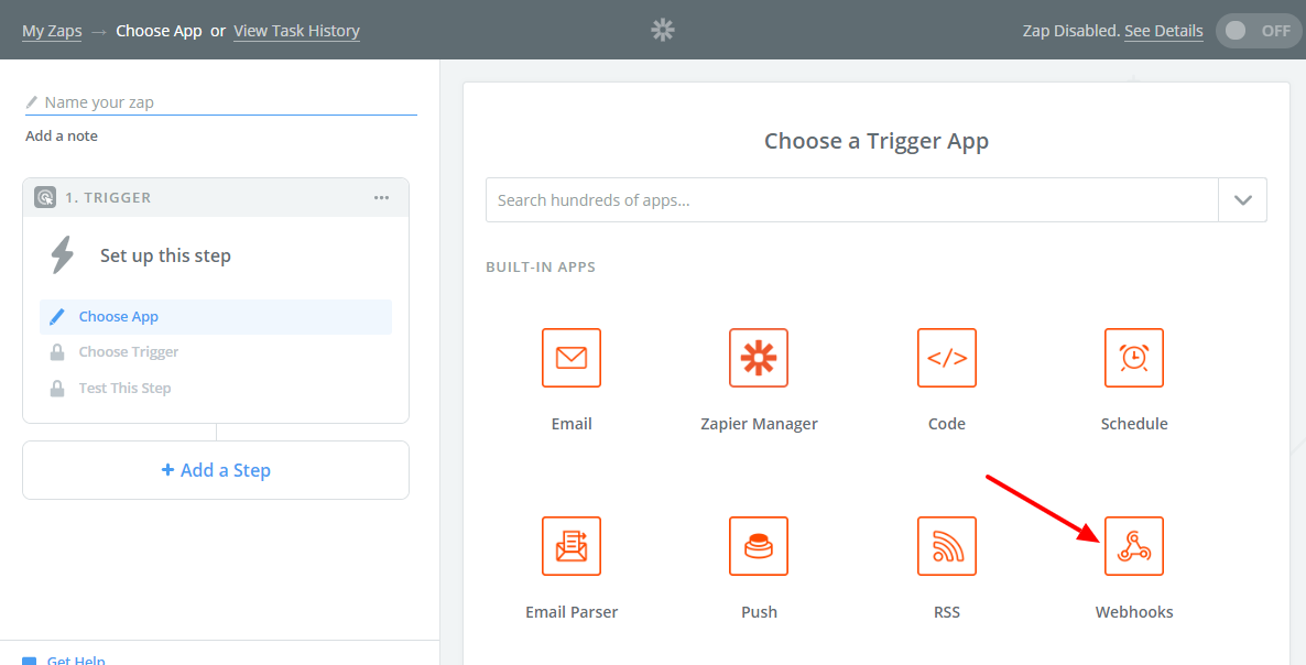
  1. Go to your Zapier account and click “Make a Zap!” button.
  2. Zapier ask you to choose Trigger App. Find built-in app “Webhooks” and click it.
    Choose Webhooks as a Trigger App
  3. Zapier ask you to select Trigger. Find “Catch Hook”, select it and click “Save + Continue” button.
    Select a Trigger
  4. Zapier generate Webhook URL which you use in integration process.
    Webhook URL
  5. Go to popup editor, create new Zapier integration and paste Webhook URL from previous step.
    Webhook URL
  6. Create as many Zapier fields as you need and map popup fields to them.
    Create Zapier fields
  7. Click “Send Sample Request” button. Plugin will send a request to the Webhook URL so Zapier can pull it in as a sample to set up your zap.
    Send Sample Request
  8. Go back to Zapier account and continue with creating new Zap. Click “OK, I did this” button.
    OK, I did this
  9. Zapier show the list of fields received from the plugin. You can use them later while creating Actions for your Zap. Click “Continue”.
    List of fields
  10. Then you need create Action for your Zap. While creating Actions you can use fields received from the plugin.

That’s it. Zapier is a pretty convenient way to integrate Green Forms with over 1500 applications and services.

Zoho CRM

To enable integration with Zoho CRM, make sure that you activated appropriate integration module. Go to Advanced Settings page and turn on Activate Zoho CRM Integration module. Then go to General Settings page, find Zoho CRM Connection section and connect plugin to your Zoho CRM account. After successful connection go to popup editor, click button on Top Toolbar, select Integrations tab and click Zoho CRM button. New Zoho CRM integration will be added. Click to configure integration.

It has the following parameters:

  • Name. The name of the integration. It is used for your convenience.
  • Enabled. You can disable this integration by turning this off.
  • Execute. You can specify when integration must be executed: after successful popup submission, when user confirmed submitted data using double opt-in feature, after successfully completed payment or after non-completed payment.
  • Fields. Map popup fields to Zoho CRM fields.
  • Conditional logic. If enabled, you can create rules to enable this integration depending on the values of input fields.

HTML form

To enable integration with 3rd party HTML form, make sure that you activated appropriate integration module. Go to Advanced Settings page and turn on Activate HTML Form Integration module. Then go to popup editor, click button on Top Toolbar, select Integrations tab and click HTML Form button. New integration will be added. Click to configure integration.

It has the following parameters:

  • Name. The name of the integration. It is used for your convenience.
  • Enabled. You can disable this integration by turning this off.
  • Execute. You can specify when integration must be executed: after successful popup submission, when user confirmed submitted data using double opt-in feature, after successfully completed payment or after non-completed payment.
  • HTML form. Copy-paste HTML-code of 3rd party form and connect it. Important! It must be pure HTML-form with <form> tag, but not javascript/iframe-driven form.
  • Fields. Map popup fields to 3rd party popup fields.
  • Client side. Enable this option if you want form to be submitted from client side. Otherwise, it is submitted from server side. Please read paragraph below regarding using this feature.
  • Target. Select where to display the response that is received after submitting the form. This feature is only available, “Client side” enabled.
  • Conditional logic. If enabled, you can create rules to enable this integration depending on the values of input fields.

Pay attention to some combination of parameters. Some of them won’t work.

  • "Execute" is "after successfully completed payment" and "Client side" is enabled. Client side is not involved into notification about successful payment received from payment provider.
  • "Execute" is "after non-completed payment" and "Client side" is enabled. Client side is not involved into notification about non-completed payment received from payment provider.

Custom GET/POST-requests

To enable sending form data to 3rd party URL using GET or POST requests, make sure that you activated appropriate integration module. Go to Advanced Settings page and turn on Activate Custom GET/POST Integration module. Then go to popup editor, click button on Top Toolbar, select Integrations tab and click GET/POST button. New integration will be added. Click to configure integration.

It has the following parameters:

  • Name. The name of the integration. It is used for your convenience.
  • Enabled. You can disable this integration by turning this off.
  • Execute. You can specify when integration must be executed: after successful popup submission, when user confirmed submitted data using double opt-in feature, after successfully completed payment or after non-completed payment.
  • Type. Select the type of the request: GET or POST.
  • URL. Enter URL to send GET/POST-requests to.
  • Query parameters. Create query parameters and map popup fields to them.
  • Conditional logic. If enabled, you can create rules to enable this integration depending on the values of input fields.

3rd party MySQL database/table

To enable inserting form data into 3rd party MySQL database/table, make sure that you activated appropriate integration module. Go to Advanced Settings page and turn on Activate 3rd party MySQL Integration module. Then go to popup editor, click button on Top Toolbar, select Integrations tab and click MySQL button. New integration will be added. Click to configure integration.

It has the following parameters:

  • Name. The name of the integration. It is used for your convenience.
  • Enabled. You can disable this integration by turning this off.
  • Execute. You can specify when integration must be executed: after successful popup submission, when user confirmed submitted data using double opt-in feature, after successfully completed payment or after non-completed payment.
  • Current connection. Enable this option if you want to use current MySQL-connection (MySQL-server and database).
  • Hostname. Enter your MySQL server hostname.
  • Port. Enter your MySQL server port. Leave it empty if you do not know the port or it is standard 3306.
  • Username. The username must have sufficient privileges to access MySQL-server and database.
  • Password. Enter password for MySQL server user.
  • Database. Enter MySQL database name.
  • Table. Select desired Table.
  • Columns. Map popup fields to MySQL table columns.
  • Conditional logic. If enabled, you can create rules to enable this integration depending on the values of input fields.

Create new WordPress user

To enable creating new WordPress user, make sure that you activated appropriate integration module. Go to Advanced Settings page and turn on Activate WP User Integration module. Then go to popup editor, click button on Top Toolbar, select Integrations tab and click WP User (create) button. New integration will be added. Click to configure integration.

It has the following parameters:

  • Name. The name of the integration. It is used for your convenience.
  • Enabled. You can disable this integration by turning this off.
  • Execute. You can specify when integration must be executed: after successful popup submission, when user confirmed submitted data using double opt-in feature, after successfully completed payment or after non-completed payment.
  • User role. Select the role for the newly created user.
  • Fields. Map popup fields to WP User fields. You can map the following fields: email, password, first name and last name.
  • User notification. Email login credentials to a newly-registered user (standard WP message). This option should be enabled if you did not request a password from the user.
  • Allow updates. Update user data for already existing users. Existing user must have the same user role.
  • Conditional logic. If enabled, you can create rules to enable this integration depending on the values of input fields.

Login existing WordPress user

To enable logining an existing WordPress user, make sure that you activated appropriate integration module. Go to Advanced Settings page and turn on Activate WP User Integration module. Then go to popup editor, click button on Top Toolbar, select Integrations tab and click WP User (login) button. New integration will be added. Click to configure integration.

It has the following parameters:

  • Name. The name of the integration. It is used for your convenience.
  • Enabled. You can disable this integration by turning this off.
  • Execute. You can specify when integration must be executed: after successful popup submission, when user confirmed submitted data using double opt-in feature, after successfully completed payment or after non-completed payment.
  • Fields. Map popup fields to login form fields. You can map the following fields: login, password, and remember.
  • Conditional logic. If enabled, you can create rules to enable this integration depending on the values of input fields.

Back To Top

Math Expressions

The plugin allows to use basic math expressions along the popup. To create math expression just click button on Top Toolbar, select Advanced tab, choose Math Expressions and create as many math expressions as you need.

Each math expression has the following parameters to configure:

  • ID. The unique ID of the expression. You can’t change it.
  • Name. The name of the expression. It is used for your convenience.
  • Expression. Type math expression here. Use basic arithmetic operators: -, +, *, /.
  • Default. This value is used if expression can not be calculated (for example, in case of division by zero, typos, missed variables, non-numeric values, etc.).
  • Decimal digits. Specify how many decimal digits the result must have.

Each Math Expression has its own unique shortcode, so you can insert it into different part of the form. For example, you can create new form element “Custom HTML”, go to its properties and find property “HTML” under “Basic” tab. On left side hover mouse over to see all available fields and math expressions. Clicking desired math expression will add its shortcode into HTML content.

Important! If you plan to show the result of math expression on front-end, please do not forget to enable JavaScript Expression Parser on General Settings page.

Back To Top

Payment Gateways

After successful popup submission user can be requested to pay some amount via certain payment gateway. To create and configure payment gateway just click button on Top Toolbar, select Advanced tab, click Payment Gateways and create as many gateways as you need.

Important! If you do not see your payment provider, make sure that you enabled appropriate module on Advanced Settings page.

Plugin has integration modules with following payment providers:

  • Authorize.Net
  • Blockchain
  • Instamojo
  • InterKassa
  • Mollie
  • PayFast
  • PayPal
  • Paystack
  • PayUmoney (BETA)
  • Perfect Money
  • Razorpay
  • Skrill
  • Stripe
  • WePay
  • Yandex.Money

If you still don’t see your provider in a list, just drop request and we will consider adding it (but not promise).

When payment gateway created, go to Confirmations tab, create confirmation of one of the following types: “Display Confirmation page and request payment”, “Display Message and request payment” or “Request payment” and select desired gateway.

Authorize.Net

Before creating payment gateway driven by Authorize.Net, make sure that you activated appropriate module. Go to Advanced Settings page and turn on Activate Authorize.Net Integration module. Then go to popup editor, click button on Top Toolbar, select Advanced tab, click Payment Gateways and click Authorize.Net button. New gateway based on Authorize.Net will be added. Click to configure it.

It has the following parameters:

  • Name. The name of the payment gateway. It is used for your convenience.
  • Mode. Please select the mode of Authorize.Net integration: Live or Sandbox.
  • API Login ID. Please enter valid API Login ID. If you do not know API Login ID, go to your Authorize.Net account settings and click “API Credentials & Keys”.
  • Transaction Key. Please enter valid Transaction Key. If you do not know Transaction Key, go to your Authorize.Net account settings and click “API Credentials & Keys”.
  • Signature Key. Please enter valid Signature Key. If you do not know Signature Key, go to your Authorize.Net account settings and click “API Credentials & Keys”.
  • Item name. Enter the item name.
  • Amount. Set amount to pay and currency.
  • Successful payment URL. All payers are redirected to this URL after successful payment.
  • Cancel URL. All payers are redirected to this URL in case of cancelled payment.

Blockchain

Before creating payment gateway driven by Blockchain (accept bitcoins), make sure that you activated appropriate module. Go to Advanced Settings page and turn on Activate Blockchain Integration module. Then go to popup editor, click button on Top Toolbar, select Advanced tab, click Payment Gateways and click Blockchain button. New gateway based on Blockchain will be added. Click to configure it.

It has the following parameters:

  • Name. The name of the payment gateway. It is used for your convenience.
  • Receive Payments API Key. Enter a valid Receive Payments API Key. You cannot use the standard blockchain wallet API key for Receive Payments V2, and vice versa. Please apply for an API Key at https://api.blockchain.info/v2/apikey/request/.
  • xPub. Enter Extended Public Key (xPub). Find it in your Blockchain account: Settings >> Addresses >> Manage >> More Options >> Show xPub.
  • Secret. Enter random alphanumeric string.
  • Confirmations. Set the number of confirmations of transaction.
  • Amount. Set amount to pay and currency.

Instamojo

Before creating payment gateway driven by Instamojo, make sure that you activated appropriate module. Go to Advanced Settings page and turn on Activate Instamojo Integration module. Then go to popup editor, click button on Top Toolbar, select Advanced tab, click Payment Gateways and click Instamojo button. New gateway based on Instamojo will be added. Click to configure it.
Instamojo gateway integration has the following parameters:

  • Name. The name of the payment gateway. It is used for your convenience.
  • API Key. Enter valid API Key. Find it in API & Plugins page in your Instamojo dashboard.
  • Auth Token. Enter valid Auth Token. Find it in API & Plugins page in your Instamojo dashboard.
  • Salt. Enter valid Salt. Find it in API & Plugins page in your Instamojo dashboard.
  • Purpose of payment. Enter purpose of the payment.
  • Amount. Set amount to pay and currency.
  • Payer’s name. Please enter payer’s name.
  • Payer’s phone number. Please enter mobile number or landline number of the payer.
  • Payer’s email. Please enter email address of the payer.
  • Successful payment URL. All payers are redirected to this URL after successful payment.

InterKassa

Before creating payment gateway driven by InterKassa, make sure that you activated appropriate module. Go to Advanced Settings page and turn on Activate InterKassa Integration module. Then go to popup editor, click button on Top Toolbar, select Advanced tab, click Payment Gateways and click InterKassa button. New gateway based on InterKassa will be added. Click to configure it.

It has the following parameters:

  • Name. The name of the payment gateway. It is used for your convenience.
  • Checkout ID. Enter a valid InterKassa Checkout ID. All payments are sent to this account. Important! Make sure that feature “Allow override in request” for “Interaction URL” is activated. Find it on Checkout Settings page, Interface tab in your InterKassa account.
  • Sign Key. Enter Sign Key. Find it on Checkout Settings page, Security tab in your InterKassa account.
  • Sign Algorithm. Enter Sign Algorithm. It must be the same as on Checkout Settings page, Security tab in your InterKassa account.
  • Item name. Enter the item name.
  • Amount. Set amount to pay and currency.
  • Successful payment URL. All payers are redirected to this URL after successful payment.
  • Cancel URL. All payers are redirected to this URL in case of failed/cancelled payment.

Mollie

Before creating payment gateway driven by Mollie, make sure that you activated appropriate module. Go to Advanced Settings page and turn on Activate Mollie Integration module. Then go to popup editor, click button on Top Toolbar, select Advanced tab, click Payment Gateways and click Mollie button. New gateway based on Mollie will be added. Click to configure it.

It has the following parameters:

  • Name. The name of the payment gateway. It is used for your convenience.
  • API Key. Enter a valid Mollie API Key. Find it on Developers page in your Mollie dashboard.
  • Item name. Enter the item name.
  • Amount. Set amount to pay and currency.
  • Redirect URL. The URL your customer will be redirected to after the payment process.

PayFast

Before creating payment gateway driven by PayFast, make sure that you activated appropriate module. Go to Advanced Settings page and turn on Activate PayFast Integration module. Then go to popup editor, click button on Top Toolbar, select Advanced tab, click Payment Gateways and click PayFast button. New gateway based on PayFast will be added. Click to configure it.

It has the following parameters:

  • Name. The name of the payment gateway. It is used for your convenience.
  • Sandbox. Enable sandbox mode.
  • Merchant ID. Enter a valid PayFast Merchant ID. The Merchant ID as given by the PayFast system. Used to uniquely identify the receiving account. This can be found on the merchant’s settings page.
  • Merchant Key. Enter a valid PayFast Merchant Key. The Merchant Key as given by the PayFast system. Used to uniquely identify the receiving account. This provides an extra level of certainty concerning the correct account as both the ID and the Key must be correct in order for the transaction to proceed. This can be found on the merchant’s settings page.
  • Passphrase. Enter a valid Passphrase. The passphrase is an optional/extra security feature, made up of a maximum of 32 characters, which is set by the Merchant in the Settings section of PayFast Dashboard.
  • Item name. Enter the item name.
  • Amount. Set amount to pay and currency.
  • Successful payment URL. The URL where the user is returned to after payment has been successfully taken.
  • Cancel URL. The URL where the user should be redirected if they choose to cancel their payment while on the PayFast system.

PayPal

Before creating payment gateway driven by PayPal, make sure that you activated appropriate module. Go to Advanced Settings page and turn on Activate PayPal Integration module. Then go to popup editor, click button on Top Toolbar, select Advanced tab, click Payment Gateways and click PayPal button. New gateway based on PayPal will be added. Click to configure it.

It has the following parameters:

  • Name. The name of the payment gateway. It is used for your convenience.
  • PayPal ID. Enter a valid PayPal email or Merchant ID. All payments are sent to this account.
  • Item name. Enter the item name.
  • Amount. Set amount to pay and currency.
  • Successful payment URL. All payers are redirected to this URL after successful payment.
  • Cancel URL. All payers are redirected to this URL in case of failed/cancelled payment.

Paystack

Before creating payment gateway driven by Paystack, make sure that you activated appropriate module. Go to Advanced Settings page and turn on Activate Paystack Integration module. Then go to popup editor, click button on Top Toolbar, select Advanced tab, click Payment Gateways and click Paystack button. New gateway based on Paystack will be added. Click to configure it.
Important! Make sure that you created webhook with the URL provided by plugin in your Paystack Dashboard.

It has the following parameters:

  • Name. The name of the payment gateway. It is used for your convenience.
  • Secret Key. Please enter valid Secret Key. Find it on API Keys page in your Paystack Dashboard.
  • Item name. Enter the item name.
  • Amount. Set amount to pay and currency. You can use NGN only.
  • Email. Enter the email address where an HTML receipt will be sent to. Make sure this is a valid email address.
  • Redirect URL. The URL your customer will be redirected to after the payment process.

PayUmoney

Before creating payment gateway driven by PayUmoney, make sure that you activated appropriate module. Go to Advanced Settings page and turn on Activate PayUmoney Integration module. Then go to popup editor, click button on Top Toolbar, select Advanced tab, click Payment Gateways and click PayUmoney button. New gateway based on PayUmoney will be added. Click to configure it.
Important! Make sure that you created webhook with parameters provided by plugin in your Merchant Dashboard.

PayUmoney gateway integration has the following parameters:

  • Name. The name of the payment gateway. It is used for your convenience.
  • Merchant Key. Enter valid Merchant Key. Find it in Merchant Dashboard.
  • Merchant Salt. Enter valid Merchant Key. Find it in Merchant Dashboard.
  • Product description. Enter the item name.
  • Amount. Set amount to pay and currency.
  • Payer’s first name. Please enter the First Name of the payer. Allowed characters: (only alphabets a-z are allowed).
  • Payer’s phone number. Please enter mobile number or landline number of the payer (numeric value only).
  • Payer’s email. Please enter email address of the payer.
  • Successful payment URL. All payers are redirected to this URL after successful payment.
  • Cancel URL. All payers are redirected to this URL in case of failed/cancelled payment.

Perfect Money

Before creating payment gateway driven by Perfect Money, make sure that you activated appropriate module. Go to Advanced Settings page and turn on Activate Perfect Money Integration module. Then go to popup editor, click button on Top Toolbar, select Advanced tab, click Payment Gateways and click Perfect Money button. New gateway based on Perfect Money will be added. Click to configure it.

It has the following parameters:

  • Name. The name of the payment gateway. It is used for your convenience.
  • Payee Account. The merchant Perfect Money account to which the payment is to be made.
  • Payee Name. The name the merchant wishes to have displayed as the Payee on the Perfect Money payment form.
  • Alternate Passphrase. Enter valid Alternate Passphrase. Find it on Settings page.
  • Item name. Enter the item name.
  • Amount. Set amount to pay and currency.
  • Successful payment URL. All payers are redirected to this URL after successful payment.
  • Cancel URL. All payers are redirected to this URL in case of failed/cancelled payment.

Razorpay

Before creating payment gateway driven by Razorpay, make sure that you activated appropriate module. Go to Advanced Settings page and turn on Activate Razorpay Integration module. Then go to popup editor, click button on Top Toolbar, select Advanced tab, click Payment Gateways and click Razorpay button. New gateway based on Razorpay will be added. Click to configure it.
Important! Make sure that you created webhook with parameters provided by plugin in your Merchant Dashboard.

Razorpay gateway integration has the following parameters:

  • Name. The name of the payment gateway. It is used for your convenience.
  • API Key ID. Enter valid Key ID. Find it in Merchant Dashboard.
  • API Key Secret. Enter valid Merchant Key. Find it in Merchant Dashboard.
  • Business name. Enter the business name to be shown in the checkout form.
  • Item name. Enter the item name.
  • Amount. Set amount to pay and currency.
  • Payer’s phone number. Please enter mobile number or landline number of the payer. This parameter can not be empty.
  • Payer’s email. Please enter email address of the payer. This parameter can not be empty.
  • Successful payment URL. All payers are redirected to this URL after successful payment.
  • Cancel URL. All payers are redirected to this URL in case of failed/cancelled payment.

Skrill

Before creating payment gateway driven by Skrill, make sure that you activated appropriate module. Go to Advanced Settings page and turn on Activate Skrill Integration module. Then go to popup editor, click button on Top Toolbar, select Advanced tab, click Payment Gateways and click Skrill button. New gateway based on Skrill will be added. Click to configure it.

It has the following parameters:

  • Name. The name of the payment gateway. It is used for your convenience.
  • Merchant email. Enter a valid email address of your Skrill merchant account.
  • Secret word. Please enter a valid secret word. Find it on Developer Settings page in your Skrill account.
  • Item name. Enter the item name.
  • Amount. Set amount to pay and currency.
  • Successful payment URL. All payers are redirected to this URL after successful payment.
  • Cancel URL. All payers are redirected to this URL in case of failed/cancelled payment.

Stripe

Before creating payment gateway driven by Stripe, make sure that you activated appropriate module. Go to Advanced Settings page and turn on Activate Stripe Integration module. Then go to popup editor, click button on Top Toolbar, select Advanced tab, click Payment Gateways and click Stripe button. New gateway based on Stripe will be added. Click to configure it.
Important! Make sure that you created webhook with the URL provided by plugin for event checkout.session.completed in your Stripe Dashboard.

It has the following parameters:

  • Name. The name of the payment gateway. It is used for your convenience.
  • Publishable Key. Enter valid Publishable Key. Find it on API Keys page in Stripe Dashboard.
  • Secret Key. Enter valid Secret Key. Find it on API Keys page in Stripe Dashboard.
  • Signing secret. Enter a valid Signing secret for webhook that you created earlier. Find it on Webhooks page in Stripe Dashboard. Click webhook that you created earlier, and find “Signing secret” parameter.
  • Item name. Enter the item name.
  • Amount. Set amount to pay and currency.
  • Successful payment URL. All payers are redirected to this URL after successful payment.
  • Cancel URL. All payers are redirected to this URL in case of failed/cancelled payment.

WePay

Before creating payment gateway driven by WePay, make sure that you activated appropriate module. Go to Advanced Settings page and turn on Activate WePay Integration module. Then go to popup editor, click button on Top Toolbar, select Advanced tab, click Payment Gateways and click WePay button. New gateway based on WePay will be added. Click to configure it.
It has the following parameters:

  • Name. The name of the payment gateway. It is used for your convenience.
  • Access Token. Please enter valid Access Token. You can find your Access Token on the “API Keys” tab of your WePay app dashboard.
  • Account ID. Please enter valid Account ID. You can find your Account ID on the “API Keys” tab of your WePay app dashboard.
  • Item name. Enter the item name.
  • Amount. Set amount to pay and currency.
  • Redirect URL. The URL your customer will be redirected to after the payment process.

Yandex.Money

Before creating payment gateway driven by Yandex.Money, make sure that you activated appropriate module. Go to Advanced Settings page and turn on Activate Yandex.Money Integration module. Then go to popup editor, click button on Top Toolbar, select Advanced tab, click Payment Gateways and click Yandex.Money button. New gateway based on Yandex.Money will be added. Click to configure it.
Important! Make sure that you set URL provided by plugin as URL for HTTP-notices in your Yandex.Money Dashboard.

It has the following parameters:

  • Name. The name of the payment gateway. It is used for your convenience.
  • Wallet ID. Enter your Wallet ID (number). Find it on Settings page in Yandex.Money Account.
  • Secret Word. Enter valid Secret Word. The Secret Word allows you to verify the authenticity of the notifications. Find it on the same page where you entered URL for HTTP-notices in your Yandex.Money Dashboard.
  • Label prefix. Enter a random alphanumeric string. It is required for some intermediate services to split HTTP-notices. If you do not use them, just ignore this parameter and leave it as is.
  • Payment type. select the payment type (Wallet or Bank Card).
  • Item name. Enter the item name.
  • Amount. Set amount to pay and currency.
  • Successful payment URL. All payers are redirected to this URL after successful payment.

Back To Top

SMS Gateways

Green Popups can send SMS to specified phone numbers. It is done through SMS gateways. To enable this feature just click button on Top Toolbar, select Integrations tab and create integration with SMS gateways. You can customize integrations and use conditional logic.

Important! If you do not see your SMS gateway, make sure that you enabled appropriate integration module on Advanced Settings page.

Plugin has integration modules with following marketing/CRM providers:

  • BulkGate
  • GatewayAPI
  • Nexmo
  • MojSMS
  • Twilio

If you don’t see your gateway in a list, just drop request and we will add it. 😉

BulkGate

To enable integration with BulkGate, make sure that you activated appropriate integration module. Go to Advanced Settings page and turn on Activate BulkGate Integration module. Then go to popup editor, click button on Top Toolbar, select Integrations tab and click BulkGate button. New BulkGate integration will be added. Click to configure integration.

It has the following parameters:

  • Name. The name of the integration. It is used for your convenience.
  • Enabled. You can disable this integration by turning this off.
  • Execute. You can specify when integration must be executed: after successful popup submission, when user confirmed submitted data using double opt-in feature, after successfully completed payment or after non-completed payment.
  • Application ID. Enter your BulkGate Application ID. Create Simple API module in BulkGate Dashboard and take Application ID there.
  • Application Token. Enter your BulkGate Application Token. Create Simple API module in BulkGate Dashboard and take Application Token there.
  • SMS type. Select the type of SMS: transactional or promotional. Find the difference between Transactional and Promotional SMS here.
  • Phone number. Enter the phone number in an international format (including country and area code).
  • Unicode. Enable this feature to send SMS in unicode format.
  • Message. Text of SMS message (max. 612 characters, or 268 characters if Unicode is used).
  • Check duplicates. Prevent sending duplicate messages to the same phone number. Messages with the same text sent to the same number will be removed if there is a time interval shorter than 5 mins.
  • Conditional logic. If enabled, you can create rules to enable this integration depending on the values of input fields.

GatewayAPI

To enable integration with GatewayAPI, make sure that you activated appropriate integration module. Go to Advanced Settings page and turn on Activate GatewayAPI Integration module. Then go to popup editor, click button on Top Toolbar, select Integrations tab and click GatewayAPI button. New GatewayAPI integration will be added. Click to configure integration.

It has the following parameters:

  • Name. The name of the integration. It is used for your convenience.
  • Enabled. You can disable this integration by turning this off.
  • Execute. You can specify when integration must be executed: after successful popup submission, when user confirmed submitted data using double opt-in feature, after successfully completed payment or after non-completed payment.
  • API Token. Enter your GatewayAPI API Token. Find API Token in GatewayAPI API Settings page.
  • From. The name or number the message should be sent from. Alphanumeric senderID is not supported in all countries.
  • Phone number. Enter the phone number in an international format (including country and area code).
  • Unicode. Enable this feature to send SMS in unicode format.
  • Message. Text of SMS message.
  • Conditional logic. If enabled, you can create rules to enable this integration depending on the values of input fields.

Nexmo

To enable integration with Nexmo, make sure that you activated appropriate integration module. Go to Advanced Settings page and turn on Activate Nexmo Integration module. Then go to popup editor, click button on Top Toolbar, select Integrations tab and click Nexmo button. New Nexmo integration will be added. Click to configure integration.

It has the following parameters:

  • Name. The name of the integration. It is used for your convenience.
  • Enabled. You can disable this integration by turning this off.
  • Execute. You can specify when integration must be executed: after successful popup submission, when user confirmed submitted data using double opt-in feature, after successfully completed payment or after non-completed payment.
  • API Key. Enter your Nexmo API Key. Find it in Nexmo Settings page.
  • API Secret. Enter your Nexmo API Secret. Find it in Nexmo Settings page.
  • From. The name or number the message should be sent from. Alphanumeric senderID is not supported in all countries.
  • Phone number. Enter the phone number in an international format (including country and area code).
  • Unicode. Enable this feature to send SMS in unicode format.
  • Message. Text of SMS message.
  • Conditional logic. If enabled, you can create rules to enable this integration depending on the values of input fields.

MojSMS (SMS)

To enable integration with MojSMS, make sure that you activated appropriate integration module. Go to Advanced Settings page and turn on Activate MojSMS (SMS) Integration module. Then go to popup editor, click button on Top Toolbar, select Integrations tab and click MojSMS (SMS) button. New MojSMS (SMS) integration will be added. Click to configure integration.

It has the following parameters:

  • Name. The name of the integration. It is used for your convenience.
  • Enabled. You can disable this integration by turning this off.
  • Execute. You can specify when integration must be executed: after successful popup submission, when user confirmed submitted data using double opt-in feature, after successfully completed payment or after non-completed payment.
  • API Key. Enter your MojSMS API Key. You can find your API Key in the REST SMS API page.
  • From. The sender of the message. This can be a telephone number (including country code) or an alphanumeric string. In case of an alphanumeric string, the maximum length is 11 characters.
  • Phone number. The phone number in an international format (including country and area code) that the message should be sent to.
  • Message. Text of SMS message.
  • Conditional logic. If enabled, you can create rules to enable this integration depending on the values of input fields.

Twilio

To enable integration with Twilio, make sure that you activated appropriate integration module. Go to Advanced Settings page and turn on Activate Twilio Integration module. Then go to popup editor, click button on Top Toolbar, select Integrations tab and click Twilio button. New Twilio integration will be added. Click to configure integration.

It has the following parameters:

  • Name. The name of the integration. It is used for your convenience.
  • Enabled. You can disable this integration by turning this off.
  • Execute. You can specify when integration must be executed: after successful popup submission, when user confirmed submitted data using double opt-in feature, after successfully completed payment or after non-completed payment.
  • Account SID. Enter your Twilio Account SID. You can find your Account SID in the Twilio Console.
  • Auth Token. Enter your Twilio Auth Token. You can find your Auth Token in the Twilio Console.
  • To. This parameter determines the destination phone number for your SMS message. Format this number with a “+” and a country code, e.g., +16175551212.
  • From. From specifies the Twilio phone number or short code that sends this message. This must be a Twilio phone number that you own, formatted with a “+” and country code, e.g. +16175551212. To get your first Twilio phone number, head on over to the console and find a number you like with SMS capabilities. If you are interested in using a short code, you can apply for one via the console as well. Note that you cannot spoof messages from your personal cell phone number without porting your number to Twilio first.
  • Message. This is the full text of the message you want to send, limited to 1600 characters. If the body of your message is more than 160 GSM-7 characters (or 70 UCS-2 characters), Twilio will send the message as a segmented SMS.
  • Conditional logic. If enabled, you can create rules to enable this integration depending on the values of input fields.

Back To Top

Custom JavaScript Handlers

You can use your own JavaScript-code for some popup events. It doesn’t mean that native JavaScript handlers are replaced by yours. It means that your JavaScript-code is executed together with native handlers.

To enable Custom JavaScript Handlers, make sure that you activated appropriate module. Go to Advanced Settings page and turn on Activate Custom JavaScript Handlers module. Then go to form editor, click button on Top Toolbar, select Advanced tab and click Custom JavaScript Handlers. There you can enable certain handler and put JS-code.

At that moment you can add JavaScript-code to the following events:

  • AfterInit. This handler is executed when popup initialized.
  • AfterUpdate. This handler is executed when popup value changed by user. It has incoming parameter element_id.
  • BeforeSubmit. This handler is executed before popup submitted.
  • AfterSubmitSuccess. This handler is executed when popup successfully submitted.
  • AfterClose. This handler is executed when popup successfully closed.
  • The following variables and functions might be useful in your JavaScript-code:

    • this.dom_id – this ID is used to access popup DOM elements.
    • this.popup_id – popup ID.
    • this.popup_slug – popup slug.
    • this.user_data – object, that can be used to store your data (to send data between handlers).
    • this.get_field_value(ELEMENT_ID) – get the value of certain input field. Replace ELEMENT_ID by real field ID taken from Advanced tab on field properties window.
    • this.set_field_value(ELEMENT_ID, value) – set the value of certain input field. Replace ELEMENT_ID by real field ID taken from Advanced tab on field properties window.

    Do not use <script>...</script> tags inside (just put regular JavaScript-code) and make sure your JavaScript-code doesn’t have any syntax errors.

    Back To Top

    Popup Elements

    General Info

    Each popup consists of popup elements. You can add as many popup elements as you need and configure their properties.
    If you want to add some element to the popup (for example, input field or button or something else), just click relevant icon on Popup Elements Toolbar and new element will be added. Then you can move new element into desired position, resize it and configure it. Following elements can be added to the popup:

    • – Text Input Field
    • – Email Input Field
    • – Numeric Input Field
    • – Numeric Spinner
    • – Textarea
    • – Select Box (Drop-down List)
    • – Checkbox
    • – Radio Button
    • – Multiselect List
    • – Image Select
    • – Tile
    • – Date Picker
    • – Time Picker
    • – File Upload
    • – Password
    • – Star Rating
    • – Signature Field
    • – Range Slider
    • – Hidden Field
    • – Submit Button
    • – Rectangle / Image
    • – HTML Content
    • – Close Icon
    • – Font Awesome Icon
    • – Progress Bar
    • – Link Button

    The properties of each element are described below.

    Back To Top

    Text Field

    Click on Popup Elements Toolbar to add regular text field to the popup. To achieve its properties just do right click over element and then click Properties. All properties are organized into 5 groups: Basic, Style, Data, Logic and Advanced. To view/edit certain group of properties just click appropriate tab on Element Properties window.

    Basic Properties

    • Name. The name will be shown in place of the label throughout the plugin, in the notification email and when viewing submitted popup entries.
    • Position. Set the position of the element relative to the upper left corner of the base frame.
    • Size. Set the size of the element.
    • Placeholder. The placeholder text will appear inside the field until the user starts to type.
    • Autocomplete attribute. Choose the value of the autocomplete attribute. It helps browser to fill the field value, if required.
    • Animation. Adjust the appearance and disappearance effect and duration.
    • Required. If enabled, the user must fill out the field. You also can specify error message here.

    Style Properties

    The general view of text fields is configured through Popup Settings. It’s applied to all input fields. Here you can adjust view of the field.

    • Alignment. Adjust the text alignment in input field.
    • Input icons. These icons appear inside/near of the input field.
    • Custom CSS class. This class name will be added to the input field.
    • CSS styles. Set custom css for certain element parts and states.

    Data Properties

    • Mask. Adjust the mask of the input field. Use the following special symbols:
      0 - mandatory digit
      9 - optional digit
      A - alphanumeric character
      S - alpha character

      Important! jQuery Mask plugin must be enabled on General Settings page.

    • Default value. The default value is the value that the field has before the user has entered anything.
    • Dynamic default value. Allows the default value of the field to be set dynamically via a URL parameter.
    • Parameter name. This is the name of the parameter that you will use to set the default value.
    • Read only. If enabled, the user can not edit the field value.
    • Save to database. If enabled, the submitted element data will be saved to the database and shown when viewing an entry.

    Conditional Logic

    Here you can create rules to show or hide the element depending on the values of other fields.

    Advanced Properties

    • ID. The unique ID of the input field.
    • Filters. Filters allow you to strip various characters from the submitted value. The following filters are available:
      • Alpha. Removes any non-alphabet characters.
      • Alphanumeric. Removes any non-alphabet characters and non-digits.
      • Digits. Removes non-digits.
      • Regex. Removes characters matching the given regular expression.
      • Strip Tags. Removes any HTML tags.
      • Trim. Removes white space from the start and end.
    • Validators. Validators check whether the data entered by the user is valid. If not, then appropriate error bubble is displayed for this field. The following validators are available:
      • Alpha. Checks that the value contains only alphabet characters.
      • Alphanumeric. Checks that the value contains only alphabet characters or digits.
      • Digits. Checks that the value contains only digits.
      • Email. Checks that the value is a valid email address.
      • Equal. Checks that the value is identical to the given token.
      • Greater Than. Checks that the value is numerically greater than the given minimum.
      • In Array. Checks that the value is in a list of allowed values.
      • Length. Checks that the length of the value is between the given maximum and minimum.
      • Less Than. Checks that the value is numerically less than the given maximum.
      • Prevent Duplicates. Checks that the same value has not already been submitted.
      • Regex. Checks that the value matches the given regular expression.
      • URL. Checks that the value is a valid URL.

    Back To Top

    Email Field

    Click on Popup Elements Toolbar to add email field to the popup. To achieve its properties just do right click over element and then click Properties. All properties are organized into 5 groups: Basic, Style, Data, Logic and Advanced. To view/edit certain group of properties just click appropriate tab on Element Properties window.

    Basic Properties

    • Name. The name will be shown in place of the label throughout the plugin, in the notification email and when viewing submitted popup entries.
    • Position. Set the position of the element relative to the upper left corner of the base frame.
    • Size. Set the size of the element.
    • Placeholder. The placeholder text will appear inside the field until the user starts to type.
    • Autocomplete attribute. Choose the value of the autocomplete attribute. It helps browser to fill the field value, if required.
    • Animation. Adjust the appearance and disappearance effect and duration.
    • Required. If enabled, the user must fill out the field. You also can specify error message here.

    Style Properties

    The general view of text fields is configured through Popup Settings. It’s applied to all input fields. Here you can adjust view of the field.

    • Alignment. Adjust the text alignment in input field.
    • Input icons. These icons appear inside/near of the input field.
    • Custom CSS class. This class name will be added to the input field.
    • CSS styles. Set custom css for certain element parts and states.

    Data Properties

    • Default value. The default value is the value that the field has before the user has entered anything.
    • Dynamic default value. Allows the default value of the field to be set dynamically via a URL parameter.
    • Parameter name. This is the name of the parameter that you will use to set the default value.
    • Read only. If enabled, the user can not edit the field value.
    • Save to database. If enabled, the submitted element data will be saved to the database and shown when viewing an entry.

    Conditional Logic

    Here you can create rules to show or hide the element depending on the values of other fields.

    Advanced Properties

    • ID. The unique ID of the input field.
    • Filters. Filters allow you to strip various characters from the submitted value. The following filters are available:
      • Alpha. Removes any non-alphabet characters.
      • Alphanumeric. Removes any non-alphabet characters and non-digits.
      • Digits. Removes non-digits.
      • Regex. Removes characters matching the given regular expression.
      • Strip Tags. Removes any HTML tags.
      • Trim. Removes white space from the start and end.
    • Validators. Validators check whether the data entered by the user is valid. If not, then appropriate error bubble is displayed for this field. The following validators are available:
      • Email. Checks that the value is a valid email address.
      • Equal. Checks that the value is identical to the given token.
      • In Array. Checks that the value is in a list of allowed values.
      • Prevent Duplicates. Checks that the same value has not already been submitted.

    Back To Top

    Numeric field

    Click on Popup Elements Toolbar to add numeric field to the popup. To achieve its properties just do right click over element and then click Properties. All properties are organized into 5 groups: Basic, Style, Data, Logic and Advanced. To view/edit certain group of properties just click appropriate tab on Element Properties window.

    Basic Properties

    • Name. The name will be shown in place of the label throughout the plugin, in the notification email and when viewing submitted popup entries.
    • Position. Set the position of the element relative to the upper left corner of the base frame.
    • Size. Set the size of the element.
    • Placeholder. The placeholder text will appear inside the field until the user starts to type.
    • Animation. Adjust the appearance and disappearance effect and duration.
    • Required. If enabled, the user must fill out the field. You also can specify error message here.

    Style Properties

    The general view of text fields is configured through Popup Settings. It’s applied to all input fields. Here you can adjust view of the field.

    • Alignment. Adjust the text alignment in input field.
    • Input icons. These icons appear inside/near of the input field.
    • Custom CSS class. This class name will be added to the input field.
    • CSS styles. Set custom css for certain element parts and states.

    Data Properties

    • Value. Set basic parameters of numeric input. Min – minimum value. Max – maximum value. Default – the value that the field has before the user has entered anything.
    • Decimal digits. Select the allowed number of digits after the decimal separator.
    • Dynamic default value. Allows the default value of the field to be set dynamically via a URL parameter.
    • Parameter name. This is the name of the parameter that you will use to set the default value.
    • Read only. If enabled, the user can not edit the field value.
    • Save to database. If enabled, the submitted element data will be saved to the database and shown when viewing an entry.

    Conditional Logic

    Here you can create rules to show or hide the element depending on the values of other fields.

    Advanced Properties

    • ID. The unique ID of the input field.
    • Validators. Validators check whether the data entered by the user is valid. If not, then appropriate error bubble is displayed for this field. The following validators are available:
      • Equal. Checks that the value is identical to the given token.
      • Greater Than. Checks that the value is numerically greater than the given minimum.
      • In Array. Checks that the value is in a list of allowed values.
      • Less Than. Checks that the value is numerically less than the given maximum.

    Back To Top

    Numeric Spinner

    Click on Popup Elements Toolbar to add numeric spinner to the popup. To achieve its properties just do right click over element and then click Properties. All properties are organized into 5 groups: Basic, Style, Data, Logic and Advanced. To view/edit certain group of properties just click appropriate tab on Element Properties window.

    Basic Properties

    • Name. The name will be shown in place of the label throughout the plugin, in the notification email and when viewing submitted popup entries.
    • Position. Set the position of the element relative to the upper left corner of the base frame.
    • Size. Set the size of the element.
    • Animation. Adjust the appearance and disappearance effect and duration.

    Style Properties

    The general view of text fields is configured through Popup Settings. It’s applied to all input fields. Here you can adjust view of the field.

    • Alignment. Adjust the text alignment in input field.
    • Custom CSS class. This class name will be added to the input field.
    • CSS styles. Set custom css for certain element parts and states.

    Data Properties

    • Value. Set basic parameters of numeric spinner. Min – minimum value. Max – maximum value. Default – the value that the field has before the user has entered anything. Step – increment value.
    • Decimal digits. Select the allowed number of digits after the decimal separator.
    • Dynamic default value. Allows the default value of the field to be set dynamically via a URL parameter.
    • Parameter name. This is the name of the parameter that you will use to set the default value.
    • Read only. If enabled, the user can not edit the field value.
    • Save to database. If enabled, the submitted element data will be saved to the database and shown when viewing an entry.

    Conditional Logic

    Here you can create rules to show or hide the element depending on the values of other fields.

    Advanced Properties

    • ID. The unique ID of the input field.
    • Validators. Validators check whether the data entered by the user is valid. If not, then appropriate error bubble is displayed for this field. The following validators are available:
      • Equal. Checks that the value is identical to the given token.
      • Greater Than. Checks that the value is numerically greater than the given minimum.
      • In Array. Checks that the value is in a list of allowed values.
      • Less Than. Checks that the value is numerically less than the given maximum.

    Back To Top

    Textarea

    Click on Popup Elements Toolbar to add textarea to the popup. To achieve its properties just do right click over element and then click Properties. All properties are organized into 5 groups: Basic, Style, Data, Logic and Advanced. To view/edit certain group of properties just click appropriate tab on Element Properties window.

    Basic Properties

    • Name. The name will be shown in place of the label throughout the plugin, in the notification email and when viewing submitted popup entries.
    • Position. Set the position of the element relative to the upper left corner of the base frame.
    • Size. Set the size of the element.
    • Placeholder. The placeholder text will appear inside the field until the user starts to type.
    • Animation. Adjust the appearance and disappearance effect and duration.
    • Required. If enabled, the user must fill out the field. You also can specify error message here.

    Style Properties

    The general view of text fields is configured through Popup Settings. It’s applied to all input fields. Here you can adjust view of the field.

    • Alignment. Adjust the text alignment in input field.
    • Textarea icons. These icons appear inside/near of textarea.
    • Custom CSS class. This class name will be added to the input field.
    • CSS styles. Set custom css for certain element parts and states.

    Data Properties

    • Default value. The default value is the value that the field has before the user has entered anything.
    • Dynamic default value. Allows the default value of the field to be set dynamically via a URL parameter.
    • Parameter name. This is the name of the parameter that you will use to set the default value.
    • Read only. If enabled, the user can not edit the field value.
    • Save to database. If enabled, the submitted element data will be saved to the database and shown when viewing an entry.

    Conditional Logic

    Here you can create rules to show or hide the element depending on the values of other fields.

    Advanced Properties

    • ID. The unique ID of the input field.
    • Filters. Filters allow you to strip various characters from the submitted value. The following filters are available:
      • Alpha. Removes any non-alphabet characters.
      • Alphanumeric. Removes any non-alphabet characters and non-digits.
      • Digits. Removes non-digits.
      • Regex. Removes characters matching the given regular expression.
      • Strip Tags. Removes any HTML tags.
      • Trim. Removes white space from the start and end.
    • Validators. Validators check whether the data entered by the user is valid. If not, then appropriate error bubble is displayed for this field. The following validators are available:
      • Alpha. Checks that the value contains only alphabet characters.
      • Alphanumeric. Checks that the value contains only alphabet characters or digits.
      • Digits. Checks that the value contains only digits.
      • Email. Checks that the value is a valid email address.
      • Equal. Checks that the value is identical to the given token.
      • Greater Than. Checks that the value is numerically greater than the given minimum.
      • In Array. Checks that the value is in a list of allowed values.
      • Length. Checks that the length of the value is between the given maximum and minimum.
      • Less Than. Checks that the value is numerically less than the given maximum.
      • Prevent Duplicates. Checks that the same value has not already been submitted.
      • Regex. Checks that the value matches the given regular expression.
      • URL. Checks that the value is a valid URL.

    Back To Top

    Select Box (Drop-down List)

    Click on Popup Elements Toolbar to add select box (drop-down list) to the popup. To achieve its properties just do right click over element and then click Properties. All properties are organized into 5 groups: Basic, Style, Data, Logic and Advanced. To view/edit certain group of properties just click appropriate tab on Element Properties window.

    Basic Properties

    • Name. The name will be shown in place of the label throughout the plugin, in the notification email and when viewing submitted popup entries.
    • Position. Set the position of the element relative to the upper left corner of the base frame.
    • Size. Set the size of the element.
    • Options. These are the choices that the user will be able to choose from. You can add as many options as you need manually or insert a set of pre-defined options such as countries, states, provinces, etc.
    • “Please select” option. Adds an option to the top of the list to let the user choose no value.
    • Autocomplete attribute. Choose the value of the autocomplete attribute. It helps browser to fill the field value, if required.
    • Animation. Adjust the appearance and disappearance effect and duration.
    • Required. If enabled, the user must fill out the field. You also can specify error message here.

    Style Properties

    The general view of input fields is configured through Form Settings. It’s applied to all input fields. Here you can adjust view of the field.

    • Custom CSS class. This class name will be added to the input field.
    • CSS styles. Set custom css for certain element parts and states.

    Data Properties

    • Dynamic default value. Allows the default value of the field to be set dynamically via a URL parameter.
    • Parameter name. This is the name of the parameter that you will use to set the default value.
    • Save to database. If enabled, the submitted element data will be saved to the database and shown when viewing an entry.

    Conditional Logic

    Here you can create rules to show or hide the element depending on the values of other fields.

    Advanced Properties

    • ID. The unique ID of the input field.
    • Validators. Validators check whether the data entered by the user is valid. If not, then appropriate error bubble is displayed for this field. The following validators are available:
      • Equal. Checks that the value is identical to the given token.
      • Greater Than. Checks that the value is numerically greater than the given minimum.
      • In Array. Checks that the value is in a list of allowed values.
      • Length. Checks that the length of the value is between the given maximum and minimum.
      • Less Than. Checks that the value is numerically less than the given maximum.
      • Prevent Duplicates. Checks that the same value has not already been submitted.
      • Regex. Checks that the value matches the given regular expression.

    Back To Top

    Checkbox

    Click on Popup Elements Toolbar to add a set of checkboxes to the popup. To achieve its properties just do right click over element and then click Properties. All properties are organized into 5 groups: Basic, Style, Data, Logic and Advanced. To view/edit certain group of properties just click appropriate tab on Element Properties window.

    Basic Properties

    • Name. The name will be shown in place of the label throughout the plugin, in the notification email and when viewing submitted popup entries.
    • Position. Set the position of the element relative to the upper left corner of the base frame.
    • Width. Set the width of the element.
    • Options. These are the choices that the user will be able to choose from. You can add as many options as you need manually or/and insert a set of pre-defined options such as countries, states, provinces, etc.
    • Animation. Adjust the appearance and disappearance effect and duration.
    • Required. If enabled, the user must fill out the field. You also can specify error message here.

    Style Properties

    The general view of checkboxes is configured through Popup Settings. It’s applied to all input fields. Here you can adjust view of the field.

    • Checkbox style. Choose how to display checkbox fields and their captions.
    • CSS styles. Set custom css for certain element parts and states.

    Data Properties

    • Dynamic default value. Allows the default value of the field to be set dynamically via a URL parameter.
    • Parameter name. This is the name of the parameter that you will use to set the default value.
    • Save to database. If enabled, the submitted element data will be saved to the database and shown when viewing an entry.

    Conditional Logic

    Here you can create rules to show or hide the element depending on the values of other fields.

    Advanced Properties

    • ID. The unique ID of the input field.
    • Validators. Validators check whether the data entered by the user is valid. If not, then appropriate error bubble is displayed for this field. The following validators are available:
      • In Array. Checks that the value is in a list of allowed values.
      • Prevent Duplicates. Checks that the same value has not already been submitted.

    Back To Top

    Radio Button

    Click on Popup Elements Toolbar to add a set of radio buttons to the popup. To achieve its properties just do right click over element and then click Properties. All properties are organized into 5 groups: Basic, Style, Data, Logic and Advanced. To view/edit certain group of properties just click appropriate tab on Element Properties window.

    Basic Properties

    • Name. The name will be shown in place of the label throughout the plugin, in the notification email and when viewing submitted popup entries.
    • Position. Set the position of the element relative to the upper left corner of the base frame.
    • Width. Set the width of the element.
    • Options. These are the choices that the user will be able to choose from. You can add as many options as you need manually or/and insert a set of pre-defined options such as countries, states, provinces, etc.
    • Animation. Adjust the appearance and disappearance effect and duration.
    • Required. If enabled, the user must fill out the field. You also can specify error message here.

    Style Properties

    The general view of radio buttons is configured through Popup Settings. It’s applied to all input fields. Here you can adjust view of the field.

    • Radio button style. Choose how to display radio button fields and their captions.
    • CSS styles. Set custom css for certain element parts and states.

    Data Properties

    • Dynamic default value. Allows the default value of the field to be set dynamically via a URL parameter.
    • Parameter name. This is the name of the parameter that you will use to set the default value.
    • Save to database. If enabled, the submitted element data will be saved to the database and shown when viewing an entry.

    Conditional Logic

    Here you can create rules to show or hide the element depending on the values of other fields.

    Advanced Properties

    • ID. The unique ID of the input field.
    • Validators. Validators check whether the data entered by the user is valid. If not, then appropriate error bubble is displayed for this field. The following validators are available:
      • In Array. Checks that the value is in a list of allowed values.
      • Prevent Duplicates. Checks that the same value has not already been submitted.

    Back To Top

    Multiselect

    Click on Popup Elements Toolbar to add a multiselect field to the popup. To achieve its properties just do right click over element and then click Properties. All properties are organized into 5 groups: Basic, Style, Data, Logic and Advanced. To view/edit certain group of properties just click appropriate tab on Element Properties window.

    Basic Properties

    • Name. The name will be shown in place of the label throughout the plugin, in the notification email and when viewing submitted popup entries.
    • Position. Set the position of the element relative to the upper left corner of the base frame.
    • Size. Set the size of the element.
    • Options. These are the choices that the user will be able to choose from. You can add as many options as you need manually or/and insert a set of pre-defined options such as countries, states, provinces, etc.
    • Animation. Adjust the appearance and disappearance effect and duration.
    • Required. If enabled, the user must fill out the field. You also can specify error message here.

    Style Properties

    The general view of input fields is configured through Popup Settings. It’s applied to all input fields. Here you can adjust view of the field.

    • Alignment. Adjust the text alignment in input field.
    • CSS styles. Set custom css for certain element parts and states.

    Data Properties

    • Maximum selected options. Enter how many options can be selected. Set 0 for unlimited number.
    • Dynamic default value. Allows the default value of the field to be set dynamically via a URL parameter.
    • Parameter name. This is the name of the parameter that you will use to set the default value.
    • Save to database. If enabled, the submitted element data will be saved to the database and shown when viewing an entry.

    Conditional Logic

    Here you can create rules to show or hide the element depending on the values of other fields.

    Advanced Properties

    • ID. The unique ID of the input field.
    • Validators. Validators check whether the data entered by the user is valid. If not, then appropriate error bubble is displayed for this field. The following validators are available:
      • In Array. Checks that the value is in a list of allowed values.
      • Prevent Duplicates. Checks that the same value has not already been submitted.

    Back To Top

    Image Select

    Click on Popup Elements Toolbar to add a set of images to the popup. To achieve its properties just do right click over element and then click Properties. All properties are organized into 5 groups: Basic, Style, Data, Logic and Advanced. To view/edit certain group of properties just click appropriate tab on Element Properties window.

    Basic Properties

    • Name. The name will be shown in place of the label throughout the plugin, in the notification email and when viewing submitted popup entries.
    • Position. Set the position of the element relative to the upper left corner of the base frame.
    • Width. Set the width of the element.
    • Mode. Image Select can operate in 2 modes: radio button (user can select only one option) and checkbox (user can select multiple options).
    • Options. These are the choices that the user will be able to choose from. You can add as many options as you need.
    • Animation. Adjust the appearance and disappearance effect and duration.
    • Required. If enabled, the user must fill out the field. You also can specify error message here.

    Style Properties

    The general view of the field is configured through Popup Settings. It’s applied to all input fields. Here you can adjust view of the field.

    • Image style. Choose how to display images.
    • CSS styles. Set custom css for certain element parts and states.

    Data Properties

    • Dynamic default value. Allows the default value of the field to be set dynamically via a URL parameter.
    • Parameter name. This is the name of the parameter that you will use to set the default value.
    • Save to database. If enabled, the submitted element data will be saved to the database and shown when viewing an entry.

    Conditional Logic

    Here you can create rules to show or hide the element depending on the values of other fields.

    Advanced Properties

    • ID. The unique ID of the input field.
    • Validators. Validators check whether the data entered by the user is valid. If not, then appropriate error bubble is displayed for this field. The following validators are available:
      • In Array. Checks that the value is in a list of allowed values.
      • Prevent Duplicates. Checks that the same value has not already been submitted.

    Back To Top

    Tile

    Click on Popup Elements Toolbar to add tile to the popup. To achieve its properties just do right click over element and then click Properties. All properties are organized into 5 groups: Basic, Style, Data, Logic and Advanced. To view/edit certain group of properties just click appropriate tab on Element Properties window.

    Basic Properties

    • Name. The name will be shown in place of the label throughout the plugin, in the notification email and when viewing submitted popup entries.
    • Position. Set the position of the element relative to the upper left corner of the base frame.
    • Width. Set the width of the element.
    • Mode. Select the mode of the Tiles: checkbox or radio-button.
    • Options. These are the choices that the user will be able to choose from. You can add as many options as you need manually or insert a set of pre-defined options such as countries, states, provinces, etc.
    • Animation. Adjust the appearance and disappearance effect and duration.
    • Required. If enabled, the user must fill out the field. You also can specify error message here.

    Style Properties

    The general view of tiles is configured through Popup Settings. It’s applied to all tiles. Here you can adjust view of the tile.

    • Tile style. Adjust the tile style (size, layout and position).
    • CSS styles. Set custom css for certain element parts and states.

    Data Properties

    • Dynamic default value. Allows the default value of the field to be set dynamically via a URL parameter.
    • Parameter name. This is the name of the parameter that you will use to set the default value.
    • Save to database. If enabled, the submitted element data will be saved to the database and shown when viewing an entry.

    Conditional Logic

    Here you can create rules to show or hide the element depending on the values of other fields.

    Advanced Properties

    • ID. The unique ID of the input field.
    • Validators. Validators check whether the data entered by the user is valid. If not, then appropriate error bubble is displayed for this field. The following validators are available:
      • In Array. Checks that the value is in a list of allowed values.
      • Prevent Duplicates. Checks that the same value has not already been submitted.

    Back To Top

    Date Picker

    Click on Popup Elements Toolbar to add date picker to the popup. To achieve its properties just do right click over element and then click Properties. All properties are organized into 5 groups: Basic, Style, Data, Logic and Advanced. To view/edit certain group of properties just click appropriate tab on Element Properties window.

    Basic Properties

    • Name. The name will be shown in place of the label throughout the plugin, in the notification email and when viewing submitted popup entries.
    • Position. Set the position of the element relative to the upper left corner of the base frame.
    • Size. Set the size of the element.
    • Placeholder. The placeholder text will appear inside the field until the user starts to type.
    • Autocomplete attribute. Choose the value of the autocomplete attribute. It helps browser to fill the field value, if required.
    • Animation. Adjust the appearance and disappearance effect and duration.
    • Required. If enabled, the user must fill out the field. You also can specify error message here.

    Style Properties

    The general view of input fields is configured through Popup Settings. It’s applied to all input fields. Here you can adjust view of the field.

    • Alignment. Adjust the text alignment in input field.
    • Input icons. These icons appear inside/near of the input field.
    • Custom CSS class. This class name will be added to the input field.
    • CSS styles. Set custom css for certain element parts and states.

    Data Properties

    • Default value. The default value is the value that the field has before the user has entered anything.
    • Dynamic default value. Allows the default value of the field to be set dynamically via a URL parameter.
    • Parameter name. This is the name of the parameter that you will use to set the default value.
    • Minimum date. Adjust the minimum date that can be selected.
    • Maximum date. Adjust the maximum date that can be selected.
    • Read only. If enabled, the user can not edit the field value.
    • Save to database. If enabled, the submitted element data will be saved to the database and shown when viewing an entry.

    Conditional Logic

    Here you can create rules to show or hide the element depending on the values of other fields.

    Advanced Properties

    • ID. The unique ID of the input field.
    • Filters. Filters allow you to strip various characters from the submitted value. The following filters are available:
      • Alpha. Removes any non-alphabet characters.
      • Alphanumeric. Removes any non-alphabet characters and non-digits.
      • Digits. Removes non-digits.
      • Regex. Removes characters matching the given regular expression.
      • Strip Tags. Removes any HTML tags.
      • Trim. Removes white space from the start and end.
    • Validators. Validators check whether the data entered by the user is valid. If not, then appropriate error bubble is displayed for this field. The following validators are available:
      • Date. Checks that the value is a valid date (according to pre-defined date format set on Popup Settings).

    Back To Top

    Time Picker

    Click on Popup Elements Toolbar to add time picker to the popup. To achieve its properties just do right click over element and then click Properties. All properties are organized into 5 groups: Basic, Style, Data, Logic and Advanced. To view/edit certain group of properties just click appropriate tab on Element Properties window.

    Basic Properties

    • Name. The name will be shown in place of the label throughout the plugin, in the notification email and when viewing submitted popup entries.
    • Position. Set the position of the element relative to the upper left corner of the base frame.
    • Size. Set the size of the element.
    • Placeholder. The placeholder text will appear inside the field until the user starts to type.
    • Animation. Adjust the appearance and disappearance effect and duration.
    • Required. If enabled, the user must fill out the field. You also can specify error message here.

    Style Properties

    The general view of input fields is configured through Popup Settings. It’s applied to all input fields. Here you can adjust view of the field.

    • Alignment. Adjust the text alignment in input field.
    • Input icons. These icons appear inside/near of the input field.
    • Custom CSS class. This class name will be added to the input field.
    • CSS styles. Set custom css for certain element parts and states.

    Data Properties

    • Default value. The default value is the value that the field has before the user has entered anything.
    • Dynamic default value. Allows the default value of the field to be set dynamically via a URL parameter.
    • Parameter name. This is the name of the parameter that you will use to set the default value.
    • Minimum time. Adjust the minimum time that can be selected.
    • Maximum date. Adjust the maximum time that can be selected.
    • Minute interval. Enter the minute interval.
    • Read only. If enabled, the user can not edit the field value.
    • Save to database. If enabled, the submitted element data will be saved to the database and shown when viewing an entry.

    Conditional Logic

    Here you can create rules to show or hide the element depending on the values of other fields.

    Advanced Properties

    • ID. The unique ID of the input field.
    • Filters. Filters allow you to strip various characters from the submitted value. The following filters are available:
      • Alpha. Removes any non-alphabet characters.
      • Alphanumeric. Removes any non-alphabet characters and non-digits.
      • Digits. Removes non-digits.
      • Regex. Removes characters matching the given regular expression.
      • Strip Tags. Removes any HTML tags.
      • Trim. Removes white space from the start and end.
    • Validators. Validators check whether the data entered by the user is valid. If not, then appropriate error bubble is displayed for this field. The following validators are available:
      • Time. Checks that the value is a valid time (according to pre-defined time format set on Popup Settings).

    Back To Top

    File Upload

    Click on Popup Elements Toolbar to add file upload field to the popup. To achieve its properties just do right click over element and then click Properties. All properties are organized into 5 groups: Basic, Style, Data, Logic and Advanced. To view/edit certain group of properties just click appropriate tab on Element Properties window.

    Basic Properties

    • Name. The name will be shown in place of the label throughout the plugin, in the notification email and when viewing submitted popup entries.
    • Position. Set the position of the element relative to the upper left corner of the base frame.
    • Size. Set the size of the element.
    • Caption. This is the caption of upload button.
    • Animation. Adjust the appearance and disappearance effect and duration.
    • Required. If enabled, the user must fill out the field. You also can specify error message here.

    Style Properties

    The general view of button is configured through Popup Settings. It’s applied to all buttons. Here you can adjust view of the button.

    • Icons. These icons appear near the button caption.
    • Colors. Adjust the colors of the button. You can do it for different button states.
    • Custom CSS class. This class name will be added to the input field.
    • CSS styles. Set custom css for certain element parts and states.

    Data Properties

    • Allowed extensions. Enter the comma-separated list of allowed file extensions. Due to security reasons, never allow executable extensions such as .php, .js, .exe, .msi, etc. You also can adjust the text of error message that appears if user tries to upload not allowed files.
    • Maximum allowed size Enter the maximum size of a file in MB. Don’t set it higher than the value of upload_max_filesize in your PHP settings. You also can adjust the text of error message that appears if user tries to upload big file.
    • Maximum number of files. Enter the maximum number of files that can be uploaded by user. You also can adjust the text of error message that appears if user tries to upload more files then maximum number of files.

    Conditional Logic

    Here you can create rules to show or hide the element depending on the values of other fields.

    Advanced Properties

    • ID. The unique ID of the input field.

    Back To Top

    Password

    Click on Popup Elements Toolbar to add password field to the popup. To achieve its properties just do right click over element and then click Properties. All properties are organized into 5 groups: Basic, Style, Data, Logic and Advanced. To view/edit certain group of properties just click appropriate tab on Element Properties window.

    Basic Properties

    • Name. The name will be shown in place of the label throughout the plugin, in the notification email and when viewing submitted popup entries.
    • Position. Set the position of the element relative to the upper left corner of the base frame.
    • Size. Set the size of the element.
    • Placeholder. The placeholder text will appear inside the field until the user starts to type.
    • Animation. Adjust the appearance and disappearance effect and duration.
    • Required. If enabled, the user must fill out the field. You also can specify error message here.

    Style Properties

    The general view of input fields is configured through Popup Settings. It’s applied to all input fields. Here you can adjust view of the field.

    • Alignment. Adjust the text alignment in input field.
    • Input icons. These icons appear inside/near of the input field.
    • Custom CSS class. This class name will be added to the input field.
    • CSS styles. Set custom css for certain element parts and states.

    Data Properties

    • Minimum length. Enter the minimum password length. You also can adjust the text of error message that appears if submitted password is too short.
    • Capital letters is mandatory. If enabled, the password must contains at least one capital letter. You also can adjust the text of error message that appears if submitted password doesn’t contain capital letter.
    • Digit is mandatory. If enabled, the password must contains at least one digit. You also can adjust the text of error message that appears if submitted password doesn’t contain digit.
    • Special character is mandatory. If enabled, the password must contains at least one special character: !$#%^&*~_-(){}[]\|/?. You also can adjust the text of error message that appears if submitted password doesn’t contain special character.
    • Save to database. If enabled, the submitted element data will be saved to the database and shown when viewing an entry.

    Conditional Logic

    Here you can create rules to show or hide the element depending on the values of other fields.

    Advanced Properties

    • ID. The unique ID of the input field.

    Back To Top

    Hidden Field

    Click on Popup Elements Toolbar to add hidden field to the popup. To achieve its properties just do right click over element and then click Properties. All properties are organized into 3 groups: Basic, Data and Advanced. To view/edit certain group of properties just click appropriate tab on Element Properties window.

    Basic Properties

    • Name. The name will be shown in place of the label throughout the plugin, in the notification email and when viewing submitted popup entries.

    Data Properties

    • Default value. The default value is the value that the field has before the user has entered anything.
    • Dynamic default value. Allows the default value of the field to be set dynamically via a URL parameter.
    • Parameter name. This is the name of the parameter that you will use to set the default value.
    • Save to database. If enabled, the submitted element data will be saved to the database and shown when viewing an entry.

    Advanced Properties

    • ID. The unique ID of the input field.

    Back To Top

    Range Slider

    To enable using Range Slider, make sure that you activated Ion.RangeSlider plugin. Go to General Settings page and turn on Ion.RangeSlider plugin. Then go to popup editor and click on Popup Elements Toolbar to add regular text field to the popup. To achieve its properties just do right click over element and then click Properties. All properties are organized into 5 groups: Basic, Style, Data, Logic and Advanced. To view/edit certain group of properties just click appropriate tab on Element Properties window.

    Basic Properties

    • Name. The name will be shown in place of the label throughout the plugin, in the notification email and when viewing submitted popup entries.
    • Position. Set the position of the element relative to the upper left corner of the base frame.
    • Width. Set the width of the element.
    • Animation. Adjust the appearance and disappearance effect and duration.

    Style Properties

    The general view of text fields is configured through Popup Settings. It’s applied to all input fields. Here you can adjust view of the field.

    • Show grid. Enables grid of values.
    • Show min/max labels. Enables labels for min and max values.
    • Custom CSS class. This class name will be added to the input field.
    • CSS styles. Set custom css for certain element parts and states.

    Data Properties

    • Range size. Set basic parameters of range slider. Min – slider minimum value. Max – slider maximum value. Step – slider step (always > 0).
    • Handle value. The default value is the value that the field has before the user has entered anything. If range slider has 2 handles, this is the default value of the left handle.
    • Double handle. Enable second handle.
    • Second handle value. This is the default value of the right handle.
    • Value prefix. Set prefix for values. Will be set up right before the number. For example – $100.
    • Value postfix. Set postfix for values. Will be set up right after the number. For example – 100k.
    • Read only. If enabled, the user can not edit the field value.
    • Save to database. If enabled, the submitted element data will be saved to the database and shown when viewing an entry.

    Conditional Logic

    Here you can create rules to show or hide the element depending on the values of other fields.

    Advanced Properties

    • ID. The unique ID of the input field.
    • Validators. Validators check whether the data entered by the user is valid. If not, then appropriate error bubble is displayed for this field. The following validators are available:
      • Equal. Checks that the value is identical to the given token.
      • Greater Than. Checks that the value is numerically greater than the given minimum.
      • In Array. Checks that the value is in a list of allowed values.
      • Less Than. Checks that the value is numerically less than the given maximum.

    Back To Top

    Signature Field

    To enable using Signature Field, make sure that you activated Signature Pad plugin. Go to General Settings page and turn on Signature Pad plugin. Then go to popup editor, click on Popup Elements Toolbar to add signature pad to the popup. To achieve its properties just do right click over element and then click Properties. All properties are organized into 5 groups: Basic, Style, Data, Logic and Advanced. To view/edit certain group of properties just click appropriate tab on Element Properties window.

    Basic Properties

    • Name. The name will be shown in place of the label throughout the plugin, in the notification email and when viewing submitted popup entries.
    • Position. Set the position of the element relative to the upper left corner of the base frame.
    • Size. Set the size of the element.
    • Animation. Adjust the appearance and disappearance effect and duration.
    • Required. If enabled, the user must sign. You also can specify error message here.

    Style Properties

    The general view of text fields is configured through Popup Settings. It’s applied to all input fields. Here you can adjust view of the field.

    • Custom CSS class. This class name will be added to the input field.
    • CSS styles. Set custom css for certain element parts and states.

    Data Properties

    • Save to database. If enabled, the submitted element data will be saved to the database and shown when viewing an entry.

    Conditional Logic

    Here you can create rules to show or hide the element depending on the values of other fields.

    Advanced Properties

    • ID. The unique ID of the input field.

    Back To Top

    Star Rating

    Click on Popup Elements Toolbar to add star rating field to the popup. To achieve its properties just do right click over element and then click Properties. All properties are organized into 5 groups: Basic, Style, Data, Logic and Advanced. To view/edit certain group of properties just click appropriate tab on Element Properties window.

    Basic Properties

    • Name. The name will be shown in place of the label throughout the plugin, in the notification email and when viewing submitted popup entries.
    • Position. Set the position of the element relative to the upper left corner of the base frame.
    • Width. Set the width of the element.
    • Animation. Adjust the appearance and disappearance effect and duration.
    • Required. If enabled, the user must fill out the field. You also can specify error message here.

    Style Properties

    • Star style. Adjust the style of stars (size, colors).
    • CSS styles. Set custom css for certain element parts and states.

    Data Properties

    • Number of stars. Choose the total number of stars.
    • Default value. The default value is the value that the field has before the user has entered anything.
    • Dynamic default value. Allows the default value of the field to be set dynamically via a URL parameter.
    • Parameter name. This is the name of the parameter that you will use to set the default value.
    • Save to database. If enabled, the submitted element data will be saved to the database and shown when viewing an entry.

    Conditional Logic

    Here you can create rules to show or hide the element depending on the values of other fields.

    Advanced Properties

    • ID. The unique ID of the input field.

    Back To Top

    Button

    Click on Popup Elements Toolbar to add submit button to the popup. To achieve its properties just do right click over element and then click Properties. All properties are organized into 3 groups: Basic, Style and Logic. To view/edit certain group of properties just click appropriate tab on Element Properties window.

    Basic Properties

    • Name. The name is used for your reference.
    • Label. This is the label of the button.
    • Position. Set the position of the element relative to the upper left corner of the base frame.
    • Size. Set the size of the element.
    • Type. Choose the type of the button (back, next or submit).
    • Sending label. This is the label of the button when data are sending to server.
    • Animation. Adjust the appearance and disappearance effect and duration.

    Style Properties

    The general view of button is configured through Popup Settings. It’s applied to all buttons. Here you can adjust view of the field.

    • Icons. These icons appear near the button label.
    • Colors. Adjust the colors of the button. You can do it for different button states.
    • Custom CSS class. This class name will be added to the button.
    • CSS styles. Set custom css for certain element parts and states.

    Conditional Logic

    Here you can create rules to show or hide the element depending on the values of other fields.

    Back To Top

    Rectangle / Image

    Click on Popup Elements Toolbar to add rectangle or image to the popup. To achieve its properties just do right click over element and then click Properties. All properties are organized into 3 groups: Basic, Style, Logic. To view/edit certain group of properties just click appropriate tab on Element Properties panel.

    Basic Properties

    • Name. The name is for your reference only.
    • Position. Set the position of the element relative to the upper left corner of the base frame.
    • Size. Set the size of the element.
    • Animation. Adjust the appearance and disappearance effect and duration.

    Style Properties

    • Background. Adjust the background style of the element.
    • Border. Adjust the border style of the element.
    • Shadow. Adjust the shadow style of the element.
    • CSS styles. Set custom css for certain element parts.

    Conditional Logic

    Here you can create rules to show or hide the element depending on the values of other fields.

    Back To Top

    Custom HTML

    Click on Popup Elements Toolbar to add HTML-code to the popup. To achieve its properties just do right click over element and then click Properties. All properties are organized into 3 groups: Basic, Style, Logic. To view/edit certain group of properties just click appropriate tab on Element Properties panel.

    Basic Properties

    • Name. The name is for your reference only.
    • Position. Set the position of the element relative to the upper left corner of the base frame.
    • Size. Set the size of the element.
    • HTML. This is the HTML-content of the element.
    • Enable scrollbar. If enabled, the scrollbar is added to the element.
    • Animation. Adjust the appearance and disappearance effect and duration.

    Style Properties

    • Text. Adjust the text style (font, color, size, etc.) of the element. These parameters override “Text style” parameters from “Global Style Settings” category.
    • Background. Adjust the background style of the element.
    • Border. Adjust the border style of the element.
    • Shadow. Adjust the shadow style of the element.
    • Padding. Adjust the padding of the element.
    • CSS styles. Set custom css for certain element parts.

    Conditional Logic

    Here you can create rules to show or hide the element depending on the values of other fields.

    Back To Top

    Close Icon

    Click on Popup Elements Toolbar to add close icon to the popup. To achieve its properties just do right click over element and then click Properties. All properties are organized into 3 groups: Basic, Style, Logic. To view/edit certain group of properties just click appropriate tab on Element Properties panel.

    Basic Properties

    • Name. The name is for your reference only.
    • Position. Set the position of the element relative to the upper left corner of the base frame.
    • Size. Set the size of the element.
    • Mode. Adjust the mode of the close icon.
    • Animation. Adjust the appearance and disappearance effect and duration.

    Style Properties

    • View. Adjust the view of the close icon.
    • Colors. Adjust the color of the close icon.
    • CSS styles. Set custom css for certain element parts.

    Conditional Logic

    Here you can create rules to show or hide the element depending on the values of other fields.

    Back To Top

    Font Awesome Icon

    Click on Popup Elements Toolbar to add Font Awesome icon to the popup. To achieve its properties just do right click over element and then click Properties. All properties are organized into 3 groups: Basic, Style, Logic. To view/edit certain group of properties just click appropriate tab on Element Properties panel.

    Basic Properties

    • Name. The name is for your reference only.
    • Position. Set the position of the element relative to the upper left corner of the base frame.
    • Size. Set the size of the element.
    • Icon. Adjust the view of the close icon.
    • URL. Specify the URL where users redirected to.
    • Open link in new tab. If enabled, the link will be opened in new tab.
    • Close. Adjust the mode of the closing.
    • Animation. Adjust the appearance and disappearance effect and duration.

    Style Properties

    • Colors. Adjust the color of the close icon.
    • CSS styles. Set custom css for certain element parts.

    Conditional Logic

    Here you can create rules to show or hide the element depending on the values of other fields.

    Back To Top

    Progress Bar

    Click on Popup Elements Toolbar to add progress bar to the popup. To achieve its properties just do right click over element and then click Properties. All properties are organized into 2 groups: Basic, Logic. To view/edit certain group of properties just click appropriate tab on Element Properties panel.

    Basic Properties

    • Name. The name is for your reference only.
    • Position. Set the position of the element relative to the upper left corner of the base frame.
    • Width. Set the width of the element.
    • Animation. Adjust the appearance and disappearance effect and duration.

    Conditional Logic

    Here you can create rules to show or hide the element depending on the values of other fields.

    Important! The general view of the bar is configured through Popup Settings.

    Back To Top

    Linked Button

    Click on Popup Elements Toolbar to add linked button to the popup. To achieve its properties just do right click over element and then click Properties. All properties are organized into 3 groups: Basic, Style, Logic. To view/edit certain group of properties just click appropriate tab on Element Properties panel.

    Basic Properties

    • Name. The name is for your reference only.
    • Position. Set the position of the element relative to the upper left corner of the base frame.
    • Size. Set the size of the element.
    • Label. Adjust the label of the button.
    • URL. Specify the URL where users redirected to.
    • Open link in new tab. If enabled, the link will be opened in new tab.
    • Close. Adjust the mode of the closing.
    • Animation. Adjust the appearance and disappearance effect and duration.

    Style Properties

    • Icons. These icons appear near the button label.
    • Colors. Adjust the color of the close icon.
    • Custom CSS clas. This class name will be added to the button.
    • CSS styles. Set custom css for certain element parts.

    Conditional Logic

    Here you can create rules to show or hide the element depending on the values of other fields.

    Important! Important! The general view of the bar is configured through Popup Settings.

    Back To Top

    Miscellaneous

    A/B Campaigns

    With Green Popups you can create A/B campaigns to perform A/B tests. All A/B campaigns can be reached through Left Side Menu “Green Popups >> A/B Campaigns”. Each A/B campaign can be used the same way as a regular popup (OnClick, OnLoad, OnExit, OnScroll and OnInactivity), so please read Using Popups chapter in this documentation.

    List of campaigns is organized as a table with several columns:

    • Name. The name is used for your own reference. It helps to identify the campaign.
    • Slug. Unique slug (ID) of the campaign. It is used to call the campaign when required.
    • Using icon. Click the icon to see how to use campaign on website.
    • Popups. This column shows how popups included into campaign.
    • Operations/actions. You can perform several actions for each popup by clicking appropriate item.
      • Edit. Edit the campaign.
      • Activate / deactivate. Activate campaign to use it. Once deactivated the campaign can’t be used on website.
      • Statistics. View campaign statistics (impressions and submits for each popups included into campaign).
      • Reset statistics. Reset campaign statistics.
      • Delete. Remove popup from the list.

    To create A/B campaign, click “Create New Campaign”, complete campaign’s name, slug and select popups that you want to include into campaign. You can use campaign the same ways as regular popup (OnClick, OnLoad, OnExit, OnScroll and OnInactivity), so please read Using Popups chapter in this documentation.

    Back To Top

    Targeting

    Important! This feature available for WordPress plugin only.

    Targeting allows you to precisely select a specific part of the site where you want to display certain popup. You can reach this functionality through Left Side Menu “Green Popups >> Targeting”.

    While creating target you need answer several simple questions: HOW, WHAT, WHEN and WHERE:

    1. Decide HOW the popup must be displayed. By other words you need choose what event will trigger the popup. It can be OnLoad, OnScroll, OnExit, OnInactivity, OnAdblockDetected, ContentStart (inline), ContentEnd (inline) events.
    2. Choose popups that will be displayed for event selected on first step. For better user experience you can choose popups for desktops/laptops and mobiles separately.
    3. Adjust details, periodicity, dates of activity and user roles for the target (if necessary).
    4. Choose part of website WHERE you want to see the popup. It can be posts/pages/products and even any custom post types filtered by any available taxonomies.

      1. All targets are combined into 2 groups: active and passive. Active targets are currently applied to website. Passive are passive. You can easily drag and drop targets from one group to another.

        Active targets can be sorted (use mouse to sort them). The upper target in the group, the higher priority it has. What is priority and why it is necessary? The answer is simple. If certain page match to several targets simultaneously, then target with higher priority will be applied to this page.

    Back To Top

    Log

    Users, who submit popup’s form, are stored in local database. Entries in the database contains values of all fields fields as well as some technical information: users IP, user agent, URL where form was submitted, etc. This info can be exported as CSV-file for further analysis, printed or exported into PDF-file. The log can be reached through menu “Green Popups >> Log”.

    List of submissions is organized as a table with several columns:

    • ID. The unique ID is used for your own reference. It helps to identify the record.
    • Primary Field. Value of the field chosen as a primary field on Popup Settings window.
    • Secondary Field. Value of the field chosen as a secondary field on Popup Settings window.
    • Popup. Popup name.
    • Amount. This column contains the amount that the user had to pay (if you use this function).
    • Created. Time when record was created.
    • Operations/actions. You can perform several actions for each popup by clicking appropriate item.
      • Details. Record details contain value of fields and some technical info.
      • Transactions. Show payment transactions associated with record.
      • Delete. Remove popup from the list.

    If you edit, print or export record into PDF file, just open its details and click relevant icon on details window.

    Back To Top

    Statistics and Field Analytics

    Green Popups collects statistics (impressions, submits, confirmations and payments) for each popups. You can reach them through Left Side Menu “Green Popups >> Stats”. Statistics can be filtered by popups and date period. If you don’t use statistics, you can disable this menu item by switching off parameter “Enable Stats menu item” on Advanced Settings page.

    If popup contains fields with pre-defined options (such as drop-down boxes, checkboxes, radio-buttons, multi-selects, etc.) you also can view comparative charts explaining how often each option was selected. Reach them through Left Side Menu “Green Popups >> Field Analytics”. If you don’t use field analytics, you can disable this menu item by switching off parameter “Enable Field Analytics menu item” on Advanced Settings page.

    Back To Top

    Transactions

    All payment transactions can be reached through Left Side Menu “Green Popups >> Transactions”. If you don’t use payments with popups, you can disable this menu item by switching off parameter “Enable Transactions menu item” on Advanced Settings page.

    Back To Top

    Add-ons

    Side Tabs

    Side Tabs is an add-on for Green Popups that allows you to create small tabs (associated with popups) and stick them to any window edge. Clicking the tab opens associated layered popup. This add-on works with WordPress and standalone version of Green Popups. Download Side Tabs from CodeCanyon.

    Installation

    1. Make sure that you have Green Popups 7.00 or higher installed.
    2. Downloads “Side Tabs” from CodeCanyon and install it into admin panel where Green Popups installed.
    3. Go to admin panel and activate “Side Tabs” add-on. Once activated, it creates Left Side Menu “Green Popups >> Side Tabs”.
    4. Click “Green Popups >> Side Tabs” and create as many side tabs as you need and associate them with existing popups.
    5. Read next paragraph to know how to embed tabs into website.

    How to use Side Tabs

    Use the tab on any web pages. How to do it?

    1. Make sure that webpage has DOCTYPE. If not, add the following line as a first line of HTML-document.
    2. Make sure that website loads jQuery version 1.9 or higher. If not, add the following line into head section of HTML-document.
    3. Copy JS-snippet taken on Advanced Settings page (under “Remote Use” section) in your admin panel and paste it into HTML-document. You need paste it at the end of body section (above closing </body> tag).
    4. To display the tab on certain part of website, insert the following JavaScript-snippet at the source code of the page.
      <script>
      if (typeof lepopuptab == typeof undefined) var lepopuptab = new Array();
      lepopuptab.push("TAB_SLUG");
      </script>

      TAB_SLUG is a tab slug taken from relevant column on Side Tabs page.
      OR

      <script>
      if (typeof lepopuptab == typeof undefined) var lepopuptab = new Array();
      lepopuptab.push("TAB1_SLUG*TAB2_SLUG");
      </script>

      TAB1_SLUG is a tab slug for desktops/laptops.
      TAB2_SLUG is a tab slug for mobiles.

    Installation

    1. Make sure that you have Green Popups 7.00 or higher installed.
    2. Downloads “Side Tabs” from CodeCanyon, install and activate it as a regular WordPress plugin. Once activated, it creates Left Side Menu “Green Popups >> Side Tabs”.
    3. Click “Green Popups >> Side Tabs” and create as many side tabs as you need and associate them with existing popups.
    4. Read next paragraph to know how to embed tabs into website.

    How to use Side Tabs

    Sitewide

    To display the tab sitewide, select it on Settings page (under “Side Tabs Settings” section).
    Certain page (standard)

    To display the tab on certain post/page/product, select it on editor of that page (“Green Popups – Side Tabs” meta box).
    Certain page (advanced)

    To display the tab on certain part of website, insert the following JavaScript-snippet at the source code of the page.

    <script>
    if (typeof lepopuptab == typeof undefined) var lepopuptab = new Array();
    lepopuptab.push("TAB_SLUG");
    </script>

    TAB_SLUG is a tab slug taken from relevant column on Side Tabs page.
    OR

    <script>
    if (typeof lepopuptab == typeof undefined) var lepopuptab = new Array();
    lepopuptab.push("TAB1_SLUG*TAB2_SLUG");
    </script>

    TAB1_SLUG is a tab slug for desktops/laptops.
    TAB2_SLUG is a tab slug for mobiles.

    Remote use Use the tab with any non-WordPress pages of the site or with 3rd party sites. How to do it?

    1. Make sure that non-WordPress page has DOCTYPE. If not, add the following line as a first line of HTML-document.
    2. Make sure that website loads jQuery version 1.9 or higher. If not, add the following line into head section of HTML-document.
    3. Copy JS-snippet taken on Advanced Settings page (under “Remote use” section) in your admin panel and paste it into HTML-document. You need paste it at the end of body section (above closing </body> tag).
    4. Use any method marked by blue dot (see above).

    Back To Top

    Secure Downloads

    Secure Downloads is an add-on which generates encrypted temporarily links and send them to users submitted the popup. The workflow is really simple. If visitors want to download certain file, they must submit their popup’s form. After submission they receive temporary encrypted URL by e-mail or redirected to encrypted URL. This URL is valid several hours only. As an administrator you can decide where to host files: Media Library, Amazon S3 servers or any 3rd party servers.

    This add-on works with WordPress version of Green Popups only. Download Secure Downloads from CodeCanyon.

    Installation

    1. Make sure that you have Green Popups 7.00 or higher installed.
    2. Downloads “Secure Downloads” from CodeCanyon, install and activate it as a regular WordPress plugin. Once activated, it creates Left Side Menu “Green Popups >> Downloads Log”.
    3. Go to General Settings page and configure plugin under “Secure Downloads Settings” section.
    4. Read next paragraph (FAQ) to know how to use the plugin.

    FAQ

    How does Secure Downloads add-on work?

    Add-on uses very simple workflow.

    1. You insert special shortcode into notification email message for certain popup.
    2. Once users submitted their contact details through that popup, they receive email message with unique encrypted link which is valid several hours.
    3. You also can put special shortcode into URL parameter of custom Confirmation (read more about Confirmations). In this case downloading starts immediately after form submission.
    You said “notification email” and “URL parameter of custom Confirmation”. What are they?
    • Notification email is a message that is sent to certain email address when user submit popup’s form. Read more about here – Notifications.
    • URL parameter of custom Confirmation is an URL where user is redirected after successful form submission. Read more about here – Confirmations.
    OK. What specific shortcode should I insert into “notification email” template or use as URL to redirect users?

    It depends on where you host the file. You can host it in Media Library or on 3rd party server.

    • If you host the file in Media Library, the shortcode looks like that: {{download id="X"}}. Each file in Media Library has its own shortcode. To find it, just go to Media Library, click desired file and find “Green Popups” field.
    • If you host the file on Amazon S3 servers, the shortcode looks like that: {{download s3="file.zip"}}. Pay attention to s3 parameter. This is the file, located in certain bucket on Amazon S3 servers. Do not forget to set Amazon S3 parameters on General Settings page under “Secure Downloads Settings” section.
    • If you host the file outside of Media Library, the shortcode looks like that: {{download url="https://domain.tld/path/to/file.zip"}}. Pay attention to url parameter. This is the URL of the file that you want to share with subscribers. This URL will be replaced by temporary encrypted URL automatically. This is not secure method.
    How long temporary encrypted URL is valid?

    It completely depends on you. You can configure this parameter on General Settings page under “Secure Downloads Settings” section.

    What happens if user uses expired link?

    In this case user is redirected to pre-defined URL. You also can configure it on General Settings page under “Secure Downloads Settings” section.

    Where can I see the list of temporary encrypted link?

    Add-on creates new sub menu item “Green Popups >> Downloads Log” in Left Side Menu. So, you can see the full list of generated links. Moreover, each link has info about the user who received that link.

    What happens if I remove temporary encrypted link from Downloads Log?

    In this case the link become invalid and nobody can use this link anymore.

    Back To Top

    Inline Content Locker

    Inline Content Locker is an add-on that allows you to hide important content using any inline popup, and display it to subscribers only. You can use any popup as opt-in inline locker. All you need to do is to wrap protected content with shortcodes [lepopuplocker slug="POPUP_ID"]...[/lepopuplocker]. If people want to view this content they must submit popup’s form. After submission all hidden content become visible.

    This add-on works with WordPress version of Green Popups only. Download Inline Content Locker from CodeCanyon.

    Installation and using

    1. Make sure that you have Green Popups 7.00 or higher installed.
    2. Downloads “Inline Content Locker” from CodeCanyon, install and activate it as a regular WordPress plugin.
    3. If you want to hide a piece of content and ask user to submit popup’s form, just wrap this content with shortcode.
      [lepopuplocker slug="POPUP_SLUG"]
      ...
      [/lepopuplocker]
      

      POPUP_SLUG is a popup slug taken from relevant column on Popups page.
      OR

      [lepopuplocker slug="POPUP1_SLUG*POPUP2_SLUG"]
      ...
      [/lepopuplocker]

      POPUP1_SLUG is a popup slug for desktops/laptops.
      POPUP2_SLUG is a popup slug for mobiles.

    Back To Top

    Video Events Listener

    Video Events Listener is an add-on which helps you to raise a popup when video, embedded into website, starts, ends or paused. You can use the add-on with self-hosted videos inserted as <video> tag ([video] shortcode) or/and with videos, hosted on YouTube, Vimeo and Wistia and embedded as <iframe>.

    This add-on works with WordPress version of Green Popups only. Download Video Events Listener from CodeCanyon.

    Installation

    1. Make sure that you have Green Popups 7.00 or higher installed.
    2. Downloads “Video Events Listener” from CodeCanyon, install and activate it as a regular WordPress plugin.
    3. Go to General Settings page and configure plugin under “Video Events Listener Settings” section.
    4. Read next paragraph (FAQ) to know how to use the plugin.

    FAQ

    How can I raise certain popup when my video starts, ends or paused?

    Wrap video with shortcode: [lepopupvideoevents]...[/lepopupvideoevents]. For certain event such as play, pause or end use the following attributes: play="POPUP1_SLUG", pause="POPUP2_SLUG" or/and end="POPUP3_SLUG".

    Example. Imagine that we use YouTube hosted video:

    <iframe src="https://www.youtube.com/embed/NOXTDntIhII"></iframe>

    Now we want to raise popup #1 (with slug: POPUP1_SLUG) when video paused, and popup #2 (with slug: POPUP2_SLUG) when video ended. We need wrap embed code like that:

    [lepopupvideoevents pause="POPUP1_ID" end="POPUP2_ID"]
    <iframe src="https://www.youtube.com/embed/NOXTDntIhII"></iframe>
    [/lepopupvideoevents]

    POPUP1_ID and POPUP2_ID are popup slugs taken form relevant column on Popups page.

    What kinds of video can be used with Video Events Listener add-on?

    You can use videos hosted on YouTube, Vimeo and Wistia and inserted as iframe as well as self-hosted videos inserted as <video> tag.

    Back To Top

    Troubleshooting

    WordPress Plugin

    Plugin doesn’t send emails.

    Please notice, WordPress plugins never send emails by themselves. They delegate this function to WordPress core by using wp_mail() function. So, the WordPress core is responsible for email sending. If you don’t receive emails, it means that WordPress can’t send them. Why it may happen and what to do?

    • By default WordPress uses php mail() function. Probably your hosting provider blocks this function. Please contact their support and ask if they do that.
    • Some hosting providers don’t allow to send emails when sender email address doesn’t belong to the same domain (where website installed) or doesn’t exists. So, please go to plugin’s Settings page and make sure that Sender Email address exists and belongs to domain, where website installed.
    • Also you can configure wp_mail() function to use any 3rd party SMTP server by using free plugins, that adjust wp_mail(): https://wordpress.org/plugins/search.php?q=wp_mail

    Back To Top